The Opera 10 experience
Introduction

Chris Mills
There has been a lot of buzz around Opera 10, what with top notch standards support, a 100/100 score on the Acid 3 test, a new UI, and alpha and beta previews leading up to the final release.
This article will cover the browser’s new features, but it will also focus heavily on the most exciting aspects of Opera 10’s web standards support. For this release we have created some new showcases to demonstrate how you can use these standards in your site.
Check out the new version — download Opera 10 from our main site.
A big thank you goes out to all my team mates who contributed showcases or otherwise helped with the articles for this release. The article contents are as follows:
- New user interface
- New features in Opera Dragonfly
- Things to watch out for
- Standards support in Opera 10
- Showcases
- Summary
New user interface
As you can see below (Figure 1), we have new UI, courtesy of Opera Lead Designer and all-round English gent Jon Hicks. Be sure to take some time to play with the refreshed panels, visual tabs and other UI refinements.
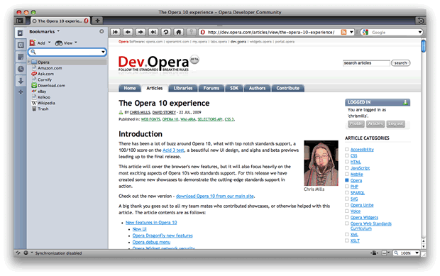
Figure 1: The new Opera 10 user interface.
New features in Opera Dragonfly
We are working hard towards turning the Opera browser into a world class development platform, and our Opera Dragonfly debugging tool is key to this plan. Opera 10 comes with Opera Dragonfly alpha 4, which has had many bugs fixed and a number of enhancements added, including:
- Improved UI and workflow: The UI is now more compact and intuitive, and we have also fixed one of the biggest Opera Dragonfly usability issues — Opera Dragonfly now selects the active tab or window in the browser automatically, cutting out a few steps required to start debugging
- Live CSS and DOM editing: Opera Dragonfly’s CSS editing abilities have been enhanced, and DOM editing is now supported allowing text nodes and DOM attributes to be edited, added or removed
- Improved error console: This lets you see, filter and log any errors in your scripts, pointing to the exact position where the error occurred
- Support for multiple languages: You can find a list of the supported languages on the Opera Dragonfly Blog
- Enhanced breadcrumb trail: Allows you to navigate the DOM tree more effectively
- Network Inspector: This gives an overview of all the resources that were requested by Opera for the active debugging context. You can break down each request to show the request summary, raw request and the request and response headers
- Remote debugging: Using Opera Dragonfly you can debug pages on Opera Mobile 9.7 beta or any other browser using Presto 2.1 or later. To find out how, have a look at the Remote debugging with Opera Dragonfly article
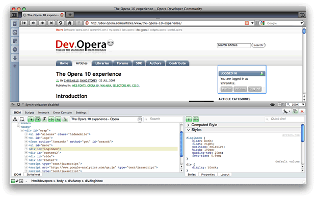
Figure 2: Opera Dragonfly in action.
To use Opera Dragonfly (see Figure 2), simply load up Opera and choose Tools > Advanced > Developer Tools. You can find more info on the Opera Dragonfly product page, and get the latest news from the Opera Dragonfly Blog.
Things to watch out for
Opera Widget network security
Opera widgets have an added security feature in Opera 10 — by default Widgets don’t have network access. You can enable network access by adding a network="public" attribute to the widget element in your widget’s config.xml file, like so:
<widget network="public">
  ...
</widget>
Changes in the user agent string
Opera 10 final has a new user agent (UA) string. On Mac, this looks as follows:
Opera/9.80 (Macintosh; Intel Mac OS X; U; en) Presto/2.2.15 Version/10.00You’ll notice that Opera 10 identifies itself as Opera 9.8. This may seem odd, but it has to do with the fact that Opera is the first browser to make it to a double-digit version number — this causes problems with a number of old browser detection scripts, which check only for the first version number digit in the UA string. In these cases an Opera 10 user agent string is interpreted as Opera 1, which would break many sites. We have decided to work around this as shown above — note the real version number provided at the end of the UA string, for those who want to create more robust browser detection code. Read more about this in Changes in Opera’s user agent string format, by Andreas Bovens.
Standards support in Opera 10
Opera 10’s Presto 2.2 rendering engine supports all of the long-standing web standards that we’ve used to create web sites for a while now:
- CSS 2.1
- HTML 4.01
- JavaScript
- DOM 2 (and part of DOM 3)
- SVG 1.1
- XML/XSLT 1.1
But there’s more — Opera 10 also features support for many features of the cutting-edge web standards currently in development at the W3C:
- CSS 3: Media queries, Web Fonts (Fonts spec), Color spec, Selectors spec
- HTML 5: Canvas, Web Forms 2.0, Server-sent events, contenteditable
- Selectors API
You can find other information/examples covering Opera’s standards support at:
- Opera web specifications support
- Standards support in Opera Presto 2.2 and Opera 10 beta
- Opera Presto 2.1 — Web standards supported by Opera’s core
Many of the features listed above were already supported in our Presto 2.1 Engine (Opera 9.6); in this article’s showcases we’ve included a lot of those features, but we’ll concentrate more heavily on the following new features in Opera 10’s Presto 2.2 engine:
- Web Fonts (True Type, Open Type, SVG): A simple way of importing font files on your server into your CSS, so you can use custom fonts on your web pages. Read about Web Fonts basics
- Transparency through opacity, RGBA and HSLA: There are now three ways to control the alpha channel (transparency) of colours via CSS. Read about CSS transparency basics
- Selectors API: This API provides a much easier way to select DOM elements in JavaScript. Read more about Selectors API basics
The "basics" links above lead you to brief primers on these subjects, in case you need an overview of basic syntax before looking at our showcases.
Due to a bug in Opera 10, specifying different weights and styles for a single font-family name currently breaks — only the last font specified (typically a bold/italic font) is applied, overriding other weights and styles of that font family. We are already working on a fix, which will be rolled out via our auto-update mechanism soon — in the meantime, you can avoid this issue by defining bolds and italics as different font families, and applying them explicitly on the elements you want to use them for. Of course, this workaround will continue working even after we've fixed the problem in question.
Showcases
Now it’s time to start running through our showcases. You can sit back and enjoy the show by all means, but we’d like to invite you to get your hands dirty! Download the full code examples using the relevant links below, and start experimenting with them yourselves — let us know what you’ve built using the "Discuss this article" link at the bottom of the page!
The Daily Standard: read your newspaper online

David Storey
- Author: David Storey
- Key features: Web Fonts, CSS 3 selectors, HTML 5 markup
- Live newspaper showcase
- Newspaper code download
First we’ll start off with David’s newspaper example. He’s created a classic newspaper layout, with two columns, a decorative image, and nice typography including Web Fonts, drop caps and small capped first lines at the start of articles. See Figure 4 to get an idea of what it looks like.
The newspaper is perfectly accessible to disabled people using screenreaders, as it follows a logical structure of headings and content. For the actual structural markup, David has used HTML 5 elements and set them to display: block; in the CSS. For a detailed explanation of the elements David uses in this example (they are also used in some of the other showcases below), read my HTML element basics primer.
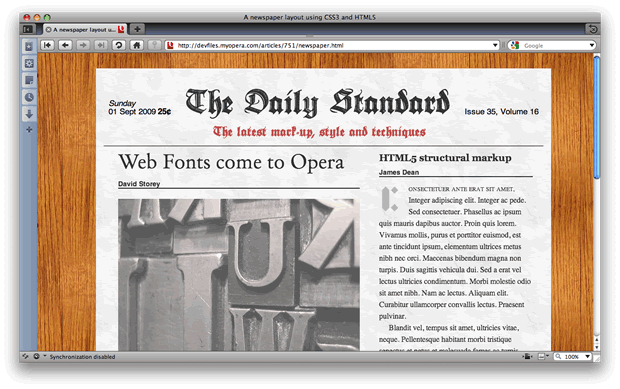
Figure 4: Our two column newspaper layout.
Web Fonts in the news
In this example, we have three fonts being imported at the top of the CSS:
@font-face {
  src: url(../fonts/DeutscheZierschrift.ttf) format("truetype");
  font-family: "Zierschrift";
  font-style: normal;
}
The fonts are then applied to the relevant elements using the font-family property in appropriate rules, like so:
#page > header h1 {
    ...
  font-family: "Zierschrift", times, serif;
    ...
}
Note that you can find a lot more Web Fonts showcases in an accompanying article, Seven Web Fonts showcases
CSS 3 pseudo-classes
Some of the CSS selectors in this example use CSS 3 pseudo-class selectors to apply some of the rules. These are fairly intuitive, but let’s review some now for completeness’ sake:
#page > header p:first--of-type { margin-left: 10px; }This rule is saying "apply this rule only to the first paragraph you find inside a header element inside the #page div."
#page > header p:nth--of-type(2) { font-weight: 800; }This means "apply this rule to the second one of these elements."
article section p:first--child { text-indent: 0; }This is saying "apply this rule to the first child element of article section p".
Reinventing the operating system, open standards style!
David Storey
- Author: David Storey
- Key features: HTML 5 markup, contenteditable, WAI-ARIA, CSS 3 generated content, CSS 3 attribute selectors, CSS 3 HSL(A)/RGB(A), CSS 3
background-size, CSS 3overflow-x/overflow-y - Operating system UI live showcase
- Operating system UI code download
For his second trick, David has produced an environment of draggable, editable windows and menus, much like the operating systems we all know and love (or as some would say, tolerate). See Figure 5 for a screenshot.
This example moves away from Web Fonts, concentrating on colours and transparency, some other CSS 3 properties like attribute selectors and background-size, and adding WAI-ARIA to the mix. It is also more complex than previous showcases, using a fair chunk of JavaScript to achieve the dynamic movement, and SVG for imagery.
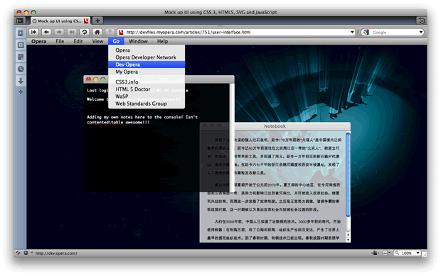
Figure 5: David’s operating system UI example.
contenteditable
contenteditable is a part of the HTML 5 spec — setting this attribute to true on an element means that you can now directly edit the text inside that element. Try changing the text inside the windows in this example!
RGBA/HSLA and fill-opacity/stop-opacity
Four different methods are used for transparency in this showcase. For HTML elements RGBA and HSLA colour models are used. These map to the RGB and HSL colour models already supported in Opera 9.5, but add a fourth value to specify the alpha channel. 1 denotes fully opaque and 0 denotes fully transparent. For more information on RGBA and HSLA read our article HSL, RGB and Alpha Transparency.
For the SVG background images, there are two CSS properties that are used to add transparency. The fill-opacity property is used to add opacity to the fill of an element, while stop-opacity is used in gradients to add opacity to the stop colour. In SVG these are separate properties, which predate the CSS 3 Color specification.
CSS 3 attribute selectors
This example makes extensive use of CSS 3 attribute selectors. For example:
ul[role="wairole:menubar""] li {
  ...
}
CSS 2.1 already allowed you to select an element with a certain attribute. CSS 3 goes further, allowing you to select for a specific attribute value, or even parts of attribute values. Find out more about CSS 3 attribute selectors by reading our article CSS 3 attribute selectors, by Christopher Schmitt.
CSS 3 background-size
The <html> element has the following rule applied to it:
html {
    ...
  -o-background-size: 100% auto; /* set background image to fill width while respecting aspect ratio */
  background-size: 100% auto; /* remember to use standard version after prefix for when browsers support prefixless version */
    ...
}
The background-size property forces the background image to always maintain a certain size proportionate to the size of the element it is applied to, regardless of how it is resized. The two values relate to the lengths of the image along the X and Y axes respectively. In this case, the image will always be 100% of the width of the <html> element, and the auto value will cause the height to always remain the same size proportionate to the width. For more information about background-size, read our article CSS text shadows and background sizing.
Note that Opera currently supports this property using the vendor prefix -o-background-size hence it being included in this example.
CSS 3 overflow-x/overflow-y
overflow has been a part of the CSS spec for a while, but CSS 3 has introduced the ability to set overflow for just the X or Y direction. In David’s example, the content areas of the windows have been set to scroll when the text overflows, so that a scrollbar will appear when the text reaches the bottom of its container:
[role="wairole:application""] .content {
  ...
  overflow-y: scroll;
}
The main UI elements: CSS and SVG
As you’ll see from playing with the example, the two main areas of functionality are the application menu at the top of the example, and the two draggable, editable windows.
The menu is a typical dropdown menu, and functions using just CSS and SVG; no JavaScript required. Most of the menu items are single links, with rollover effects created using CSS 3 attribute selectors and SVG for all the images.
The UI windows work in much the same way — the only difference is contenteditable being used to make the contents directly editable, and JavaScript being used for drag-and-drop, which is explained below. SVG is used for all the images, including the Mac-style gel buttons.
David uses CSS 3 generated content for the gel buttons. In the HTML, the buttons are given sensible text labels so they are accessible:
<button id="close">Close</button>
<button id="min">Minimise</button>
<button id="max">Maximise</button>
In the CSS, content: "" is then set on these buttons to remove the text, and SVG background images are added to replace the text and make it look nice:
#window-controls button {
    ...
  content:  "";
    ...
}

#close {
  background-image: url("unfocused-gem.svgz");
  left:  5px;
}

/* (the rules for the other buttons then follow...) */
Note that generated content can be used on everything, not just :before and :after .
text-overflow: ellipsis; is also used, so that if the title bar text gets longer than its container, it will automatically be truncated with an ellipsis at the end, rather than falling off the edge untidily.
Drag-and-drop with JavaScript
The JavaScript for dragging and dropping the windows is adapted from a dragDrop class written by Peter-Paul Koch. You can find a detailed explanation of how the dragDrop class works on Peter-Paul Koch’s site. For his example, David has also added WAI-ARIA support to the code.
WAI-ARIA
WAI-ARIA is a specification to provide a means of describing roles, states, and properties of web application features such as navigation menus and editable live regions so that they are recognisable and usable by assistive technology users. If you are interested in finding out more, check out the WAI-ARIA tutorials available on Dev.Opera.
Back to our showcase! First of all, the title bars of the windows are set as drag handles (the part that you click and hold the mouse on top of to drag them); they are identified using the WAI-ARIA role attribute — role="wairole:heading"":
var dragHandle = element.querySelector('header[role="wairole:heading""]') When you start dragging a window, the aria-grabbed attribute is set to true, which indicates that this object is currently being dragged:
startDrag: function (obj) {
  if (dragDrop.draggedObject)
    dragDrop.releaseElement();
  dragDrop.startX = obj.offsetLeft;
  dragDrop.startY = obj.offsetTop;
  dragDrop.draggedObject = obj;
  obj.setAttribute('aria-grabbed', 'true');
},
Finally, when you stop dragging the window, aria-grabbed is set back to false:
releaseElement: function() {
  removeEventListener('mousemove',dragDrop.dragMouse, false);
  removeEventListener('mouseup',dragDrop.releaseElement, false);
  removeEventListener('keypress',dragDrop.dragKeys, false);
  removeEventListener('keypress',dragDrop.switchKeyEvents, false);
  removeEventListener('keydown',dragDrop.dragKeys);
  dragDrop.draggedObject.setAttribute('aria-grabbed', 'false');
  dragDrop.draggedObject = null;
},
This example also uses a basic Selectors API query in the initialization function (Selector API basics are explained earlier on, and there is more about them in the next showcase):
var dragApps = document.querySelectorAll('div[draggable="true"]')The Selectors API gets things done faster!
David Storey
- Author: David Storey
- Key features: Selectors API
- Selectors API live showcase
- Selectors API code download
David’s third example deals extensively with the W3C Selectors API spec, which aims to make element selection quicker and more painless in a way that will make more sense to non-JavaScript experts, similar to how libraries like jQuery work. This showcase presents a series of examples showing Selectors API usage compared to the standard DOM equivalents. The example looks like Figure 6.
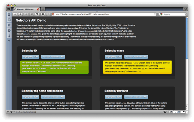
Figure 6: Selectors API showcase.
In each box you will find some sample text and two buttons — one that applies a background-color via the selectors API, and one that applies a different background-color via the equivalent standard DOM method. I don’t need to add any more explanation here, as there are plenty of details included on the live Selectors API example page itself. Check it out!
SVG animation with flying colours
David Storey
- Author: David Storey
- Key features: SVG, SMIL
- SVG animation live showcase
- SVG animation code download
In David’s fourth and final showcase (see Figure 7) he presents a really neat SVG animation using Web Fonts and SMIL — check it out! The type specimen is made up of a number of rectangles (<rect> in SVG), which are rotated into position using a rotate transform. An element can be rotated in SVG using transform="rotate(angle x y)", where angle is the value of the angle that the element is rotated through, and the x and y values are the coordinates of the centre point that the element is rotated around.
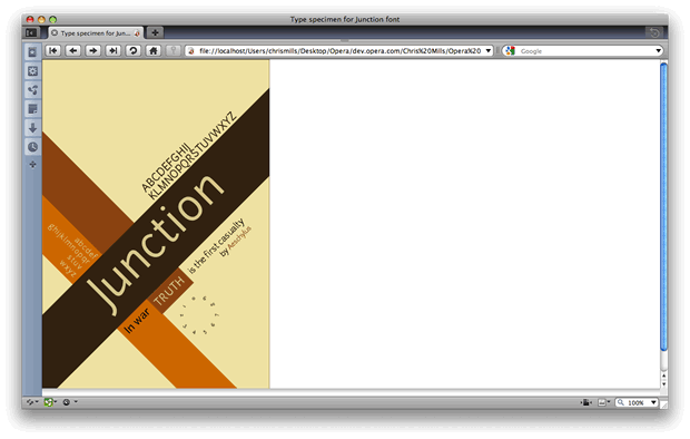
Figure 7: SVG animation showcase.
Three kinds of animation are used via SMIL elements: set, animate and animateTransform. The set element is a one-time animation, which changes state from the from state to the to state without any progression. This is used to set a shape from visible to invisible, for example. It is used in the showcase like so:
<set attributeType="CSS" attributeName="visibility"
  from="visible" to="hidden" begin="0s" dur="1s"/>
To animate an element progressively from one value through to another, the animate element is used:
<animate attributeType="XML" attributeName="width"
  from="0" to="600" dur="1.5s" begin="1s"/>
In this example, the burnt orange rectangle that sits behind the lower case text animates from a width of 0 to 600. The animation starts after one second and lasts for 1.5 seconds.
The final type of animation, animateTransform, is used to animate the transform attribute of the circular numbers. This works in much the same way as the animate element, but it also includes a type attribute to specify the type of transform that needs to be animated:
<animateTransform attributeName="transform" attributeType="XML" type="rotate"
  from="0 290 472" to="300 290 472" dur="4s" begin="2s" fill="freeze"/>
This rotates the textPath element through 300 degrees. The fill attribute is set to freeze, which means that at the end of the animation it will freeze in that position rather than reverting to its original position.
Summary
And that rounds off our look at the new Opera 10 release — we hope the showcases have given you some inspiration and food for thought to help you create your own amazing new examples. As always, don’t hesitate to leave comments and give us any feedback you may have.
For more about web fonts and RGBA/HSLA, see the Seven Web Fonts showcases and Color in Opera 10 — HSL, RGB and Alpha Transparency articles.
Chris Mills

Chris Mills is a web technologist, open standards evangelist and education agitator, currently working at Opera Software in the developer relations team. He spends most of his time writing articles about web standards for dev.opera.com and other publications (such as .net mag and A List Apart), giving talks at universities and industry conferences, and lobbying universities to improve their web education courses. He believes that education is the answer to everything, but in particular he is passionate about using education to improve the overall content quality, accessibility, usability and future-viability of the Web.
He is the creator of the Opera Web standards curriculum, contributor to the WaSP InterACT project, and coauthor of InterACT with web standards: A Holistic Approach to Web Design. In August 2011, he also accepted the position of co-chair of the newly-formed Web Education Community Group.
Outside work he is a heavy metal drummer, proud father of three and lover of good beer.
This article is licensed under a Creative Commons Attribution, Non Commercial - Share Alike 2.5 license.
Comments
The forum archive of this article is still available on My Opera.
No new comments accepted.