Seven Web Fonts showcases
Introduction
As we were coming up with web standards examples to highlight the standards support in our Opera 10 final release, we realised that we were all very excited about CSS 3 Web Fonts, possibly above any other feature. We ended up with way more showcases illustrating Web Fonts usage than any other type of showcase, therefore we decided to break most of them out into a separate article — the one you're reading now!
This article contains a nice variety of web fonts showcases, looking at usage of different font formats (TrueType, OpenType, SVG), different alphabets and character sets (including Devanagari (South Asian), Russian and Japanese font families), and some different effects (including using SVG for text effects, and text-shadow).
In any case, we hope you find these examples interesting and useful, and that they inspire you to create fabulous designs of your own. The contents of this article are as follows:
- The news in Russian
- Devanagari Web Fonts study
- Japanese Web Fonts!
- Attractive text outlines using multiple drop shadows and transparency
- Adding some SVG fonts into the mix
- The delicate art of SVG text manipulation
- Elegant drop caps with Web Fonts
These related links might also be useful to you as you work your way through the article:
- Download Opera 10 final
- Web Fonts primer: If you need to review the basics
- Where to find free Web Fonts for embedding
- The Opera 10 experience: Find out more about the Opera 10 release, including new features and more standards showcases
- Color in Opera 10 — HSL, RGB and Alpha Transparency: This article by Molly Holzschlag explains how the RGB and HSL colour models work, and looks at adding transparency to the mix — a very useful designer's guide
Due to a bug in Opera 10, specifying different weights and styles for a single font-family name currently breaks — only the last font specified (typically a bold/italic font) is applied, overriding other weights and styles of that font family. We are already working on a fix, which will be rolled out via our auto-update mechanism soon — in the meantime, you can avoid this issue by defining bolds and italics as different font families, and applying them explicitly on the elements you want to use them for. Of course, this workaround will continue working even after we've fixed the problem in question.
The news in Russian

Vadim Makeev
- Author: Vadim Makeev
- Key features: Web Fonts, HTML 5 markup, RGBA colors
- Live Russian newspaper showcase
- Russian newspaper code download
Vadim has created a neat-looking Russian news poster to demonstrate some Russian Web Font usage, as seen in Figure 1. Vadim has also made use of HTML 5 markup in his example — we won't explain this in detail here, but you can read up on the basics by checking out the HTML 5 element basics primer. He has also made use of RGBA colours, which will be explained below.
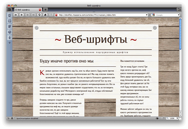
Figure 1: Our Russian Web Fonts showcase.
The Web Fonts
There is nothing complicated at all about including Web Fonts in a page. Vadim includes his fonts in his CSS using the standard @font-face construct, like so:
@font-face {
  font-family:'Philosopher'; /* © Ivan Gladkikh, http://jovanny.ru/ */
  src:url (../f/Philosopher.otf);
}
Note that he uses OpenType fonts in this example, rather than the more common TrueType fonts. This is just a different common font format — for more information, check out the OpenType fonts Wikipedia page.
The fonts are then included in the page using the standard font-family property, for example:
article h2 {
    ...
  font:2em/1 'Philosopher',sans-serif;
    ...
}
RGBA
Vadim has set the poster background colour using an RGBA value. 255,255,255 is white, but it has an alpha value of 0.9, so the background slightly shows through — we've used very thin paper to print our poster on!
#page {
    ...
  background:rgba(255,255,255,.9);
    ...
}
Devanagari Web Fonts study

Shwetank Dixit
- Author: Shwetank Dixit
- Key features: Web Fonts, HTML 5 markup, CSS 3
opacity, RGBA colors - Live Devanagari Web Font showcase
- Devanagari Web Font code download
Shwetank has also provided us with a nice showcase, to illustrate some Devanagari (South Asian) Web Fonts and how they work — see Figure 2. The showcase uses Hindi. Look at them carefully — notice the difference in the spacing, the slants and the curves of the letters. The fonts are included in the CSS in the standard way, as discussed above. Again, HTML 5 markup has been used in this showcase, and RGBA colors have also been used in the same way as before; we therefore don't need to discuss those again.
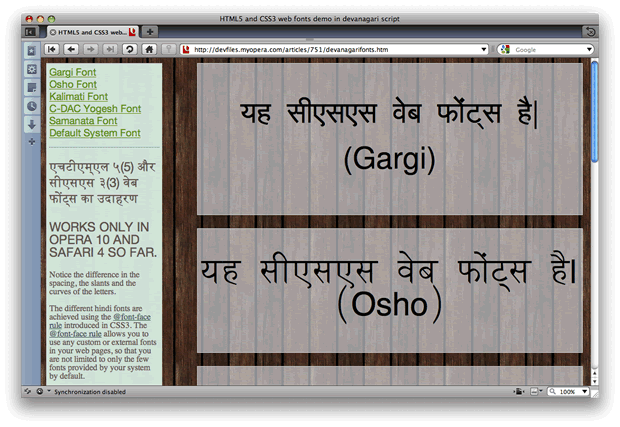
Figure 2: Our Indian Web Fonts showcase.
Opacity
The transparency in the main example boxes is done using RGBA colours as before, but for the navigation/sidebar and the footer it is done using the CSS 3 opacity property. In these cases Shwetank wanted to give the elements and all of their contents a little bit of blanket transparency. This can be achieved using opacity, whereas if you just want to give a single text or background colour transparency, you are better off using an RGBA or HSLA colour. For example:
footer, footer p{
    ...
  background-color:rgb (100, 89, 81);
  opacity: 0.85;
    ...
}
Japanese Web Fonts!

Daniel Davis
- Author: Daniel Davis
- Key features: Web Fonts
- Live Japanese Web Font showcase
- Japanese Web Font code download (1.5mb)
Our man in Japan, Daniel Davis, has contributed a fantastic Japanese Web Fonts showcase to the mix. He has taken the code from David's newspaper showcase, adapted it somewhat (although they are functionally the same), and used Japanese fonts — along with a little polish such as some text-shadow — to give a flavour of how these kinds of typefaces can work on web pages. Figure 3 shows an image of the example in action.
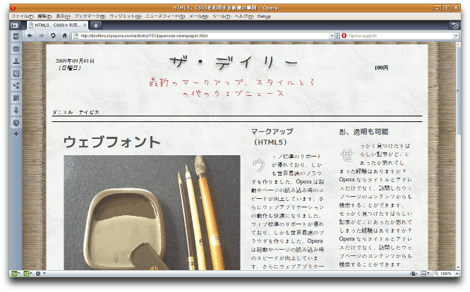
Figure 3: Japanese Web Fonts showcase.
One point to bear in mind is that Japanese and similar East Asian languages have thousands of characters. This can result in large font file sizes for the user to download so they should be used with care.
Attractive text outlines using multiple drop shadows and transparency

Andreas Bovens
- Author: Andreas Bovens
- Key features: Web Fonts, multiple
text-shadows, RGBA colour - Live text outline showcase
- Text outline code download
In this example, Andreas has used multiple text-shadows along with RGBA colours to create attractive overlaid copyright notices for his photos with semi-transparent gradiated outlines — see Figure 4. The example uses a nice pixel font called CC Red Alert:
@font-face {
  src: url(ccredalert.ttf) format("truetype"); /* http://www.dafont.com/c-c-red-alert-inet.font */
  font-family: "ccredalert";
  font-style: normal;
}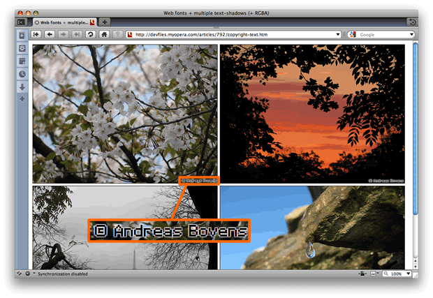
Figure 4: This text outline effect has been created using multiple text-shadows with RGBA colours — the magnified inset has been included so you can see the effect more easily.
Multiple text shadows and RGBA
text-shadow is a well-supported part of the CSS 3 spec that does just what its name implies. The rule applying the text-shadows to the copyright notices in this example looks like so:
span {
  ...
  text-shadow: rgba(255, 255, 255, 0.6) 1px 1px 0, rgba(255, 255, 255, 0.6) -1px -1px 0,
  rgba(255, 255, 255, 0.6) 1px -1px 0, rgba(255, 255, 255, 0.6) -1px 1px 0;
}
As you can see, the span has four shadows applied to it. Each comma-separated block defines one text shadow:
rgba(255, 255, 255, 0.6) -1px -1px 0The four values respectively denote:
- Shadow colour
- Horizontal offset — positive values place the shadow to the right of the original text; use a negative value if you want the shadow to be offset to the left
- Vertical offset — positive values place the shadow below the original text; use a negative value if you want the shadow to be offset above
- Blur radius of the shadow — how dispersed it is
You can apply as many text shadows as you want to a piece of text, and as you can see in this example, you can also apply transparency to the colours of your shadows.
Adding some SVG fonts into the mix

Chris Mills
- Author: Chris Mills
- Key features: SVG Web Fonts
- Live SVG Web Font showcase
- SVG Web Font code download
I've come up with an example that makes use of a couple of fantastic SVG fonts I found — Ubuntu and Graffiti — see Figure 5. An SVG font is used pretty much like any of the other fonts from the previous showcases. In my example, the fonts are included like this:
@font-face {
  font-family: ubuntu;
  src: url(UbuntuTitleBold.svg#UbuntuTitleBold) format("svg");
}
One difference to note is that we are not just pointing to the SVG file, but to an ID inside the SVG file — in each case, this points to the ID of the font element inside the SVG file, which contains all the font information.
We then apply the fonts to our HTML as expected:
font-family: "ubuntu";
font-family: "graffiti";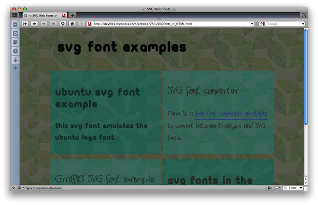
Figure 5: Making use of an SVG Web Font.
The delicate art of SVG text manipulation
Andreas Bovens
- Author: Andreas Bovens
- Key features: Web Fonts, SVG filters, CSS 3
nth-child - Live text spiral showcase
- Live filtered text showcase
- Link to SVG text effects code download
This showcase consists of a couple of examples where Andreas has applied some extra special effects to text using SVG, plus a couple of Web Fonts for good measure. The examples are contained inside SVG files, and as you'll see below, text is defined slightly differently inside SVG. However, you can still apply CSS to SVG elements in the same way as you do with regular HTML. Check out the source of the example files and all will become clear.
A text spiral
The first example takes a block of text and winds it up into a spiral — see Figure 6! This would take a lot of work to write by hand, so Andreas created it using the Inkscape open source SVG editor. It's a great tool for creating more complex SVG design elements, so we'd recommend you check it out.
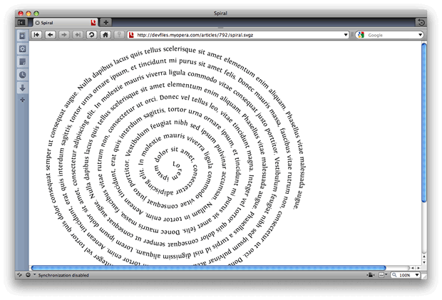
Figure 6: A rather interesting spiral of text — wound up using SVG!
The first thing defined inside the SVG file is a path element, which looks like so:
<path d="m236.09,436.60c-0.60926-3.9660,4.7996-2.9105 ...more curves...
id="spiralpath" transform="matrix(2.0828054,0,0,1.9429071,-107.51929,-506.8181)" />
The text element contains a textPath element, which references the path we just specified.
<text>
  <textPath startOffset="4.5" xlink:href="#spiralpath"> Lorem ipsum dolor sit amet...</textPath>
</text>
This maps the text along the path, which results in our text spiral.
Applying a noise filter to text
The second text-manipulation example takes a block of text with a Web Font applied to it, and adds some "noise" to the text by way of an SVG filter to create a rough "printed" effect. Check out Figure 7.
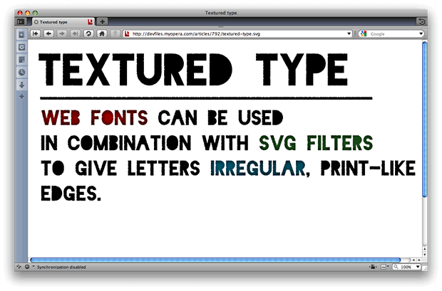
Figure 7: SVG filters help to create this rather interesting "rough printed" look.
I'm not going to get into too much detail about how this works — check out the example source if you want to gain more of an understanding. The noise filter is defined inside the filter element, and the text sections are defined inside text and tspan elements, for example:
<text x="31.094646" y="127.95984" id="title">
  <tspan x="31.094646" y="127.95984">Textured type</tspan>
</text>
The noise filter is applied to the text using the following line of CSS:
#title, #textblock, rect {
  filter:url((#filter5853);
  fill:#000;
}
This SVG-specific CSS is fairly intuitive, applying the filter defined at the specified URL, and applying a font/background colour (fill, in SVG terms) to the various elements.
The other interesting CSS feature to mention from this example is the nth-child pseudo-class, which is used to set colours on different instances of the same SVG element.
#textblock tspan:nth--child(1) tspan {fill:#aa0000;}
#textblock tspan:nth--child(2) tspan {fill:#217821;}
#textblock tspan:nth--child(3) tspan {fill:#006680;}
For more on using the nth-child pseudo-class, check out our article Zebra striping tables with CSS3.
Elegant drop caps with Web Fonts

Bruce Lawson
- Author: Bruce Lawson
- Key features: Web Fonts
- Live drop caps showcase
- Drop caps code download
In this showcase, Bruce Lawson has created a nice image-replacement-free drop caps solution using a Web Font — check out Figure 8. The font is imported into the CSS in the standard way, although it's worth noting that in this example Bruce has added support for IE by also importing an EOT version of the font:
/* For IE */

@font-face {
  font-family: 'Kingthings Versalis';
  src: url('Kingthings_Versalis.eot');
}
The font is then applied to the first letter of every paragraph to create the drop cap, using the following rule:
p:first--letter {/* selector should be p::first-letter, with 2 colons, but IE doesn't understand that */
  font-size: 2.3em;
  font-family: "Kingthings Versalis";
  float: left;
  padding: 0 0.3em 0 0;
  line-height: 1.2;
  font-weight:bold;
}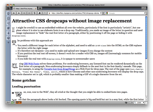
Figure 8: An elegant drop caps solution created using a Web Font.
Make sure you check out the live drop caps demo page — it contains a description and further useful information about the technique.
Chris Mills

Chris Mills is a web technologist, open standards evangelist and education agitator, currently working at Opera Software in the developer relations team. He spends most of his time writing articles about web standards for dev.opera.com and other publications (such as .net mag and A List Apart), giving talks at universities and industry conferences, and lobbying universities to improve their web education courses. He believes that education is the answer to everything, but in particular he is passionate about using education to improve the overall content quality, accessibility, usability and future-viability of the Web.
He is the creator of the Opera Web standards curriculum, contributor to the WaSP InterACT project, and coauthor of InterACT with web standards: A Holistic Approach to Web Design. In August 2011, he also accepted the position of co-chair of the newly-formed Web Education Community Group.
Outside work he is a heavy metal drummer, proud father of three and lover of good beer.
This article is licensed under a Creative Commons Attribution, Non Commercial - Share Alike 2.5 license.
Comments
The forum archive of this article is still available on My Opera.
No new comments accepted.