Opera Skinning part 5: Tips and tricks
9th October 2012: This article is obsolete
Opera 12 and above support a new, simplified form of skinning. See our tutorial on how to make themes (skins) for Opera.
pages: 1/5: Introduction, general explanations — 2/5: Skinning examples — 3/5: Skin.ini explained — 4/5: skin.ini element reference — 5/5: tips & tricks
Introduction
In this article I’ll give you some tips and tricks to help you test skins, develop new skins more easily, and improve the quality of your skins. If you have any tips of your own to share, leave a comment, and they may get added!
Index
- Use colors to identify elements
- Specify only changed elements
- Rename sections to test them
- Create your own sections
- Choice of color
- Keep the icon size and color scheme settings in mind
- Use of “Inverted” icons on the tab bar
- Mail header images
Use colors to identify elements
When you aren’t sure which sections in skin.ini you have to edit to change a certain part of the Opera user interface, a clever idea is to create a test skin to help you identify the elements that each part of skin.ini controls.
Instead of specifying types, Tile-images and parameters you can just set one color per element, choosing different colors for each element. For example you can color [Pagebar skin] in red, [Toolbar button skin] in blue, and so on. To figure out what element in the Opera skin is controlled by each section of skin.ini, you can then look at what color each element is, and then look for that color inside skin.ini.
Specify only changed elements
To keep your skin.ini file small and easy to read you should only specify sections you have actually changed, and miss out the rest. Opera will then fallback to the “Opera Standard” skin for any elements you want to just look the same as the default. If you want, you can add a comment to skin.ini, saying the element is loaded from the standard skin.
The same goes for parameters you haven’t changed. If you omit them from your skin.ini file, Opera will use the default value so you don’t have to specify them if default is what you want to use anyway.
Rename sections to test them
Elements can sometimes be hard to find, eg the fraud indicator in the address field, which only appears on sites considered to be dubious. To be able to test these elements easily it’s a good idea to put their parameters in another section.
For example, you could rename the [Untrusted Site Security Button Skin] section to [Low Security Button Skin] and comment out the original [Low Security Button Skin] section. The indicator for fraud sites will then appear on any unverified site, so you don’t have to find a fraud site to test with.
Create your own sections
Opera ignores unknown sections in skin.ini, but you can also create your own ones. This is especially useful if you want several elements to look the same — then when you want to change them you only have to change them in one place in skin.ini, not in multiple places.
For example, if you wanted all toolbar to be styled with the same images but different paddings, you could create a section [My custom toolbar skin] with all the images. In the toolbar sections you then only need to clone this custom section and specify the paddings.
Choice of color
Some elements should always be styled the same, no matter which skin one is using. For example, the high security indicator should always be yellow while the fraud indicator should be red.
In the same way [Edit Skin], [Treeview Skin], [Listbox Skin], [MultilineEdit Skin], [MultilineEdit Skin] and [Dropdown Skin] should always use “Window” as color.
For these elements you should also disable Colorize as that could change the colors as well.
Keep the icon size and color scheme settings in mind
The easiest way for the user to change the look of a skin is to change the icon size and color schemes. Both can easily be done in the “Appearance” dialog, so check that your skin still looks good even if the user changes those values.
Hover effects
As described on the previous pages hover effects can be set using the .hover state. When that state isn’t specified Opera will apply its own hover effect, which adds a lighter grey with a touch of blue. This native effect can’t be adjusted.
On hover this native effect adds an overlay to the existing image using the formula MIN(color + (100 * colorfactor) / 255) with the RGB values of 60, 60, 140.
Example: If a pixel previously had the RGB values 206, 164, 33 the result would be MIN(206 + (100 * 60) / 255) = 229, MIN(164 + (100 * 60) / 255) = 187, MIN(33 + (100 * 140) / 255) = 87 when hovered.
Use of "Inverted" icons on the tab bar
If a skin is using different colors for the toolbars and the tab bar, like Opera’s standard skin does, it sometimes occurs that icons that are easy to distinguish on toolbars become hardly visible on the tab bar. As both bars normally use the same icons, this causes severe usability problems.
By enabling Inverted Pagebar Icons in the [Options] section of skin.ini this problem can be avoided. This option makes Opera use different icons for the tab bar than for other toolbars. The name of those icons used for the tab bar consist of the normal name plus an attached “Inverted”. For example, if the icon that’d usually be used is the Window Document Icon, Opera would instead use Window Document Icon Inverted.
Mail header images
To make it easier to recognize which mail filter one has currently open it’s possible to specify mail header images. These are shown at the left of the [Mailbar Skin]:
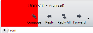
These images can be specified independently for every filter but for consistency reasons either each or no filter should have one. The images are usually specified in the [Images] section with their name being one of the following, depending on which filter it's to be used with:
Mail Filter HeaderMail Unread HeaderMail Inbox HeaderMail Outbox HeaderMail Sentbox HeaderMail Drafts HeaderMail Trash HeaderMail Spam HeaderMail Thread HeaderAttachment Documents HeaderAttachment Archives HeaderAttachment Music HeaderAttachment Video HeaderAttachment Images HeaderLabel Important HeaderLabel Todo HeaderLabel Mail back HeaderLabel Call back HeaderLabel Meeting HeaderLabel Funny HeaderLabel Valuable HeaderUnknown contact headerSearch HeaderNews HeaderFolder HeaderChat Room HeaderChat Private HeaderNewsfeed Header
By default mail headers cause the content of the mail bar to get moved 80px to the right, no matter how wide the mail header is. If the mail header is wider than 80px it extends behind the text, as seen on the figure above. The indentation can be adjusted by specifying “Margin Right” for the mail header. For example, to disable the indentation you would set “Margin Right = -80”; “Margin Right = 20” would indent the mail bar content by 100px. If no mail header is specified the indentation is disabled completely.
In the following example ”mail_headers/unread.png” is specified as the mail header for the unread filter and the text indentation is set to 40px (80px default width minus 40px negative margin right):
Mail Unread Header = mail_headers/unread.png, 1, 0, 0, -40, 0
Summary
So that’s the end of our journey into Opera skinning — in this set of articles I have taken you through skinning in detail, including packing and unpacking skins, simple image replacements and a very detailed account of what all the sections and properties inside skin.ini do. I would love to see what skins you come up with after reading my articles — please provide links to them in comments. In addition, feel free to comment if you have any suggestions on how to improve the articles.
Pages: 1/5: Introduction, general explanations — 2/5: Skinning examples — 3/5: Skin.ini explained — 4/5: skin.ini element reference — 5/5: tips & tricks
This article is licensed under a Creative Commons Attribution, Non Commercial - Share Alike 2.5 license.
Comments
The forum archive of this article is still available on My Opera.
No new comments accepted.