Opera Skinning part 3: Skin.ini explained
9th October 2012: This article is obsolete
Opera 12 and above support a new, simplified form of skinning. See our tutorial on how to make themes (skins) for Opera.
pages: 1/5: Introduction, general explanations — 2/5: Skinning examples — 3/5: Skin.ini explained — 4/5: skin.ini element reference — 5/5: tips & tricks
Introduction
This document is a detailed reference showing what all the different parameters in the skin.ini file do. The next article will provide a similar reference, but that one will detail all the different sections inside skin.ini, and define what elements in the UI they control/specify attributes of.
Index
- [Info] section
- [Options] section
- Element Types
- Parameter reference
- Native
- Type
- Corner Topleft, Corner Topright, Corner Bottomright, Corner Bottomleft
- Tile Left, Tile Top, Tile Right, Tile Bottom
- Tile Center
- Padding Left, Padding Bottom, Padding Right, Padding Top
- Margin Left, Margin Bottom, Margin Right, Margin Top
- Spacing
- Color
- Text color
- Text bold
- Text underline
- Text zoom
- Border
- Border color
- Width
- Height
- Clone
- Colorize
- Blend
- Child0
- Child1
- Fallback version
- [Images]
- [Boxes]
- Special stuff
[Info] section
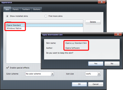
Name
Specifies the skin’s name, which is displayed in the dialog shown after downloading a skin and in the skin list in the “Tools > Appearance” dialog box.
Valid values: any text string
Author
Specifies the author’s name, which is displayed next to the skin’s name in the dialog shown after downloading a skin:
Valid values: any text string
Version
The version of the format used for skin.ini. For Opera versions 9.5 and greater this must be set to “3”. This setting must not be used to indicate the skin’s version number as that will likely break the skin in future versions of Opera.
Before version 9.2 skins used Version = 2. The default skin used in 9.5 is very different from the one in 9.2 and thus many skins made for 9.2 or earlier would have broken in 9.5 — because of this they get a special fallback treatment in Opera 9.5. As these fallbacks will likely be removed in the near future, all skins should be updated to version "3".
Valid values: 3
Preview Image
This option is currently not being used and can be omitted.
[Options] section
Native skin
If enabled (by setting the value as “1”) Opera will use elements from the operating system to draw the skin instead of using images from the skin. This allows Opera to integrate better with the look of the operating system. Please see the section in part 1 for more information on this topic.
There are four different values to enable this setting: “1”, “Windows”, “Mac” and “Qt”. “1” enables native skinning — in this case Opera automatically selects the proper source for the native element, depending on the operating system used by the user. The other three options work only on one or two operating systems and will cause the skin to be broken on other systems, therefore “1” is the recommended value to use.
Valid values: 0 / 1 / Windows / Mac /Qt
Pagebar max button width
Specifies the maximum width of tab bar buttons (tabs), specified in pixels. If this option isn’t set Opera will grow tabs to fit the website’s <title>. If this option is used to limit the maximum width Opera will still grow the tabs, but they won’t become any wider than the value set here. To stop tabs from adjusting in size, set both Pagebar max button width and Pagebar min button width (see below) to the same value.
Valid values: Any positive whole number
Pagebar min button width
Specifies the minimum width of tab bar buttons (tabs), specified in pixels.
Valid values: Any positive whole number
Fallback foreground
Unless disabled (by setting the value as “0”) Opera will use images from the standard skin as a fallback for any foreground images (like icons) missing from the skin. This option should be enabled so the skin can still be used when a new version of Opera introduces new icons that aren’t included in older skins. If disabled, Opera won’t show anything, which is bad as it can break functionality by causing buttons to not display.
Valid values: 0 or 1
Fallback background
Unless disabled (by setting the value as “0”) Opera will use images from the standard skin as a fallback for background images (like dialog backgrounds, buttons, etc) missing from the skin. Please see above (Fallback foreground) for more on the effects of this option.
Valid values: 0 or 1
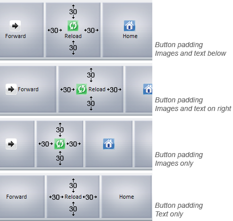
Button Text Padding
Specifies the padding around the text labels of buttons added to create some space between the text and their corresponding images. This setting applies to all elements and is cummulative with spacing, which can also be set for any element individually.
Valid values: Any positive whole number
Center tabs
If enabled (by setting the value as “1”) Opera will center tabs in dialog boxes (like the ones in the Preferences dialog), otherwise they’ll be left-aligned. Please note that this setting doesn’t apply to the “tabs” in the pagebar — those are called “Pagebar buttons”. The default value is “0” (left-aligned).
Valid values: 0 or 1
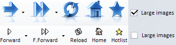
Large images
Specifies whether the skin contains large images as an alternative to the standard ones. If enabled (by setting the value to “1”) Opera will show the checkbox for “Large images” in the Appearance > Toolbar dialog. It’s only necessary to specify that this should appear if any .large toolbar button images are defined — the default value is “0”. If they exist, the user can choose whether they want to see small icons or large ones (for example 16px vs 28px) by unchecking or checking the “Large images” checkbox:
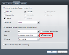
The following image shows an example of a skin with large images enabled and disabled.
Valid values: 0 or 1
PageCloseButtonOnTop
If enabled (by setting the value as “1”) the close button on tabs (pagebar buttons) is aligned to the top of the tab, else it’ll be centered. Please note that this setting doesn’t work in Opera versions before 9.5. The default value is “0” (vertically centered).
Valid values: 0 or 1
Inverted Pagebar Icons
If enabled (by setting the value as “1”) Opera will load “Imagename Inverted” instead of “Imagename” for images shown on pagebar buttons. This is especially useful if pagebar is using a similar background color as the icons to be shown on it which would make the icons hardly visible.
Valid values: 0 or 1
Element Types
Image
The image type normally isn’t used in the form Type = Image. Elements of that type are specified in the [Images] section instead. Every line in that section creates a new element with one image assigned to it.
Instead of using this shorthand way of creating elements you could also do it like this, which is not recommended and only mentioned to aid understanding:
[Panel Search]
Type			= Image
Tile Center		= buttons/search.png
Width			= 22
Height			= 22
The Tile Center image expands to fill the space available; if you don’t want that to happen you have to use a box-type.
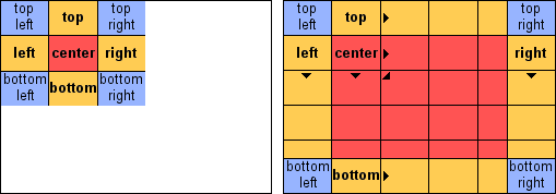
Box
This element is the most simple box element, but it is a bit inflexible. It creates a box consisting of 9 elements:
- One image per corner —
Corner Topleft,Corner Topright,Corner Bottomright,Corner Bottomleft. These are fixed in position in the corners of the element. - One image per border —
Tile Left,Tile Top,Tile Right,Tile Bottom. these are repeated to fill the space along each edge of the element. - One center image that is repeated to fill the empty room left in the middle of the element —
Tile Center.
Elements of this type can also be specified in the [Boxes] section. Only one image is specified there, which is used as Tile Center; the other 8 are omitted.
Each of the corner images is placed in their relevant corner, the “Tile Top/Right/Bottom/Left” images are placed in the middle of their respective sides, and the “Tile Center” image is put in the middle. This is better illustrated with an image:
This image also illustrates the problem with Type = Box: If the box is bigger than the images some parts are left unskinned. This is where BoxTile comes in handy; we shall look at this next.
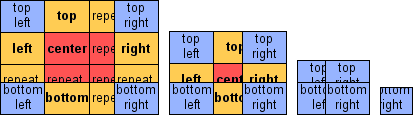
BoxTile
This is an improved version of Type = Box. Its basic structure is the same as for Type = Box, but it’s more flexible in terms of element resizing. All of the “Tile …” images are repeated (tiled) in order to fill the whole box — this allows the element to be any size and still be completely covered:
[Caption Button Skin]
Type                = BoxTile
Tile Center         = caption/center.png
Tile Left           = caption/left.png
Tile Top            = caption/top.png
Tile Right          = caption/right.png
Tile Bottom         = caption/bottom.png
Corner Topleft      = caption/topleft.png
Corner Topright     = caption/topright.png
Corner Bottomright  = caption/bottomright.png
Corner Bottomleft   = caption/bottomleft.png
If the box becomes smaller Opera first removes copies of the “Tile …” images; if they’ve already completely disappeared the corner images will overlay each other, as seen here:
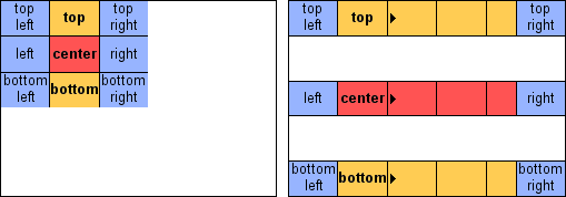
BoxTileHorizontal
This is a mix between Box and BoxTile. In the horizontal direction images are tiled just like in BoxTile, but vertically they aren’t tiled and therefore work just like in Box:
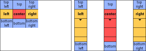
BoxTileVertical
This type works on the same principle as BoxtileHorizontal, except that the directions are switched:
BoxStretch
Introduced in Opera 9.5, this type creates results very similar to Type = BoxTile but it is a lot easier to create them using this method. Instead of having to create nine images only one is needed and Opera will automatically stretch it to the required size.
The image is specified with Tile Center. The value of Stretchborder specifies how much of that image is used to draw the borders and corners (“0” is a valid value here). The corners aren’t stretched at all; the top/bottom borders are stretched horizonally and the left/right borders are stretched vertically. The rest of the image is then used to draw the center area where it’s stretched to fit both horizontally und vertically.
[Push Button Skin]
Type              = BoxStretch
Tile Center       = buttons/push_button.png
StretchBorder     = 5
In the following figure the dotted lines indicate the area set by Stretchborder:
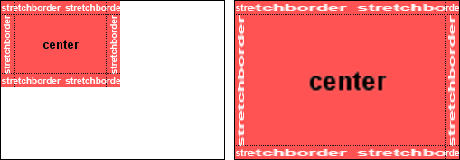
When using the BoxStretch type, the image should be larger than the expected resulting image in the skin to prevent artifacts.
Note: This type is not supported by releases previous to 9.5.
Parameter reference
All parameters in this section can be set for any skin element. Depending on the Type specified and the way the skin is designed, not all parameters are required.
Native
If Native skin is enabled it can be disabled for individual elements by setting this option to “0”. It’s not possible to have it globally disabled and then enabled for certain elements.
Valid values: 0 / 1
Type
Specifies the element’s type — see Types for detailed information on this.
Valid values: Image, Box, BoxStretch, BoxTile, BoxTileHorizontal, BoxTileVertical
Corner Topleft, Corner Topright, Corner Bottomright, Corner Bottomleft
Specifies the image to be used to draw a named corner of an element of the types Box, BoxTile, BoxTileHorizontal or BoxTileVertical.
Valid values: the relative path to an image
Tile Left, Tile Top, Tile Right, Tile Bottom
Specifies the image to be used to draw a named side of an element of the types Box, BoxTile, BoxTileHorizontal or BoxTileVertical, excluding the area covered by the corner images.
Valid values: the relative path to an image
Tile Center
Specifies the image to be used to draw the center area of an element of the types Box, BoxTile, BoxTileHorizontal or BoxTileVertical. For Type = Image this is the only image specified.
Valid values: the relative path to an image
Padding Left, Padding Bottom, Padding Right, Padding Top
Specifies the padding for the specified side of the element. Padding is inserted between the element border and it’s contents, as shown here:
Valid values: Any positive whole number
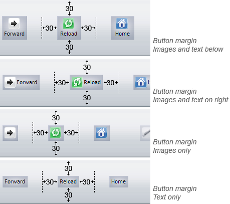
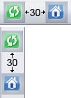
Margin Left, Margin Bottom, Margin Right, Margin Top
Specifies the margin for the specified side of the element. Margins are inserted outside the element’s borders, making the distance between elements larger:
Valid values: Any positive whole number
Spacing
Specifies the spacing to be used for an element. Spacing is added between an element’s children. Setting it for a toolbar would add some distance between the toolbar buttons that are children of the toolbar; setting it for a specific toolbar button would specify the distance added between the button’s icon and text.
Valid values: Any positive whole number
color
Specifies the background color of an element. This can be used instead or in addition to images (Tile/Corner). The color is specified as a hex value (for example “#FFFFFF” for white). There are also two special values, “Window” and “Window Disabled”, which use operating system colors.
Valid values: A color specified in hex code, “Window”, or “Window Disabled”
Text color
Specifies the text color. This is often used for highlights, eg as an indication when a page has finished loading. The color is specified as a hex value (for example “#FFFFFF” for white):

Valid values: A color specified in hex code, “Window”, or “Window Disabled”
Text bold
Makes text bold. The default setting is “0”, which means normal font-weight; “1” makes the text bold.
Valid values: 0 or 1
Text underline
Makes the text underlined. The default setting is “0”, which means no underlining; “1” makes the text underlined.
Valid values: 0 or 1
Text zoom
If this setting is enabled, toolbar button text will be hidden until the toolbar button is hovered over. This setting only works in the [Toolbar Button Skin] section, and with the following criteria:
- The operating system used must be Windows 2000, Windows XP or Windows Vista
- “Special effects” must be enabled
- The toolbar style must be set to “Images and text below”.
The following image shows the Opera 7 main bar with text zoom enabled:

Valid values: 0 or 1
Border
Specifies the border width in pixels. The border grows from the edge of the element, so if it’s set too large, it’ll overlap the button content.
Valid values: Any positive whole number
Border color
Specifies the border color. Border must be set for this setting to have an effect. The color is specified as a hex value (for example “#FFFFFF” for white).
Valid values: A color in hex code, “Window”, or “Window Disabled”
Width
Specifies the element’s width in pixel.
Valid values: Any positive whole number
Height
Specifies the elements height in pixel.
Valid values: Any positive whole number
Clone
If set Opera will copy all parameters from the specified element to the current one. If you want two elements to look the same you only have to define all parameters once and can then just clone them across to any others you specify the Clone element on.
If an option is both cloned from another element and set for the current one the cloned value will be overwritten and the element’s own setting is used.
Warning: Be careful not to create clone loops — they’ll crash Opera!
Valid values: An element name
Colorize
If enabled, color schemes will be applied to the element. color schemes allow you to change a skin’s coloring to the colors chosen by the user. The default value is “1” but for images specified in [Images] and [Boxes] sections it’s “0”.
Valid values: 0 or 1
Blend
Specifies the opacity to be used for .hover elements. “0” means the element isn’t visible at all, while “100” means it’s completely opaque and doesn’t let the one below shine through.
Valid values: Any whole number from 0 to 100.
Child0
Creates a child element inside the element. Depending on the child’s type it is either resized to fill the content area available (for Type = Image and items specified in the [Images] section) or just put in the center of the element (for Box-types and items specified in the [Boxes] section).
If you want to specify multiple child elements for one parent you have to number them. The first child should always be called Child0, the second one Child1, and so on.
Examples of current usage in Opera’s default skin include the arrows in scrollbar button, and icons in caption buttons (close, minimize, restore).
Valid values: Any element name
Child1
Second child element, see Child0.
Valid values: Any element name
Fallback version
Introduced in Opera 9.5, this option provides backwards compatibility with older skins. It’s only to be used in standard_skin.zip, which ships with Opera; it mustn’t be used with user-created skins.
If set to “3” and a skin with “Version = 2” with this element missing is loaded the element won’t be loaded from standard_skin.zip as usual but instead Opera will use a hardcoded fallback to an element that existed before 9.5. For example, [Panel Treeview Skin] will fallback to [Treeview Skin].
Valid values: 3
[Images]
All elements specified in this section are of the type Images. Putting them in this section is a more convenient way of specifying them as it’s a lot shorter and better arranged. Most images used as toolbar buttons or icons are usually specified in this section. Note that, as with all elements of the type Image, the image is resized to fill the available space.
Creating Elements
Elements are specified using the syntax Name = path/to/image.png with one element per line.
Setting parameters
As with the complex version of specifying elements you can set various parameters as described above. Instead of specifying them using Name plus value, the values are just appended after the path to the image, seperated by a comma, in the following order:
ColorizeMargin LeftMargin TopMargin RightMargin BottomPadding LeftPadding TopPadding RightPadding Bottom
If an option isn’t specified Opera uses the default value; the defaults are Colorize = 0, Margins = 0, Paddings = 2.
Note that for most skin elements specified in the [Images] section neither margins nor padding have any effect!
Examples for elements specified in [Images] section
Reload       = buttons/reload.png
Stop              = buttons/stop.png, 1, 2, 0, 2, 0
Forward           = buttons/forward, 0, 1, 1, 1, 1, 3, 2, 3, 2
[Boxes]
All elements specified in this section are of type Box. Specifying them in this section is just a more convenient way of specifying them as it’s a lot shorter and better arranged.
Elements in this section are specified in the same way they are in the [Images] section, and parameters are also set in the same way — please see that section for more details. The fundamental difference between the two of them is the type used — elements specified in the [Boxes] section don’t grow to fit the available space.
Examples of elements commonly found in this section are the arrows to be used in scrollbars and dropdowns and the caption buttons.
Other special settings
Special color values
“Window” and “Window Disabled“ are special color values used by Opera. Instead of specifying a color as a hex value you can tell Opera to get the color from the operating system it’s running on instead. Opera will query the operating system for the color and then display it just as if it was specified as a hex value.
“Window” is the color used by operating systems to fill blank (background) space. On most systems, including Windows, Mac OS X and most Linux distributions this is by default set to white and can be changed in the systems settings.
“Window Disabled” is the color used to fill disabled space, in most cases this will be a shade of grey.
These two color values are often used for elements like address fields, panel backgrounds and similar as this allows the user to preserve their operating system color scheme across Opera as well, to a certain extent.
Comments
You can use “;” or “#” at the start of lines to mark them as comments — these lines will then be ignored by Opera.
Sizes
Opera supports three different element sizes which allow the user to adjust elements. Those sizes are toolbar specific and can’t be enabled for single elements only.
- normal: If no size is specified Opera will just display the element as it is.
.large: To enable large elements the Large Images option in[Options]must be enabled. Large elements are then specified by adding and additional element with.largeappended to the element’s name, egReload = small/reload.pngbecomesReload.large = small/reload.png..mini: For toolbars with “Mini Buttons” enabled Opera automatically resizes elements to 80% of their size and padding if they’re larger than 16*16px. It’s not possible to specify seperate mini images but sections like eg[Statusbar Skin.mini]and[Dropdown Skin.mini]can be specified.
Additional to these 3 sizes users can set a custom size in percentage in “Appearance” dialog.
States
An element can exist in different states. States are defined by appending the states name to the elements name, seperated by a dot.
The available states are as follows:
.hover: This is used when the mouse is placed above an element. The hover state is drawn on top of the normal state. Thus if elements with transparency are used for the .hover state the normal one will still shine through..pressed: This state is used when a button is pressed with the mouse. As such it’s usually visited for short moments only..attention: The attention state is used to indicate special situations and is supported by only a few elements, for instance:[Pagebar Button Skin.attention]is used when an inactive tab has finished loading[Panel Mail.attention]indicates new messages[Panel Transfers.attention]indicates finished transfers[Selector Button Skin.attention]is used with[Panel Mail.attention]and[Panel Transfers.attention][Trash.attention]is used when a popup is blocked
.selected: Indicates an element that’s currently selected, eg the active pages tab in the tab bar or buttons indicating their state..open: This is used for elements that can opened and closed, eg mail threads or bookmark folders..disabled: This state is used for elements that currently can’t be used, eg the Wand button on pages with no login details saved.
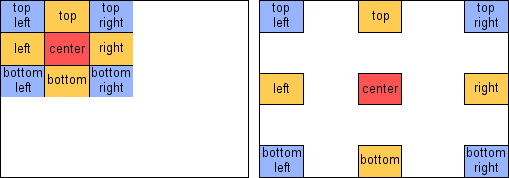
Positions
Toolbars and their buttons can be styled depending on the toolbar’s placement as well. Positions are defined by appending the name to the elements name, separated by a dot.
The four positions available are .top, .right, .bottom and .left.
A common usecase for positions is the pagebar — depending on the bar’s position different images are used for #8212; please see that section for more details. The fundamental difference between the two of them is the type used the pagebar buttons so they look attached to the document.
Combining sizes, states and positions
You can use more than one size, state or position for an element and even combine them. For example, [Pagebar Button Skin.hover.attention] is used when a page has finished loading (.attention) and you hover that tab (.hover). Likewise, [Pagebar Button Skin.bottom.selected] is used for the active tab (.selected) with the pagebar placed at the bottom (.bottom).
When using those combinations you have to stick to a certain order: first you have to set the size, then position and finally the states in the order .pressed, .selected, .hover and .attention. .disabled can be combined with positions only.
pages: 1/5: Introduction, general explanations — 2/5: Skinning examples — 3/5: Skin.ini explained — 4/5: skin.ini element reference — 5/5: tips & tricks
This article is licensed under a Creative Commons Attribution, Non Commercial - Share Alike 2.5 license.
Comments
The forum archive of this article is still available on My Opera.
No new comments accepted.