Opera Skinning part 4: skin.ini element reference
9th October 2012: This article is obsolete
Opera 12 and above support a new, simplified form of skinning. See our tutorial on how to make themes (skins) for Opera.
pages: 1/5: Introduction, general explanations — 2/5: Skinning examples — 3/5: Skin.ini explained — 4/5: skin.ini element reference — 5/5: tips & tricks
Introduction
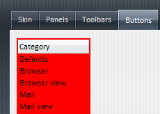
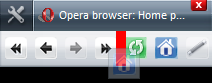
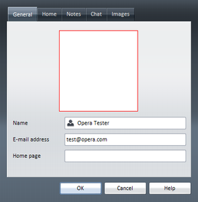
This article lists all the different sections inside skin.ini, and defines which elements inside the UI these sections control. On the screenshots the element is either completly red or marked by a red border, to allow you to see what elements I am talking about more easily.
[Account Skin]
Not used in Opera 9.5.
[Active Element Inside Inverse]
Specifies the inner corners of the border around focused elements when several areas form a focused region. While a box only needs the normal 4 corners more complex elements need the extra 4 corners.
This element should not be changed for consistency across skins as it’s an essential element for keyboard users; changing it might cause severe problems for them!
[Active Element Inside Image]
Not a skin element; only provides images for [Active Element inside].
[Active Element Outside]
Specifies the border around focused elements if the element is located at the edge of the viewport.
This element should not be changed for consistency across skins as it’s an essential element for keyboard users; changing it might cause severe problems for them!
[Active Element Inside]
Specifies the border around focused elements.
This element should not be changed for consistency across skins as it’s an essential element for keyboard users and changing it might cause severe problems for them!
[Address DropDown Title Label]
Specifies the text color of the pages title in address field dropdown. Only “Text Color” can be specified.
[Address DropDown URL Label]
Specifies the text color of the pages address in address field dropdown. Only “Text Color” can be specified.
[Addressbar Skin]
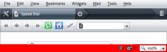
Specifies the background of the address bar.

[Boxes]
Not an element, but this groups elements — see Skin.ini explained for more details.
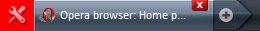
[Browser Skin]
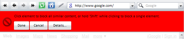
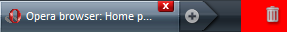
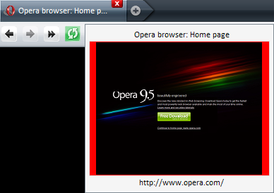
Specifies a border around websites to distinguish the site from the user interface. For this item Padding Right should be set to 0 so the user can just move his mouse pointer to the very right of the screen to use the scrollbar.
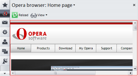
[Browser Window Skin]
Specifies the browser window including many toolbars, unless they’re specified seperately which is the case in Opera 9.5.
[Caption Close Button Skin]
Specifies the close button shown in the upper right corner (or left on Mac) when close buttons on tabs are disabled.
States: .hover, .pressed
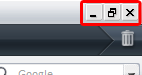
[Caption Minimize Button Skin]
Specifies the minimize button shown in upper right corner (or left on Mac) when close buttons on tabs are disabled.
States: .hover, .pressed
[Caption Restore Button Skin]
Specifies the restore button shown in the upper right corner (or left on Mac) when close buttons on tabs are disabled.
States: .hover, .pressed
[Chatbar skin]
Specifies the background of the chat toolbar which is shown at the top of chat window.
[Checkbox Skin]
Specifies the checkboxes used in the UI and websites, unless the website specifies another style.
States: .hover, .pressed, .selected
[Content Block Toolbar Skin]
Specifies the toolbar shown at the top of the active tab when in content block mode, which can be accessed from a page’s context menu.
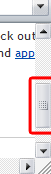
[Cycler Button Skin]
Specifies the background surrounding the thumbnails in the tab cycle dialog (Ctrl + Tab) if thumbnails are enabled.
[Cycler Page Button Skin]
Specifies the page buttons in the tab cycle dialog.
States: .selected, .attention
[Cycler Pages Skin]
Specifies the area holding the [Cycler Page Button Skin] items in the tab cycle dialog.
[Cycler Window Skin]
Specifies the whole page cycle dialog.
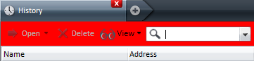
[Detailed Panel Treeview Skin]
Specifies the background of treeviews in maximized panels, eg “Tools > History”, “Tools > Contacts”, etc.
[Dialog Button Border Skin]
Specifies an additional border around buttons in dialogs. Colors can’t be used here, only paddings.
[Dialog Page Skin]
Specifies the content area of dialogs.
[Dialog Skin]
Specifies the background of dialogs.
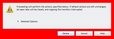
[Disclosure Triangle Skin]
Specifies an icon to indicate an expandable section in dialogs, eg an arrow or a “+” sign.
States: .hover, .pressed
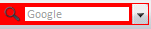
[Dropdown Button Skin]
Specifies the dropdown button used in websites and the UI, eg in the address field.
States: .hover, .pressed
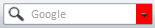
[Dropdown Skin]
Specifies the dropdowns used in websites and the UI. The color of this should always be “Window”.
[Edit Skin]
Specifies input fields used in websites and the UI, eg the address field. The color of this should always be “Window”.
[Expand Hover Skin]
Specifies the area indicating an expandable section in small dialogs like the “Synchronise Opera” dialog.
States: .hover, .pressed
[Expand Icon Skin]
Not used in Opera 9.5.
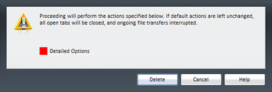
[Expand Skin]
Specifies areas to enable expandable sections in wide dialog boxes like the “Delete private data” dialog. Not skinned in standard skin as it looks strange due to the dialog being that wide.
States: .hover, .pressed
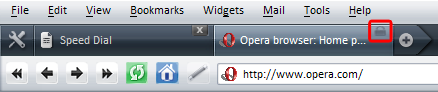
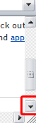
[Extender Button Skin]
Specifies the button appearing at the right end of the tab bar when the bar is full. Clicking this button shows a list of tabs that currently don’t show in the tab bar.
States: .hover, .pressed
[Header Button Skin]
Specifies the column header used in dialogs with sortable lists like bookmarks, contact lists and mail lists.
States: .hover, .pressed
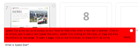
[Help Tooltip Close Button Skin]
Specifies the close button used in the [Help Tooltip Skin].
States: .hover, .pressed
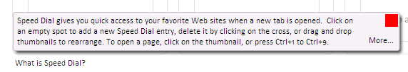
[Help Tooltip Skin]
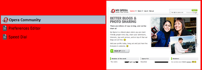
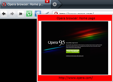
Specifies the dialog that appears when the “What is Speed Dial?” button on Speed Dial is clicked.
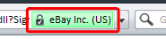
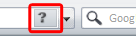
[High Assurance Security Button Skin]
Specifies the skin used for the security level indicator in the address bar on secure websites using Extended Validation Certificates.
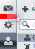
[Horizontal Drop Insert]
Specifies the position marker shown when dragging elements in toolbars to help placing them.
[Horizontal Separator]
Specifies the horizontal seperator used in dialogs, eg the “Preferences” dialog.
[Hotlist Floating Button Skin]
Specifies the button shown as the last item in the panel selector that, when clicked, shows a list of panels available.
States: .hover, .pressed
[Hotlist Floating Skin]
Specifies the area at the end of the panel selector containing [Hotlist Floating Button Skin].
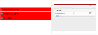
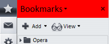
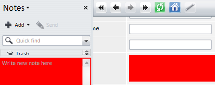
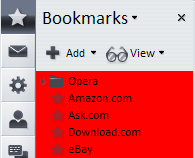
[Hotlist Panel Skin]
Specifies the content area of panels, including the panels toolbar and it’s content, but excluding the header.
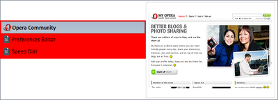
[Hotlist Panel Header Skin]
Specifies the header of panels that shows the panels name and a close button.
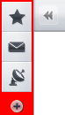
[Hotlist Selector Skin]
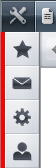
Specifies the area that holds buttons to select panels — these are called “Panel Selectors” in Opera’s user interface.
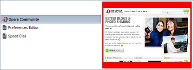
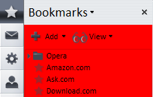
[Hotlist Skin]
Specifies the look of the panels, including their toolbars and the panel selector.
[Hotlist Splitter Skin]
Specifies the divider between panels and the browser pane; this can be dragged to resize the panel.
[Images]
This is not an element; it groups elements — see Skin.ini explained for more details.
[Info]
This is not an element; it is a section for meta info — see Skin.ini explained for more details.
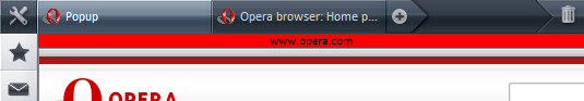
[Insecure Popup Header Skin]
This is shown instead of the addressbar when a page opens a popup without an addressbar; it contains the popup’s server name.
[Link Button Skin]
Specifies the look of the buttons in the personal bar.
States: .hover, .pressed
[Listbox Skin]
Specifies the background of list boxes, eg “Tools > Manage mail and chat accounts” or “Tools > Preferences > Search”
[Low Security Button Skin]
Specifies the look of the security level indicator in the address bar for websites that tried to apply security measures but failed.
States: .hover, .pressed
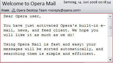
[Mail Browser Window Skin]
Specifies a border around the message view to distinguish the site from the user interface. For this item Padding Right should be set to 0 so the user can just move his mouse pointer to the very right of the screen to use the scrollbar.
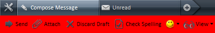
[Mail Compose Toolbar Skin]
Specifies the toolbar shown at the top of the mail compose window.
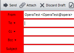
[Mail Compose Window Skin]
Specifies the background of the mail compose window, which contains various input fields — To, CC, Subject, etc.
[Mail Header Toolbar]
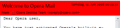
Specifies the toolbar shown at the top of the message view, which shows various data like Subject, Date, From, etc.
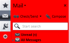
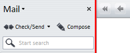
[Mailbar Skin]
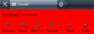
Specifies the mail toolbar shown at the top of the mail folders.
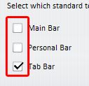
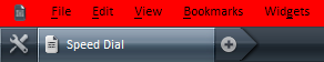
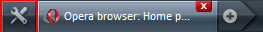
[Mainbar Skin]
Specifies the main bar that is disabled by default.
[Menu Button Skin]
Specifies the look of the buttons in the menu bar.
States: .hover, .pressed, .selected
[Menu Skin]
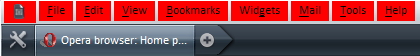
Specifies the menu bars background. This is used in Windows only — in Linux, Qt handles the menu bar.
[MultilineEdit Skin]
Specifies edit fields with more than one line. The color of this should always be “Window”.
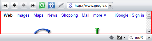
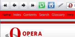
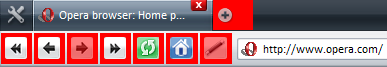
[Navigationbar Skin]
Specifies the navigation toolbar shown if sites contain certain references in their <head> section.
[Notifier Close Button Skin]
Specifies the close button shown in the upper right of the notification popups shown when a new message arrives or the user searches for text in a page.
States: .hover, .pressed
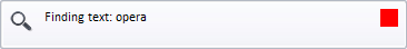
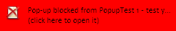
[Notifier Skin]
Specifies the look of the notification popup shown when a new message arrives or a popup is blocked.
[Options]
This is not an element, but instead is a section for settings; see the options section in Skin.ini explained for more details.
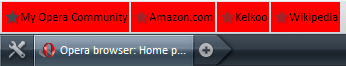
[Pagebar Button Skin]
Specifies the tab buttons shown in the tab bar.
States: .hover, .pressed, .selected
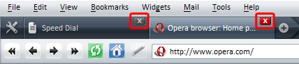
[Pagebar Close Button Skin]
Specifies the look of the close button shown on tabs in the tab bar.
States: .hover, .pressed, .selected
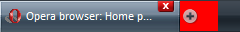
[Pagebar Floating Button Skin]
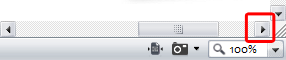
Specifies the button to open a new tab, shown next to the right-most tab bar button.
States: .hover, .pressed
[Pagebar Floating Skin]
Specifies the area next to the right-most tab bar button that contains [Pagebar Floating Button Skin].

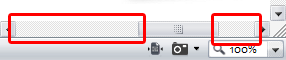
[Pagebar Head Button Skin]
Specifies the buttons shown at the very left of tab bar.
States: .hover, .pressed
[Pagebar Head Skin]
Specifies the area at the very left of thetab bar, containing [Pagebar Head Button Skin].
[Pagebar Locked Button Skin]
Specifies the style of the lock button shown on tabs in the tab bar, indicating that they can’t be closed.
[Pagebar Skin]
Specifies the tab bar, including the buttons at the beginning and end of it.
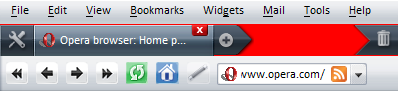
[Pagebar Tail Skin]
Specifies the area at the very right of the tab bar.
[Panel Browser Skin]
Specifies a border around websites in panels to distinguish the site from the user interface. For this item Padding Right should be set to “0” so the user can just move his mouse pointer to the very right of the screen to use the scrollbar if panels are placed on the right.
[Panel Full Toolbar Skin]
Specifies the toolbar of maximized panels, as available from “Tools > History̵, “Tools > Contacts”, etc.
[Panel Normal Toolbar Skin]
Specifies the toolbar of panels.
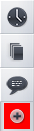
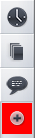
[Panel Toggle Skin]
Specifies the panel toggle shown at one side of Opera, depending on where panels are placed.
States: .hover, .pressed
[Panel Treeview Skin]
Specifies the style of the skin used in panels.
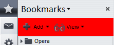
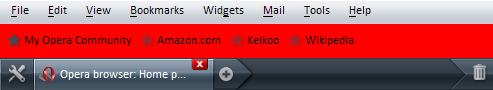
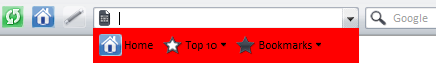
[Personalbar Skin]
Specifies the look of the personal bar.
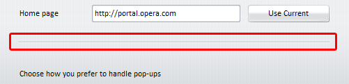
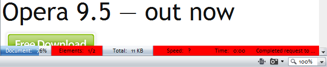
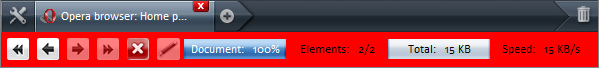
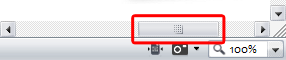
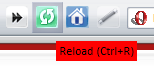
[Progress Empty Skin]
Specifies the part of the progress bar indicating the not yet loaded percentage. When the page is loaded this is replaced by [Progress Full Skin], which is expanded from left to right.
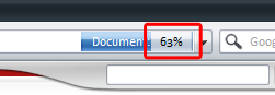
[Progress Full Skin]
Specifies the part of the the progress bar indicating the already loaded percentage.
[Progressbar Popup Skin]
Specifies the progress bar when “Pop-up at bottom of page” is enabled.
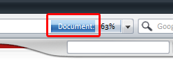
[Progressbar Skin]
Specifies the progress bar when “Show in address bar” is enabled. This should use the same style as the [Addressbar Skin].
[Push Button Skin]
Specifies the style of buttons used in dialogs and websites. This shouldn’t be dark as some sites use dark text on buttons, which would then be unreadable.
States: .hover, .pressed, .disabled
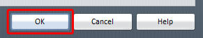
[Push Default Button Skin]
Specifies the default button used in dialogs — this is the one that gets “pressed” when you hit the enter key.
States: .hover, .pressed
[Radio Button Skin]
Specifies the radio buttons used in the UI and websites, unless the website specifies another style.
States: .hover, .pressed, .selected
[Scrollbar Horizontal Knob Skin]
Specifies the style of the Horizontal scrollbar.
States: .hover, .pressed
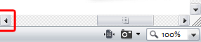
[Scrollbar Horizontal Left Skin]
Specifies the style of the scrollbar button with a left facing arrow.
States: .hover, .pressed
[Scrollbar Horizontal Right Skin]
Specifies the scrollbar button with a right facing arrow.
States: .hover, .pressed
[Scrollbar Horizontal Skin]
Specifies the horizontal scrollbar background.
States: .hover, .pressed
[Scrollbar Vertical Down Skin]
Specifies the scrollbar button with an arrow pointing down.
States: .hover, .pressed
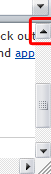
[Scrollbar Vertical Knob Skin]
Specifies the vertical scrollbar.
States: .hover, .pressed
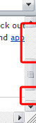
[Scrollbar Vertical Skin]
Specifies the vertical scrollbar background.
States: .hover, .pressed
[Scrollbar Vertical Up Skin]
Specifies the scrollbar button with an upwards facing arrow.
States: .hover, .pressed
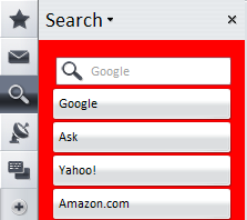
[Search Skin]
Specifies the style of the search panel background.
[Secure Popup Header Skin]
Specifies the skin shown instead of the addressbar when a page opens a secure page in a popup without an addressbar — it contains the popup’s address.
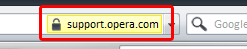
[Security Button Skin]
Specifies the skin used for the security level indicator in the address bar on secure websites.
[Selector Button Skin]
Specifies the button used to open a panel.
[Speed Dial Configuration Dialog Button Border Skin]
Specifies the area around buttons in Speed Dial configuration dialogs. Colors can’t be used here, only paddings.
[Speed Dial Configuration Dialog No Alpha Skin]
This is the same as [Speed Dial Configuration Dialog Skin] but applied to operating systems that don’t support alpha-transparency.
[Speed Dial Configuration Dialog Page Skin]
Specifies the content area of the Speed Dial configuration dialog.
[Speed Dial Configuration Dialog Skin]
Specifies the Speed Dial configuration dialog, which is partly covered by [Speed Dial Configuration Dialog Page Skin].
[Speed Dial Search Widget Skin]
Specifies the styling of the Search field on the Speed Dial page.
[Speed Dial Thumbnail Close Button Skin]
Specifies the style of the close buttons on Speed Dial next to every thumbnail that delete each item.
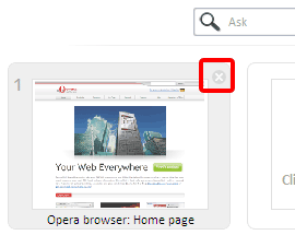
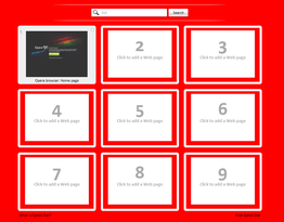
[Speed Dial Thumbnail Image Skin]
Specifies the background of the thumbnail area on Speed Dial.
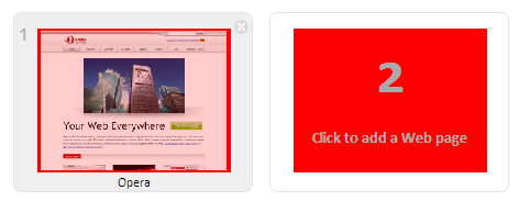
[Speed Dial Thumbnail Widget Skin]
Specifies the frame holding the thumbnails on Speed Dial.
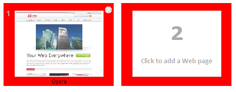
[Speed Dial Widget Skin]
Specifies the background of the Speed Dial page.
[Start Skin]
Not used in Opera 9.5.
[Start Popup Skin]
Specifies the start bar background, which is mostly covered by [Startbar Skin].

[Startbar Skin]
Specifies the toolbar that shows when focus is in the address bar.
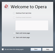
[Startup Dialog Skin]
Specifies the dialog shown when starting Opera if Opera was either closed unexpectedly or with startup options set to “show startup dialog”
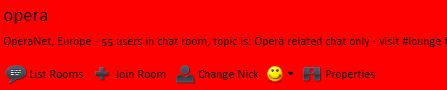
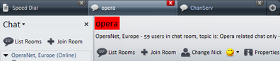
[Status Title Skin]
Specifies the chat room name in Opera’s chat client.
[Statusbar Skin]
Specifies the background of the status bar.
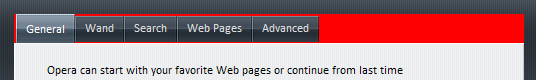
[Tab Button Skin]
Specifies the tabs used in dialogs (not in the tab bar)
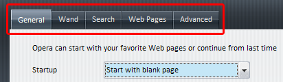
[Tabs Skin]
Specifies the style of the area tabs that are shown in dialogs.
[Thumbnail Image Skin]
Specifies the background of the thumbnail image that appears when a tab bar button is hovered.
[Thumbnail Widget Skin]
Specifies the style of the window thumbnails that are shown when hovering over a tab bar button.
[Toolbar Button Skin]
Specifies the style of the buttons used in toolbars.
[Tooltip Skin]
Specifies all tooltips in Opera appearing when an element is hovered with the mouse.
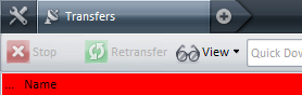
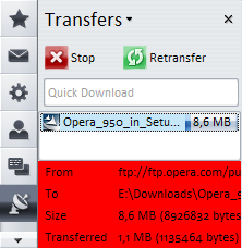
[Transfer Panel Details Skin]
Specifies the bottom section of the transfers panel, which shows various information about the transfer.
[Treeview Skin]
Specifies the style of the skin used in panels, some dialogs and the address bar.
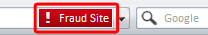
[Untrusted Site Security Button Skin]
Specifies the skin used for the security level indicator in the addressbar on websites that are considered fraud by Opera’s fraud filter.
[Vertical Drop Insert]
Specifies the position marker shown when dragging elements in toolbars to help placing them.
[Vertical Separator]
Specifies the style of the vertical seperator in dialogs, in a similar manner to [Horizontal Separator]. This is currently not used.
[Viewbar Skin]
Specifies the look of the view bar.

[Web Image Browser Skin]
Specifies a border around images in contacts properties dialog.
[Window Skin]
Specifies the background for all windows, unless covering elements have a different background specified.
pages: 1/5: Introduction, general explanations — 2/5: Skinning examples — 3/5: Skin.ini explained — 4/5: skin.ini element reference — 5/5: tips & tricks
This article is licensed under a Creative Commons Attribution, Non Commercial - Share Alike 2.5 license.
Comments
The forum archive of this article is still available on My Opera.
-

.... so how do I change the Opera button?
-

i don't remember well, but in skin.ini, search for "omenu"
No new comments accepted.Supuhstar
Thursday, April 5, 2012
Tiago Wakabayashi
Sunday, May 13, 2012