9: Building up a site wireframe
11th October 2012: Material moved to webplatform.org
The Opera web standards curriculum has now been moved to the docs section of the W3C webplatform.org site. Go there to find updated versions of these docs, and much more besides!
12th April 2012: This article is obsolete
The web standards curriculum has been donated to the W3C web education community group, to become part of a much bigger educational resource. It is constantly being updated so that it remains current with modern web design practices and technologies. To find the most up-to-date web standards curriculum, visit the web education community group Wiki. Please make changes to this Wiki yourself, or suggest changes to Chris Mills, who is also the chair of the web education community group.
Introduction
Every web designer should know and understand a Web site’s parameters before lifting a finger to start designing the site. In this article, you will learn the basics required to start designing business Web sites. While this information is useful if you want to build sites for others, it can also serve as a checklist article for sites you want to build for yourself. This is usually the stage that comes after information architecture—you should collect information on what the client wants on their site and how it should be structured, what kind of branding that company uses, and then use that information to build up a visual design mockup that you can ok with the client before you add graphics and colour schemes on to it. Specifically, I’ll cover the following:
- Although colour and design are important, you need to understand what the client wants to accomplish with his or her Web site. This information will have a heavy bearing on the site’s look and feel.
- You therefore need to manage a checklist of items to learn about the client’s Web site before the design is attempted.
- You also need to know more about the company’s previous marketing efforts, including branding. This information will have a bearing on the Web site design.
- Based upon all the information gathered from the client, you will create the visual design for the site so that the client can visualize the foundation for his additional graphics and content.
The article table of contents is as follows:
What you need to know
Usually before a Web site design is decided upon, the individual or business should have a plan in place about what the Web site should accomplish. While colour and graphics are important, a plan should be in place for a budget, the intended market and projected goals as well as resources to accomplish these tasks. Is the site just going to give the user information, or is it intended to sell them products or services as well? Will this Web site expand, or is it intended to be a short-term effort to reach a niche market (such as a political campaign site or a site that intends to tap in on a current trend). Will the site include a blog, legal and information pages, photo gallery, e-mail contact form? What else does it need? How does this site compare to the competition?
Last, but not least among all these questions, is whether the company has a brand in place along with marketing guidelines. If not, then this job needs attention before a Web site design is attempted. The logo, branding of merchandise or services intended for a specific market, and a means to reach that market may be beyond your skills. If you haven’t attempted this task before, you might pull in an expert in marketing to help set this business in the right direction. On the other hand, if a plan already is in place, then it’s important to follow the company’s directives so the Web site will fall in place with other marketing materials.
While much of this information may be decided before the proposed site reaches the designer, the answers to these questions can help you decide what type of site to design, the colours to use and the type of graphics to include. But, one thing can be determined up front in most cases—the site should be accessible and usable. Therefore, attention to code and to navigation is a priority in all cases. You can read more about accessibility later in this course (the main accessibility articles are still to be published), and some further points about usability issues from Jakob Nielsen.
The point is to keep the site simple by using HTML and CSS for code and design, respectively. Avoid Flash unless it is appropriate for some elements of the site (much has been done to make Flash more accessible of late, and it is good for some tasks, such as video), and think about where JavaScript and other technical stuff is needed. This will make the site design easier for the designer and programmer to create (especially if the designer is the programmer) and it will be more compatible across all browsers.
The first steps
To help you along with these issues, I’ll build a simple business site using a set of guidelines that I use for designing Web sites for myself and others. These checklists will include business aspects as well as design issues. For convenience, I’ll use an imaginary business that is already developed, so it has used marketing materials in the past. Printed materials, including a logo and branding are already in place. If you’re starting from scratch, the logo and branding plans will need to be developed first before you begin to develop the Web site.
As a Web designer, I’ll want to know the following information about a business before I begin the site design. I want to make a list of everything that I want on that site design so I don’t need to make radical changes later. This is not an imaginary situation, as the topics below need to be discussed with the business owners/decision makers to make sure that your vision of the project is in line with their vision.
- Web site name: Does the name reflect the company and its online efforts? In this case, the Web site name is the company name, which is “Wiki Whatevers.” The company may want to develop a tag line as well if they don’t already use one. The tag line will then be placed with the company name and logo together on the Web page.
- Logo and branding: I want to collect any printed matter that was developed prior to this task, including logo, brochures, etc, so I can build a file that will hold information such as phone numbers and addresses. These items will also help me to understand the "tone", branding and style of this business better from their past efforts. If none of this has been developed previously, then I’ll want to hire a logo design team to build a logo (I’m not a logo designer, so I farm that work out—and you can as well by building that price into your billing).
- Web site domain name: In tandem with the Web site name, I want to know if the domain name is available. The domain name is the address that a Web site uses for identification, and that the user will type into a browser’s address bar to reach that Web site. The domain name also is used as the link to the Web site from outside resources. The domain name can carry any number of upper level domain registrations, such as “.com,” “.org,” and so on. While a designer usually isn’t responsible for the domain name registration, it helps to know if the domain name has been chosen and registered. In some cases I’ve had to change a domain site name and some site content because the domain name was unavailable. This problem led to a higher charge for the client, which would have been unnecessary had the domain name been chosen first.
- Competititon research: It helps to know what competitors’ Web sites contain in terms of graphics and content so that the site you design will enter the market on an equal or better footing than the company’s main competitors.
- Information architecture: Does the site need a shopping cart or a blog? What plans for expansion does the site owner have in mind? What structure would be best to link the pages together? These items are important, as you will need to build them into the site design and its navigation. You need to know how the site will expand in the future—this will determine how you build the site as well.
- Site content: Has the site content been developed? If so, you’ll want to gain access to the content immediately to help determine the navigation, type design, and layout. Categorizing the content is the best way to develop navigation. The content can help determine the look and feel of the site as well; therefore, if content hasn’t been developed, it might be wise to delay the design. Be sure that the content is relevant and plan for updates, as site content is what keeps visitors returning to a site.
- Research web hosts: While the client may have a particular Web host provider in mind, you may need something else entirely as not all hosts provide equal technology support. A Web host is the business that hosts Web sites, and some Web hosts provide access to databases, which you may need for a blog or for cataloging information or products through a shopping cart. Other hosts limit the number of visitors to a site, and this can create problems if the site becomes popular. For a large list of Web hosting providers and their capabilities, visit the Web Host Database (WHDb). Make sure the client has purchased space on this Web host before you begin your site design so that you know your design parameters.
- Directed departure: Planning for directed departure means that you/your client gains control over how users will leave the site. Viewers will leave the Web site eventually, so why not plan for their departure through monetized ad placement or through link exchanges? Making plans for this direction now can add value to the site monetarily and/or through offering a service to your site users.
- Deadlines: Determine now when the site will go “live”. Usually an eight-week lead time is enough to finalize any small project such as this, as long as the clients have their content ready, they are amenable to colour and layout designs you offer as samples, and no difficult programming is required.
Once you have these basics out of the way, you can sit down, read the content, plan for navigation and decide how to best optimize the site for search engines. While you might not be in charge of SEO (Search Engine Optimization), you can work closely with an SEO expert to determine how best to use the site’s content and your code to generate more traffic via keywords in content and in headings and subheadings.
Just as you wouldn’t pick out carpets or a couch for a new home before the architect has created the blueprint, neither would you create a visual design for the site until you’ve planned the site’s architecture. The navigation and plans for SEO in this initial stage will save time and headaches down the road. By the time you’re ready to create a visual plan, you’re already familiar with the site’s direction and its contents, and this makes the job of working with colour and graphics that much easier.
The imaginary example site
This imaginary site is a business that provides Open Source code for wikis, and they come up with at least three new code ideas per week. Since the code is free to use and modify, the site owners want to monetize the site (generate money from it) through donations, ad placement, and through extra services offered by their programmers. The site name is “Wiki Whatevers,” and the domain name has been chosen. The content has been developed, and it contains code snippets that need to be cataloged, articles, and bios that feature the programmers involved with this project. The Web host provides MySQL database availability, and it is geared to accept the heaviest of surges in traffic without down time. Now it’s time to pull together the items that will be used on the site:
- Using the company’s pre-existing logo, I want to prepare a digital copy to use throughout the client’s Web site. I'll need a scanner to scan the image into a graphic program such as Photoshop or Gimp. I’ll size the logo for the site later, once I’ve determined the layout. I’ll save the image at 72 dpi, which will allow for faster download time. I probably will use this logo for #4 below as well.
- I’ll use photos of the programmers on the staff page (or “About" page), so I’ll need digital images for this project. They will either provide photos for scanning or send digital images. If they send digital images, I’ll want an image with more detail than I’ll eventually use, so a 300 dpi image is good, or a full-sized image that I can reduce later to my own specifications.
- The client has decided to use a blog, since they already have sufficient content to keep this blog active for the next few months. Fortunately, the client has chosen a Web host provider that is familiar with blogs and has the necessary capabilities to handle databases and high traffic—including spikes in traffic. This host also provides several solutions for expansion, a great offer if the client wants to grow. If the host’s up time is guaranteed, the client will be happier if he or she can stay with the same host throughout this growth phase down the road. This ability to stay with a host provider for years makes life much simpler.
- Using FTP (there are several to choose from on the market, such as the Open Source products Filezilla, or fireftp for Firefox, or a proprietary client such as CuteFTP), I’ll upload a static page that announces the upcoming site. “Under Construction” is a terrible phrase to use, as visitors to the site may not return if they don’t know your “grand opening” date. Instead, use a page that states the name of the company, what they will offer, a date that the site will be active, and a contact (email is fine—if this is a bricks-and-mortar business, use a street address and phone number as well). Even better, utilize an email form that individuals can use to be notified when the site goes live. This last suggestion provides clients with potential consumers even before the site opens for business.
- Using the content/structure information received from the client and the fact that they want advertising space designed into all pages, I’ll design the architecture for the site and plan the navigation and textual links. I’ll also use this copy to plan for keywords for the site’s SEO.
- Using the colours in the logo, I’ll choose two or three colour schemes to present to the client for approval.
- Then, I’ll choose other photographs or illustrations from a stock photo place such as iStock or Comstock. But, be sure to shop around, as some stock photo businesses offer sales and other deals that you may not be able to pass up. Using stock photography is not that expensive, and it saves headaches concerning copyright issues. I’ll also need any images that the company has produced—or that they will produce—to accompany any code, "how-to" articles and blog entries.
Note: These last two steps will be covered in the next article in the series; bear in mind that you want to get approval from the client for the visual mockup layout before you start putting colours and graphics all over it!
The logo
The logo is a vital part of any company’s branding. While most businesses will not rush a logo as this piece of artwork will represent their business for many years, other clients will be less concerned with the image that represents a company. I can tell you from experience that a company that doesn’t spend time and money on a professional logo usually will never spend that money—no matter how logical your arguments to the contrary.
The Wiki Whatevers company owners all attended Georgia Tech, so they used their Alma Mater’s colours—gold and black—in the logo design. But, while the logo is simplistic, at least it may prove easy to work with in colour and layout. Figure 1 shows the logo:
Figure 1: The Wiki Whatevers logo.
The issue here is that I just scanned in a print logo, wanting to use the same logo online. The print colours, which are CMYK (Cyan, Magenta, Yellow and Key, or black), will not match the Web colours that consist of RGB (Red, Green, Blue). So, I’ll need to try to do a little colour matching to get the Web colours to match the logo as closely as possible. There are four ways to accomplish this goal:
- Contact the printer to ask what colours were used to print the Wiki Whatevers logo on previous printed matter. Usually, the printer will use Pantone colours, and Pantone provides tools that help designers match print colours to Web colours. This Pantone Colour Matching system is something that the printer may have on hand, so that printer can help match the print colours to the appropriate matching Web colour without spending money on Pantone tools.
- Since the guys who own Wiki Whatevers used Georgia Tech’s colours, I can go to the Georgia Tech site to see if I can match the colours from the Web. You can use a graphic program to extract a colour from a Web site by making a screenshot and bringing that image into a graphic program to use an eyedropper or some other tool to match the colours.
- Eyeball the printed matter with the Web colours to try to match as closely as possible. In some cases, the colours may be vastly different. In other cases, the colours may seem too close to warrant a change.
- Scan the print image in a scanning program that accepts CMYK and use Photoshop’s Pantone Colour Swatches to match as closely as possible. This last solution works only if your scanner accepts CMYK and you own Photoshop software.
In my case, I was able to get that gold to match perfectly from the mascot image at the Georgia Tech Athletic site. The gold is #eab200, and the black is, well, black (#000000). The background, which is a dark green-blue (#002123), was used in the drop shadow in the logo. So, what could have been problematic was made easy through a simple bumblebee mascot, as seen in Figure 2:

Figure 2: A portion of Georgia Tech’s mascot used to match logo colours.
Note: Very seldom will you run across a business that hasn’t used a digital image of their logo or brand online for items such as business cards and letterhead, if not for an actual Web presence. However, many of these businesses seem to accept the colours that the Web presents, rather than change the colours to match their printed matter. So, don’t always rely on Web colours for a company’s site, especially if those colours don’t match the company print matter such as brochures or letterhead. Instead, ask the company which colours they prefer—they may not have noticed that the colours were different in the first place.
The Layout
For the layout, and for simplicity’s sake for this tutorial, I will demonstrate one layout. I chose a blog layout that promotes the most frequent changes to the body copy at top, easy access to navigation between the header and that recent body copy, and access to previous posts “below the fold” on the home page. The term “below the fold” originates from newspaper production. When a newspaper is on the stand, the reader will see only that copy placed “above the fold” in the newspaper (ie the physical fold in the paper). That copy—including images—is important, as it needs to entice the reader to purchase the paper.
The same “above the fold” theory applies to web site design. Anything that shows on a monitor when a visitor enters a site is “above the fold”. Any copy that a viewer needs to scroll down to view is “below the fold”. So, the trick is to keep a web site visitor’s attention with the first images and copy that they view on any monitor, no matter the resolution (which is just one good reason to test your web sites on a number of different monitors/screen resolutions—an issue addressed later in this article). A rough example for the initial layout for Wiki Whatevers is shown in Figure 3:
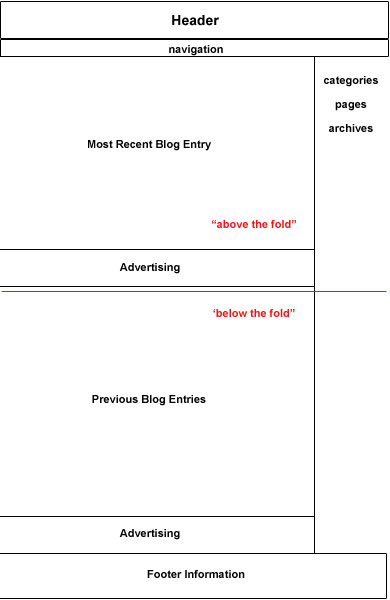
Figure 3: Rough layout (wireframe) for the Wiki Whatevers home page
This layout will remain the same throughout the site, but may change for the archived pages to list the article and blog entries without images. The reason for this consistency is so the viewer doesn’t become confused. Once users “learn” how to use a site, they usually don’t like to see changes from page to page. Here is what this specific design will contain:
- Header: The header is small, as I didn’t want to make the logo take up too much space on the page. While the logo is a minor feature, the colours within that logo will contribute to the overall colour scheme for the site. The header is at the top, a traditional placement, and the logo will link to the blog’s home page. Linkage from the logo is convenient and many users have become accustomed to using the logo as a means to return to the home page on any given site
- Navigation: Placed immediately below the header, the navigation is obvious and easy to use. This navigation also will be repeated in the footer. I repeat the navigation in the footer simply because I’m from the old school where navigation is repeated in simple text for those users who don’t display images in their browser. Since I'm not sure at this point whether I’ll use images for the navigation at top, I automatically include textual navigation somewhere else on the page as well—usually in the footer. This text helps those blind readers who use a screen reader to “read” a Web page. Whether you place that navigation text at the top or the bottom of the page is irrelevant except to the design, as blind readers can scan a page from bottom to top and vice versa as quickly as a sighted person. With that said, it is up to the designer and his/her client whether or not to repeat the navigation anywhere on a given page. If you use images for navigation and do not repeat the navigation links in text, then be sure to include descriptive
altattributes for those navigation images. This way, users who use a screen reader or who turn off images will still know what those images are for. See the relevant section of article 17 for more about correct use ofaltattributes. - Most recent blog entry: The most recent blog entry deserves highlighting, and the ability to make this entry a major focus on the page “above the fold” is advantageous to both the client and his readers. As soon as the viewer surfs to this site, this is the copy that he or she will see. This obvious placement, however, means that the client will need to continuously update the site on a consistent basis or risk losing return visitors —people are unlikely to keep returning to a blog if there is no new content being published on it.
- Previous blog entries: This is where previous blog entries will reside—about three to five entries should be enough to let viewers know, at a glance, exactly what to expect from this site on an ongoing basis. Images might be nice here but they are not necessary as this area is located below the fold, so it is not as important for catching the viewer’s eye. The decision to use images may be based on whether download time is an issue, or if the previous article actually needs an image to entice the viewer to click through to the full article/blog entry.
- Right column: This is where viewers can gain access to blog entries listed by category, archives, and other types of site content. Examples of other pages include an "about the company" page, a site index and contact information. It’s important to decide how you want to list these items in a side column, as the blog will build upon the categories you create, the pages you build and the archival material. As you grow the site, these lists will become longer, possibly to the point where —in this case—the categories may be the only list that a viewer will see “above the fold”. The clients may decide that the “pages” are more important than the categories, and the list shown above may be altered to place pages above categories. As a side note, this list does not include everything that can be included in a side bar or side column. Some clients may feel that two columns would be better, making the blog a three-column, rather than two-column blog as shown above.
- Footer information: Footer information is vital and important, as it provides viewers with background information about company and its Web site at a glance instead of having to dig for it. Company name, possibly a repeat of the logo, address, email address, links (to contact form, privacy notices, disclaimers, legal information), and news summaries are all good candidates for being included in the page footer. As mentioned before, you can also repeat the navigation as a text only version.
- Advertising: In this layout, the advertising is positioned following the recent blog entry and the previous blog entries in a horizontal banner. This provides the client with the flexibility of choosing ad text or banner art for their advertising needs. This type of layout for advertising places just one ad “above the fold” and another ad “below the fold”. This amount of advertising is plenty enough for most sites. Additionally, it relegates advertising to a secondary position, below the body copy for the site’s contents.
This layout allows the viewer to quickly move from body copy to navigation without scrolling, and it also allows users to view other topics that the site may cover with further links into the site’s categories at the very least. Even if the viewer never scrolls down past the red “fold” line, the layout provides all the major elements that a viewer might need, all placed “above the fold. ”
About Advertising on a Site
It is to the client’s advantage, and a service to the reader if the advertising on a site is content-relevant. In other words, if the content on the site is about flowers, then ads for that site might include landscaping services, catering (to compliment floral arrangements), etc. So, for a site that provides open source materials, you might seek advertisers that are relevant to open source content. Google Adsense, as one source, would help in this regard, as the ads are content-relative. The use of this type of advertising is a great idea until traffic grows enough to entice other advertisers to your site. However, always think about the SEO implications before you accept ads, as some advertising may adversely affect the client’s standing in search pages. Some good SEO resources are as follows:
- Intelligent site structure for better SEO!, by Joost de Valk.
- Semantic HTML and search engine optimization, by Joost de Valk.
- How Affiliate Programs Can Affect Search Rankings, by Fredrick Marckini.
- New Report Explores how PPC Rank Affects Traffic, by Jennifer Laycock.
Note: You may not be responsible for site advertising as a designer unless you're designing a site for yourself, but if you plan to work with an advertising or design agency in the future, you may want some input into the advertising at these design firms. The more you know about what makes a site successful, the more success you may encounter in your design career. When possible, learn as much as you can about marketing (for yourself and for your clients) and search engine optimization tactics.
Checking Layout with validation and the client
Before this layout is implemented using code, I want to confirm the layout(s) (or wireframes) with the client. One tactic I use to convince the client that any one layout is better than the other is to remind them that coding additional layouts does cost money. This helps the client pick one layout, with the idea that the code can be tweaked later to make some structural changes.
The next step is to code the layout and then validate that code. I use the W3C Markup Validation Service and the W3C CSS Validation Service to confirm that the HTML and CSS used to build the layout contains no errors. You can upload files directly from your computer to these validation services, so you don’t need to upload them to the client’s site to test them. This test allows the designer and/or the programmer to find any errors on the front end that can be resolved before the site becomes saturated with code from images, advertising and other items added to the pages.
Accessibility is another big concern—making sure the site is usable by people with disabilities such as blindness or motor deficiencies. This isn’t as easy a validation process as validating your CSS and HTML. There are checkers available, such as TAWDIS, but ideally you should test with real users and do a qualitative analysis of your sites for accessibility—a mechanized checker can’t conclusively say whether a site is accessible or not, although it can give some indication as to what is right and wrong. They sometimes make mistakes as well. There will be much more information about accessibility published in the next part of the course, so watch this space!
You should also test the layout across the different available browsers so that you know your web site can be viewed by the maximum number of web users possible. You can do this by having Mac, Windows, Linux and Mobile systems available, all with various browsers installed, or use emulators such as VMWare Fusion to emulate different systems on one computer, but this is rather fiddly and longwinded. Another option is to use browser-capturing services such as BrowserCam, as this service is fast, convenient, covers a number of different browser possibilities (including much older browsers). They offer a 24-hour free trial so you can see if this service is right for you, and after the free offer, the charge to use this service is worth it, especially if you design a large number of sites and test on a large number of different browsers.
Finally, it’s a good idea to check in with the client to let them know that the code has been generated for the layout and that it has been validated; you should also let them know how many changes were needed to the wireframe to get it to work across browsers. Only after the code is generated, validation finalized, and go-ahead from the client received should you begin to add colours, images, and any other code such as for advertising. Although this work may seem tedious, it’s best to confirm all the validation and get client approval before adding the icing on the cake. Otherwise, you may find yourself working harder than you want as you find code problems and browser incompatibilities after the fact. Additionally, any artwork or body copy can prove a distraction for the client when they are trying to review the actual architecture of the site.
Once you’ve completed this process, you can then begin to work on the site’s text, images, and colours. How do you begin to do this? Find out in the next article!
Summary
The web designer often wears many hats, because Web site design is based upon many factors. Will that site grow over time, or will it remain static? Can the Web host provide consistent quality service and room to grow, or will that client need to move from Web host to Web host with new additions to the site? And, if the designer cannot sufficiently perform all design issues, does that designer have a network of people on hand to help?
So, beyond colour and graphics, a foundation needs to be laid to build that Web site upon. The business of building a site affects the design, and any issues that might become problems down the road can be ironed out in the planning phases. This ability to resolve issues before they arise makes for a professional designer.
Once the foundation has been laid and the architecture and wireframe of the site has been developed, the designer then can begin to work with colour schemes to develop the full Web site for client approval.
Further reading
Here are some other sites that offer checklists:
- Dive In Designs checklist
- Net Mechanic’s Web Usability Checklist
- Max Design checklist
- Usability First’s Checklist
- David Skyrme and Associates’ Checklist
- SCORE’s Web site design checklist
Exercise questions
- What items should you have on hand before you begin to develop a Web page design?
- Why should you list all the items that you plan to use on a Web page?
- Why is it important to research Web host providers?
- A designer can wear many hats, but what would you do if your client asked you to design a logo and you didn’t know the first thing about logo design?
- Name two good reasons to research a company’s competitors’ Web sites.
- What is CMYK and what do those letters mean?
- Name at least two ways to convert CMYK to a matching RGB colour.
- Name one reason why a designer should use text for navigation on at least one area in a Web page layout.
- Why would a designer keep a consistent layout for a Web site throughout that site?
- Name one reason why a site’s code should be validated in the early stages of design.
About the author

Linda Goin carries a BFA in visual communications with a minor in business and marketing, and an MA in American History with a minor in the Reformation. While the latter degree doesn’t seem to fit with the first educational experience, Linda has used her 25-year design expertise on site at archaeological digs and in the study of material culture.
Accolades for her work include fifteen first-place Colorado Press Association awards, numerous fine art and graphic design awards, and interviews about content development with The Wall St. Journal, Chicago Tribune, Psychology Today, and LA Times. Linda is the author of several ebooks on Web design, accessibility, and—as a sideline—also writes personal finance articles and ghostwrites for a few SEO pros.
This article is licensed under a Creative Commons Attribution, Non Commercial - Share Alike 2.5 license.
Comments
The forum archive of this article is still available on My Opera.
-

Good overview. The blog wireframe layout was a good example of what that particular kind of layout could look like. It would have been helpful to have had some links in this article that explained other common types of layouts in the wireframe format. Also, there are broken links in the Logo section.
-

@mredhorsey
-

There are a lot of blogs and articles out there on this topic, but you have acquired another side of the subject. This is reliable content thank you for sharing it.
No new comments accepted.mredhorsey
Tuesday, January 31, 2012
Chris Mills
Wednesday, February 1, 2012
Thanks for the feedback - this article certainly could be improved, but we are planning on doing an update soon. The latest version of the WSC can now be found over at the W3C - see http://www.w3.org/community/webed/wiki/Main_Page.
I checked the links under "Logo", but didn't find any broken ones. Which ones were broken?
singhprofile99
Tuesday, December 10, 2013
www.penisvive.com