8: Colour Theory
11th October 2012: Material moved to webplatform.org
The Opera web standards curriculum has now been moved to the docs section of the W3C webplatform.org site. Go there to find updated versions of these docs, and much more besides!
12th April 2012: This article is obsolete
The web standards curriculum has been donated to the W3C web education community group, to become part of a much bigger educational resource. It is constantly being updated so that it remains current with modern web design practices and technologies. To find the most up-to-date web standards curriculum, visit the web education community group Wiki. Please make changes to this Wiki yourself, or suggest changes to Chris Mills, who is also the chair of the web education community group.
1st February 2012: This article contains obsolete details
This article refers to an obsolete version of the Color scheme designer, making it hard to follow along with if you use the newest version. Access the older version this article refers to, when following along with it.
- Previous article—What does a good web page need?
- Next article—Building up a site wireframe
- Table of contents
Introduction
Without much colour or graphics, every site would become Jakob Nielsen’s dream site. Although Nielsen’s philosophy of bare-bones Web architecture has accessibility and usability merits, most Web designers want to add a signature touch to their sites with many design elements. Fortunately, a designer can add colour to a site without losing accessibility and usability if the site is designed with those capabilities in mind. While many designers feel comfortable designing a site for many users, those same designers might feel inadequate when it comes to choosing colours and graphics.
In this article, I’ll cover colour basics and three simple colour schemes so that you can feel confident about choosing colours for your site. I’ll follow up this article with another piece on how to simplify these colour choices. After all, it’s more fun to enjoy the compliments on your Web site design than it is to sweat over the colour choices. The contents are as follows:
Colours, tints, and shades
Colours, or hues, have historically been divided into primary, secondary, and tertiary colours. The primary colours consist of red, yellow and blue, and they’re called primary colours because you don’t need to mix colours to make these three hues. If you want to translate these colours into web colours, you can recreate them using their hex (hexadecimal) equivalents of #ff0000, #ffff00, and #0033cc as shown in Figure 1:
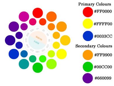
Figure 1: the primary and secondary colours, and their hex equivalents
Secondary colours are mixed from primary colours, and those colours are as follows:
- Red + Yellow = Orange (#ff9900)
- Yellow + Blue = Green (#00cc00)
- Blue + Red = Violet (#660099)
Tertiary colours are mixed from the secondary colours, and they lie between the primary and secondary colours shown on the wheel above. Although web colours differ from regular "painters" colours, it might help to get hold of a colour wheel (as seen in Figure 2) to have at hand while you learn about various colour schemes. In addition, a colour wheel will show all the tints, tones and shades so you can begin to realize the colour possibilities you have at hand. Some more important terms to learn are as follows:
- Tint – The resulting colour when white is added
- Tone – The resulting colour when gray is added
- Shade – The resulting colour when black is added
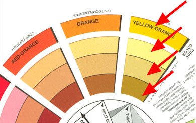
Figure 2: A real colour wheel
The arrows in Figure 2 indicate different things as follows:
- Outermost band – tertiary colour of yellow-orange (yellow + orange)
- Second band – the tint of that tertiary colour (white added)
- Third band – the tone of the colour (gray added)
- Innermost band – shade on the print wheel (black added)
As you can see from the colour wheel shown above, the amount of white, gray and black added to a colour are minor—just enough to alter the original colour and to create what is known as a monochromatic colour scheme.
Monochromatic colour schemes
Colour schemes have been around for centuries, so there’s no need to reinvent the colour wheel. Although web colour differs from print colour, the concepts are the same. You just exchange hex numbers for colour names, and match then as closely as possible. One online tool I suggest using to help out with this is the Color Scheme Designer, as seen in Figure 3, which allows you to determine colour schemes quickly and easily, and even determine whether the colours you’ve chosen provide enough contrast for low-vision or colour-blind users.
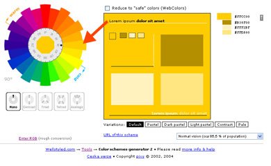
Figure 3: Color Scheme Generator II.
If you want more help deciding whether the colours you've chosen provide a good enough contrast, try out the Contrast Analyser from the Paciello Group. This tool checks the contrast between foreground and background colours.
To achieve the tint, tone and shade for the yellow-orange colour at the online colour generator, first select the colour that the arrow points to in the image shown above. Then, select Mono in the panel located under the colour wheel and Default in the panel in the box to the right. Also select Normal Vision in the selection from the pull-down menu at the bottom right. Do not check the "reduce to ‘safe’ colours" box above the colour box unless you’re a purist.
Note:The term "web-safe colours" comes from a time when monitors could display 256 colours, only 216 of which were the same across Windows/Mac/Unix platforms, hence the "web safe" monicker. While some purists still stick with the "Web-safe colour palette", modern browsers are capable of handling what is known as "24-bit" colour. Actual 24-bit colour at ten to eleven bits per channel produces 16,777,216 distinct colours. In other words, it’s safe to say that the "Web safe" colour palette rarely is needed anymore.
Back to the monochromatic colour scheme. The results you should receive by following the steps described above are: yellow-orange (#FFCC00), tint (#FFF2BF), tone (#FFE680), and shade (#B38F00). These hex numbers are much more reliable than any guesses you will make by trying to match a tangible colour wheel to the backlit screen of a Web browser. And, as the "Mono" suggests, this scheme translates to a monochromatic colour scheme, as seen in Figure 4.

Figure 4: A monochromatic colour scheme.
A monochromatic colour scheme equates to one colour and all its tints, tones and shades. While this scheme is the easiest to use, it doesn’t provide much excitement in a Web design for many designers. Instead, you may want to explore other schemes to add pizzaz to your links, images, and banners.
Complementary Colour Schemes
The next colour scheme family to explore is the complementary scheme, where you match up colours that lie directly opposite each other on the colour wheel, as seen in Figure 5.

Figure 5: Examples of complementary colour schemes.
When you choose one colour and its opposite colour, you also include all the tints, tones and shades of both colours. This provides a wider range of choices, and it translates well with the online colour tool—see Figure 6.
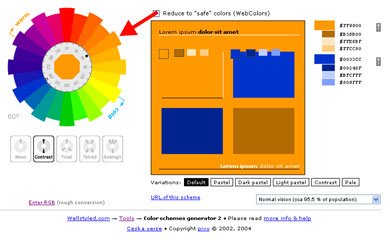
Figure 6: A complementary colour scheme inside the online colour tool.
In the image above, I have chosen an orange colour with the opposite complementary colour of blue. The settings I chose to get to this scheme include the Contrast setting at lower left, the default on the menu below the generator, and normal vision. Notice that the main colour selected is marked by a black dot on the inner disc of the colour wheel (both above and online at the generator site) and that the opposite, complementary colour that was automatically picked for you is marked with a hollow circle in the inner rim. These markings make it easier for you to analyze your colour scheme.
This colour generator makes it easy for you to choose colours for links, visited links, and even images as it provides the hex colours for you at the upper right. You can mix and match any pure colour (the colour at the top) and its tint, tone or shade and feel great about choosing a solid colour scheme.

Figure 7: The Greenpeace site—a good example of a complementary colour scheme.
Greenpeace USA (see Figure 7) is one of many sites that uses a contrasting colour scheme. Yes, you see yellows and oranges, but the predominant colours are green and red—two colours that are directly opposite each other on the colour wheel. You almost can’t go wrong with this complementary colour method. In fact, the use of a “warm” and “cool” colour combination makes a site zing with colour contrast.
Warm vs. cool colours
Complementary colour schemes are great to use in web sites, as they also contain both warm and cool colours. The use of these colours provides contrast, and it’s easy to remember which colours are "warm" and which colours are "cool" as you can see in Figure 8 (and on the colour generator site):
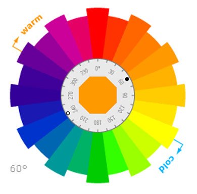
Figure 8: Warm and cool colours.
Warm colours are those colours that would remind you of the summer, sun or fire. They consist of violets to yellows. Cool colours might remind you of spring, ice, or water. Those colours range from yellow-green back to violet. If you notice how the colours work on the wheel, you’ll soon discover that you can’t choose one colour without choosing its opposite in "temperature." So, if you pick a hot red, the opposite is a cool green. Or, if you pick a cool blue-green, you’ll end up with a spicy red-orange on the other side.
One example of a site that consistently uses a warm/cool colour combination is Ecolution, as seen in Figure 9.

Figure 9: Ecolution—a good example of warm/cool colours.
Ecolution usually uses red as an accent colour on their home page in contrast to their green logo. They then blend the two contrasting colours with varying tints, tones and shades of those two colours. Even the “blacks” in an image can lean toward “warm” or “cool,” as do whites. Overall, the photograph is “warm,” which plays nicely with the stark pure green. Although they use the same colours as Greenpeace, the Ecolution site takes on less “glare” with the rich tones and shades in the photograph.
You never realized that colour theory was so easy, did you? Well, then…let’s complicate the issue a bit…
Triadic colour schemes
A triadic colour scheme (see Figure 10) is created when you pick one colour and then pick two other colours that lie equidistant from each other around the circle, like so:
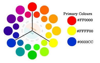
Figure 10: A triadic colour scheme.
I chose the primary colours for this scheme as I wanted to show how the colour schemes seem to contain a method to the madness. It’s no accident that the primary colours lie where they do on the colour wheel, as each colour contains an equal amount of secondary and tertiary colours between each primary. But, a primary colour triadic scheme can seem old-hat as it has been overused. Instead, you might try some other colour choices at the online colour generator, something like Figure 11:
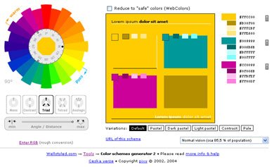
Figure 11: An alternative triadic colour scheme.
The above triad scheme is built from orange-yellow, blue-green, and red-violet. I picked the orange-yellow first (notice the dark dot on the inner section of the colour wheel at left), and then chose the Triad selection located beneath the wheel. The generator automatically chose the triadic choices including all tints, tones and shades. The accompanying colours are marked on the colour wheel with the hollow dots, just as the complementary colour was noted in the monochromatic example.
Now, this is where a real colour wheel might come in handy, as the online results didn’t quite match the results of a hand-held colour wheel. When I pushed the Angle/Distance tool under the colour wheel to "max," however, it seemed to match the colour wheel I held in my hand. The results shown above are those that matched the colour wheel the closest.
The triadic colour scheme also contains warm and cool colours, but one temperature will predominate. Usually, the temperature that will overshadow the other is the one that you chose on the front end. In this case, I initially chose the orange-yellow, which is a warm colour. The warm colours shown above will predominate as a result, with one of the other two colours lending the cool contrast.
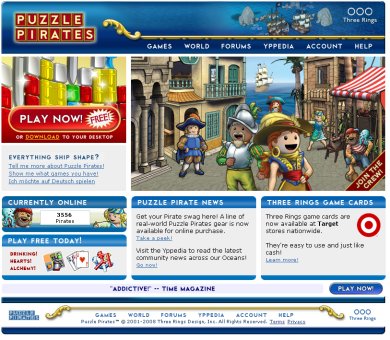
Figure 12: Puzzle Pirates—A good triadic colour scheme.
Puzzle Pirates, shown in Figure 12, uses a triadic scheme on their home page. They use the primary red-blue-yellow scheme, and this primary scheme is perfect for a kid’s game site. Note that the blue is predominant and that the reds and yellows are used as accents and to lead the eye around the page.
Tetradic colour schemes
The more colours you choose, the more complicated the colour scheme. However, one trick is to find a tint, tone or shade and stick to those regions across the board rather than mix pure colours and their tints, tones and shades. This method works well with a colour scheme such as the four-colour tetradic scheme. This scheme (see Figure 13) is just like the complementary scheme, only you use two complementaries that are equidistant.

Figure 13: Tetradic colour schemes.
Figure 14 shows how a tetrad scheme works out online:
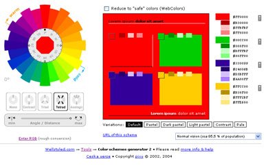
Figure 14: A tetradic colour scheme inside the online generator.
Note the black dot under the red in the colour wheel to the left. This was the first colour that I chose; I then clicked on the Tetrad button beneath the wheel. The four colours that showed up once again were a bit off from my hand-held colour wheel, but when I pushed the Angle/Distance tool under the colour wheel to "max," it seemed to match the colour wheel I held in my hand. The results shown above are those that matched the colour wheel the closest.
This colour scheme can become quite complicated, so what you might want to do at this point is to pick all four tints or tones or shades from the colours in the right column. You can make your choices by clicking the arrows at the far right. For instance, Figure 15 shows an example of a block filled with the tints of this colour scheme:
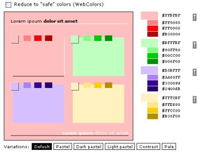
Figure 15: Tetradic tints.
And Figure 16 shows an example of the mid-range tones:
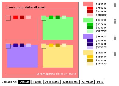
Figure 16: Tetradic mid-range tones.
If you look closely at the squares above, you’ll see that the generator also provides you with four monochromatic colour schemes. These schemes are shown both in the column to the right as well as in each square within the larger square.

Figure 17: The Jane Goodall Institute site—a good tetradic colour scheme example.
The Jane Goodall Institute site (Figure 17) is one of the few sites that really carries the tetradic colour scheme well. Note the purple, the yellow tone, the red highlights in the photograph (the site holds more red further down on the page), and the greens. The purple doesn’t match up exactly to the colour scheme generated by the online colour tool—it leans toward a red-violet—but it’s close enough to use as an example of how you can use both a colour wheel and the online colour generator to produce ideas for your site.
Now, when you surf around the Web searching for colour and design ideas, keep your colour wheel close at hand to learn more about how designers use colour schemes on your favorite Web sites!
Summary
Although colour combinations may seem complicated, all colour schemes carry certain "rules." These guidelines make it easy to understand which colours work together to add interest and contrast to a Web site.
The reason colour wheels exist are for people to use them. Colour wheels and tools like the online Color Generator make colour-picking easy even for the inexperienced designer.
The four colour schemes covered in this article are monochromatic, complementary, triadic, and tetradic. Although other colour schemes exist, these four colour schemes are the easiest to understand and implement.
Exercise Questions
Note: the last two questions do not have "right" or "wrong" answers.
- Name the three primary colours, and explain why they’re called primary colours.
- Name the three secondary colours and the primary colours that are used to make those secondary hues.
- Describe how a tint, a tone, and a shade are made.
- What is a monochromatic colour scheme?
- What is a complementary colour scheme?
- Describe "warm" and "cool" colours.
- What is a triadic colour scheme? Can you pick three colours that would fit this scheme?
- What is a tetradic colour scheme? Can you pick four colours that would fit this scheme?
- Which colour scheme seems easiest to use?
- Which colour scheme seems the most complicated?
- Previous article—What does a good web page need?
- Next article—Building up a site wireframe
- Table of contents
About the author

Linda Goin carries a BFA in visual communications with a minor in business and marketing, and an MA in American History with a minor in the Reformation. While the latter degree doesn’t seem to fit with the first educational experience, Linda has used her 25-year design expertise on site at archaeological digs and in the study of material culture.
Accolades for her work include fifteen first-place Colorado Press Association awards, numerous fine art and graphic design awards, and interviews about content development with The Wall St. Journal, Chicago Tribune, Psychology Today, and L.A. Times. Linda is the author of several ebooks on Web design, accessibility, and—as a sideline—also writes personal finance articles and ghostwrites for a few SEO pros.
/strongThis article is licensed under a Creative Commons Attribution, Non Commercial - Share Alike 2.5 license.
Comments
The forum archive of this article is still available on My Opera.
-

The online color wheel link in this article is obsolete. They've put a new version of their color wheel at the link this article refers to. Therefore, you can't follow the exercise as it's written. However, you can still get access to the old version of the color wheel used in these examples at this link: http://colorschemedesigner.com/previous/colorscheme2/index-en.html
-

@mredhorsey - thanks for the heads up. I have added an obsolete notice to the top of the article, pointing to the older version at the URL you gave.
-

Really interesting theories on colors. Great read.
No new comments accepted.mredhorsey
Tuesday, January 31, 2012
Chris Mills
Wednesday, February 1, 2012
Werlen Makacka
Wednesday, January 23, 2013