10: Colour schemes and design mockups
11th October 2012: Material moved to webplatform.org
The Opera web standards curriculum has now been moved to the docs section of the W3C webplatform.org site. Go there to find updated versions of these docs, and much more besides!
12th April 2012: This article is obsolete
The web standards curriculum has been donated to the W3C web education community group, to become part of a much bigger educational resource. It is constantly being updated so that it remains current with modern web design practices and technologies. To find the most up-to-date web standards curriculum, visit the web education community group Wiki. Please make changes to this Wiki yourself, or suggest changes to Chris Mills, who is also the chair of the web education community group.
Introduction
After a web designer presents a site’s architecture, or wireframe, to a client for approval, the next step is to determine the look and feel of the site through colour and graphics. In this article, I’ll demonstrate how I keep this process as simple as possible, both for myself and for the client. I believe in the KISS philosophy—Keep It Simple, Sweetie. There are two reasons for the use of this tactic: First, life is complicated enough without adding more curves; secondly, a simple plan also helps to keep a site more accessible and usable for all concerned. In this article, you will:
- Determine the typeface for headings, subheads and body copy, along with any other typographical issues.
- Plan different colour combinations for the web site.
- Build a mock-up for the client to decide on the colour and graphics.
- Consider how to test the web site before it goes "live".
The article table of contents is as follows:
- First step: considering typography
- Second step: add typography
- Third step: colour
- Fourth step: testing
- Summary
- Exercise questions
First step: considering typography
You will learn some more about the technical aspects of typography in the typography article after this article; now I will look at a few aspects of it that you will find useful at this stage.
Fonts also are called "typefaces" and they’re used to display text, numbers, characters and other symbols. Also known as “glyphs,” these symbols, letters and numbers are categorised by family (all related), style (italic, normal, oblique, etc.), variant (normal or small caps), weight (boldness), stretch (condensing or expanding type by height or width) and size (by points or by pixel height or width). Typography is the arrangement and appearance of text, so typography concerns the look of the glyphs and how they are placed on the page (columns, paragraphs, alignment and more). The most effective way to control how typography looks on a web page is through using Cascading Style Sheets (CSS).
One of the first steps in finalising a web design is to decide upon the fonts you will use throughout a web site. Many studies have shown that a variety of typefaces on a web site may confuse the reader. On the other hand, a site that uses only one font throughout seems bland.
My advice is to use one typeface for the headings and subheads and another typeface for the body copy, especially if you plan to add advertising to a site. Limiting the number of fonts adds continuity to the site while still allowing the reader to differentiate between headings and body copy when they're scanning the web page. Advertisers will add the variety; you can never know in advance which typeface or variety of typefaces an advertiser might use in a banner or text ad.
Personally, I usually use Verdana for body copy and Times Roman or Georgia for headings. The Times Roman and Georgia typefaces are serifs, and Verdana is a sans-serif.
As you’ll see shortly, I decided to stay with Verdana for body copy in the example site, but since the logo was built upon Arial Black, I also used that sans-serif typeface for all the headings. Sometimes you need to break your own rules, and this layout provides a prime example for that contingency. But first, allow me to explain the difference between typefaces, and why I keep my choices so simple.
About typefaces or fonts
There are four main types of fonts and they are as follows:
Serif: Any typeface that contains a finished stroke, flared or tapering ends, or have actual serifed endings (including slab serifs). Throughout history, the serif font has been chosen for print body copy, as it’s easy to read on a printed page. But, the Web is different than print, and some studies on font readability show that some sans-serif fonts are easier to read, like the one shown in Figure 2, when they’re used as body copy on a web page.

Figure 1: A sample of serif type, Times New Roman, regular (not bold or italic), at 18 pt.
sans-serif: Any typeface that has stroke endings that are plain without any flaring, cross stroke, or other ornamentation. While some authors argue that the studies on font readability are flawed, I’ve noticed that those sites use sans-serif type in their body copy. Even articles that argue that serif typefaces are more legible use sans-serif type in their web page copy. So, I tend to follow the crowd here—I use sans-serif like the one shown in Figure 2, because it has become a traditional body copy typeface for the Web.

Figure 2: A sample of sans-serif type, Verdana, regular at 18 pt
-
Script or Cursive: These fonts usually look more like handwritten pen or brush writing than printed letterwork, like the example shown in Figure 3 below. These fonts would include those that appear handwritten, even when they aren’t cursive. One reason not to use this type of font on a web page, especially in body copy, is that it is difficult to read in large chunks (think about how difficult it was to read that hand-written letter from your aunt Margaret, or the manuscript from the twelfth century that you once viewed in the museum). Additionally, not all browsers display the same fonts, so if you decide to use a script or cursive font, it may choose to show itself as a serif font in someone else’s browser.

Figure 3: A sample of the script font, Staccato, at 18 pt
-
Specialty, including monospace: The sole criterion of a monospace font is that all glyphs have the same fixed width, similar to what a typewritten page might look. Other fonts might have a fantasy appeal, like the one shown in Figure 4 below, and these fonts are used solely for decorative purposes. Monoscript fonts have their place on a web site, especially when displaying programming code. This typeface often is used for that purpose, as a monospace font clearly shows each letter and symbol used in code.

Figure 4: A sample of a specialty script, Jokewood, at 18 pt
A look at the visuals above will show that not all type is created equal, even if it’s created at the same point size. The point size is the height of a letter, and some fonts will be larger at 18 points than others. Other variances exist as well, such as the spaces between letters and words, or the fact that some typefaces, such as Jokewood, lack lower case letters. But, you can see where Jokewood and Staccato, the script, would be difficult to read as body copy. Those scripts might find a place in small areas as headings or in advertisements.
One point to consider is that these fonts may not show up the same across all browsers because different browsers basically remain incompatible. You may have picked up on my comment above that “not all browsers display the same fonts.” The reason for this problem is that not all operating systems support the same fonts. Or, they may support the same fonts but the variant, weight, and other factors may show up differently from one browser to another. For this reason, you may choose to use a generic font, or simply a “serif” or “sans-serif” to display your web page’s typography. Or, you can use both the generic name and the name of the font you chose and hope for the best, because users also have the ability to change your font or the way it looks in some cases.
The only way you can use a specific typeface in a specific style, variant, weight or stretch across all browsers is to create a graphic with that font in a graphic program. This is, however, not recommended for many reasons, including the text being inacessible (a screen reader cannot read the text hidden inside a graphic), harder to resize (not all browsers do full page resizing), and harder to maintain (you’ve got to recreate the graphic every time you want to change the text). Trust me—don’t go there.
It is for this reason that, as a web designer, you must learn to let go of the fact that Web is—for all intents and purposes—basically a malleable format. You have control over only so many things in a web site design. Type is one item that you have some control over, but only if you keep it as simple as possible. And, that is the reason why I’ve stuck with Verdana for body copy and Times Roman or Georgia for headings for all these years.
With that said, type designers and programmers continuously try to find ways to make fonts more legible and beautiful. So, take what I say with a grain of salt and try something new if you think it will work. You’ll find out soon enough if it doesn’t pan out when you test that web page across a number of browsers yourself (a task I’ll explain later in this article).
About readability and legibility
When you show your web page design to a client, he or she usually won’t know the difference between a serif or a sans-serif typeface. All that client will know is whether or not he or she can read the content on that page. So, in the end, legibility is what matters. To that end, you need to make sure that:
- Your type is large enough to read in a variety of browser resolutions. Although users have the means to change a font size in some browsers (such as Opera), you can try to make sure that your fonts are adjustable to different browser resolutions. One way to accomplish this feat is to size your fonts by percentages or ems rather than by pixel height (you use CSS to do this).
- You provide enough contrast between background and body copy. White or light type on a black background for large chunks of body copy can strain some eyes, however - if you need to go that route, try to provide an alternative stylesheet so users can read dark copy on a light background instead.
- The headings are, indeed, different than the body copy. The ability to break up large chunks of copy with headings and subheadings, or with lists (like this one) makes it easier for users to scan a page to find what’s important to them. Breaking up a page with images is nice, too, but make sure that those images are relevant to the copy. Otherwise, you’re just wasting bandwidth.
- You avoid stretching body copy across the entire width of a screen with a fluid layout. Try reading a paragraph that stretches the horizontal space provided by a large monitor—it will wear you out after a while because you’re using your eyes and your head as you scan the text from one side of the screen to the other side. Take a look at this web page on readability, which is the best I’ve seen to date to illustrate a typical readable width for body copy (illustration shown below in Figure 5 as well). This page also explains in depth how people read a page, no matter if it’s web or print. The image shown below was captured on a twenty-four inch screen at a 1920 x 1200 resolution. Compare this image to the one you see on your screen when you click on that previous link. Then, note the resolution of your screen to see the differences. Sometimes a fixed layout is a good thing, as it will define the parameters of the body copy area for the benefit of your readers. Don’t worry about all the space around that body copy area (like that shown below). Provide a nice background that doesn’t distract from the design or the copy, and you’ll provide a service to those who own large screens.
40–60 characters is generally regarded as a good line length for body text, and this varies depending on factors such as font size and target audience.
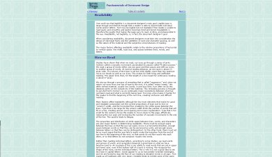
Figure 5: A sample of an appropriate width for body copy, displayed on a large screen.
Last, but not least, be sure to check your body copy and headlines for typographical and spelling errors. I found at least one typographical error and a few spelling errors in approximately half the links I provided thus far for this article. While it’s human to err, a company’s or an individual’s credibility can be marred by poor spelling and with words that lack spaces or other issues that can easily be resolved.
Second step: add typography
Once you’ve chosen the fonts you’ll use for the site, you’ll need to layout the headings, subheads and body copy in the site layout. In the previous article, I introduced an imaginary company, “Wiki Whatevers”, a business that wanted to share their code snippets on a web site as open source material. I designed a site architecture for approval, and I am happy to report that they loved the ideas that I presented! Although this wireframe seems stark, it avoids any placement of graphics or images that may give the client a preconceived notion of where things “might” go, including the company logo. The image of that wireframe is shown below in Figure 6:
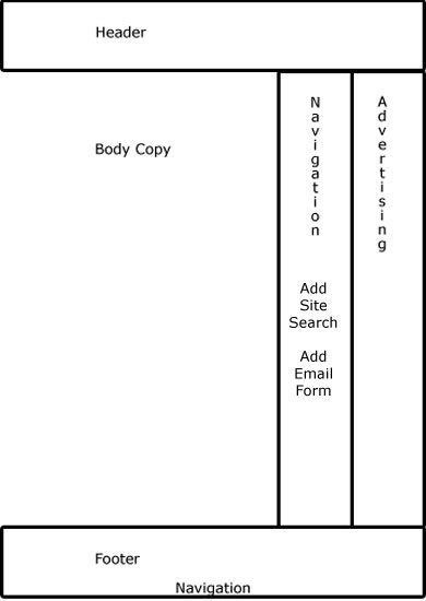
Figure 6: Wireframe for Wiki Whatevers
Now, for my own piece of mind, I want to add the logo and some of the copy that company provided to determine if it will flow correctly within that layout. The other reason I want to add the logo and the copy at this point is so that typography can lend a hand in the colour choices I’m about to make. Body copy, headlines, and other typography on a web page adds its own “colour” to a site. Just compare the image below in Figure 7 to the one directly above in Figure 6 to see the difference:
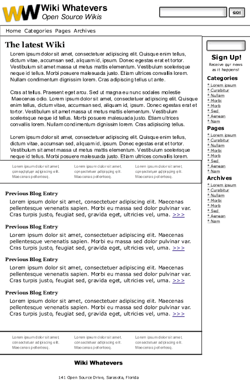
Figure 7: Body copy and logo added to wireframe
The copy above adds “colour” to the site, although the only colour has been added by the logo. The copy has added “value”, not just in content, but in tints, tones and shades of black and white and grey. I’ve added only those items that are essential to the site—the logo, the site name (which also is the company name), a tag line (Open Source Wikis), the links and sign-up for a newsletter or feed in the middle column, and the footer information about the company as well as text links and ad copy. The search box proved too large to use just one column, so I placed it into the header.
While I say I used body copy, in reality I used a “filler” provided by the Lorem Ipsum generator. This “fake” body copy can stand in for real copy if you want to design a site and the copy remains unavailable to you.
Attention to alignment
At this point, I want to show how I made the decision to place the copy where it is as far as alignment. Alignment means how copy is positioned in a certain area. You can align it to the left, and leave “ragged” edges to the right, which is a traditional layout. Or, you can center the copy, or make it justified (aligned both right and left equally), or align it so the right edges are straight and the left edges are ragged.
I chose to use the traditional left alignment, where the type lines up in a straight line to the left. But, you might notice that the body copy is indented further to the right than the subheads that go with that copy. The logo was the reason why I chose this alignment. Here’s a close-up illustration that explains why I made that decision in Figure 8:
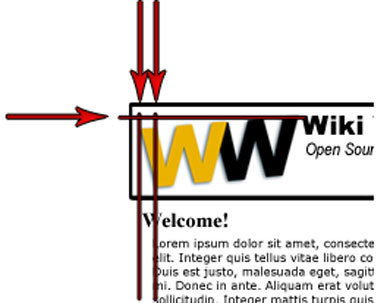
Figure 8: Illustration of alignment between logo and body copy
Since the logo isn’t an award-winning design, I tried to keep the size small. Plus, the weight provided by the Arial Black typeface makes the logo appear larger and more out-of-proportion than any other feature on the page. Although I reduced it greatly, I wanted the logo to be large enough to fit the company name and their tagline, “Open Source Wikis”, into the space provided by the height of the logo. You can see from the red lines I placed in the illustration above that the business name is aligned at the top of the slanted logo, and the tagline is located at the bottom of the black “W” in the logo. (Also look back at Figure 7 - looking down from the first “W” in the logo, you’ll see that the heading for “The latest Wiki” is aligned with that letter’s left bottom point. Since the logo is slanted, the lowest point helps to point to the heading below the navigation. In fact, it makes the navigation appear secondary, since the heading is as bold as the business name.)
At this point, I noticed that the Georgia typeface that I chose for the blog entry title seems a little too busy for that area. This is when I decided to change the headings to Arial Black, a sans-serif type that is slightly different than the Verdana I used in the body copy, yet not so different as to create chaos.
This ability to align various elements within a page design is made easier with CSS. Although some browsers may try to thwart your efforts at alignment, in many cases using exact points within a layout to apply your elements will work. This is why you also can align a search box with the bottom of a tagline, or why you can align the right side of that search box with the right side of a form located below—just as I did in the sample shown above.
I could have aligned the body copy with the logo’s top left corner and with the headings as well, but the indentation shown above allows the reader to quickly scan headings and read the copy that’s important to the reader. With that said, each web page is different, and another logo design might call for a totally different alignment. The point is to align all the important elements on the page so they flow smoothly. The reader won’t notice that you’ve gone through this trouble (neither will the client, in most cases). But, the minute you don’t take the time to align important objects on a page, someone might make the comment that “something doesn’t feel right”.
Moving body copy in by a small amount also creates what is known as “white space”, or a shape (sometimes called a gutter) around the copy and any other elements that allows the viewer to easily perceive one piece of copy apart from another. The space on the left of the body copy should usually be set similar to the space to the right of the body copy (or any images), so that you can create a balance within a given space. This white space gives the site some “breathing room”, so that it doesn’t appear too crowded.
Take a look at web pages the next time you’re surfing around on the Internet. Note the pages that seem well-designed to you, or those pages that just “feel right”. Note the alignment of body copy, headings, logos and other elements on the page. Are they aligned? Do they seem to flow from one element to another? Perhaps the designer took the time to attend to small details like this to help make the page design less important than the content—which, for all intents and purposes—is the goal of good design.
Granted, a design may encounter some issues in different browsers. The text may not line up just right in Safari, but it may appear perfectly aligned in Opera or Firefox. That’s a road to cross shortly, but only after the colours for this site are chosen.
Some of you may wonder why I didn’t choose Arial Black for the subheads as well as for the name of the company. I chose to remain with my faithful choice of Times New Roman as this serif face adds contrast to the site, a design principle that adds interest to a page. The overall use of Arial Black for all the headings would make this site appear bland.
Third step: colour
When I prepare a web site mock up for a client, I usually try to take it as far as possible after the initial wireframe has been developed before I show the samples to the client again. When possible, I prefer to use code rather than an image for the wireframe. This way I can drop in elements such as the logo, body copy, and even mocked-up ads to show the client how everything will appear on the final page. With such a complete layout, the client has no delusions about what the page will look like with all elements in place. Then, the client can make decisions about what can be added or removed. Additionally, when I can show a client a web page on a computer just as it would appear on the web, the client can visualise how that page would look if he visited it in real-time.
Colour is part and parcel of that “everything in its place” mentality. The reason for this is that different colour schemes can change the mood of a site entirely, even with all elements in place. Further, I prefer to keep the colour samples to a minimum, because too many samples can become confusing. In this case, the client had a limited budget, so I persuaded them to limit the choices to one colour scheme as a sample to work with.
When I introduced the Color Scheme Generator II in Article 8, I didn’t mention that you can input a hex colour in this tool to generate a colour scheme from a specific colour. Directly beneath the colour wheel, you’ll see a link for “Enter RGB”. In my case, the gold in the logo was the strongest colour, so I entered that hex (#eab304) to learn more about my choices. The resulting monochromatic scheme was somewhat boring, but the contrasting colour scheme held promise. That scheme held a blue-violet that I could work with, as the shadow behind the logo was tinted blue as well, as shown in Figure 9:
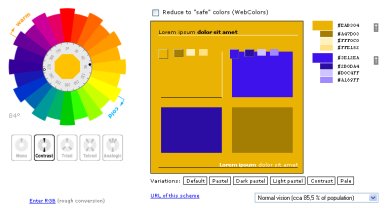
Figure 9: Contrasting colour scheme based upon #eab304
With the colours shown here, I decided to use the main gold logo colour as the background for the top navigation. I used the darker blue (almost a blue-violet) #2b0da4 for links (which I also underlined), and I used a lighter opacity of that same colour blue for the advertising background. You can see how these colour additions alter the look of the layout in Figure 10:
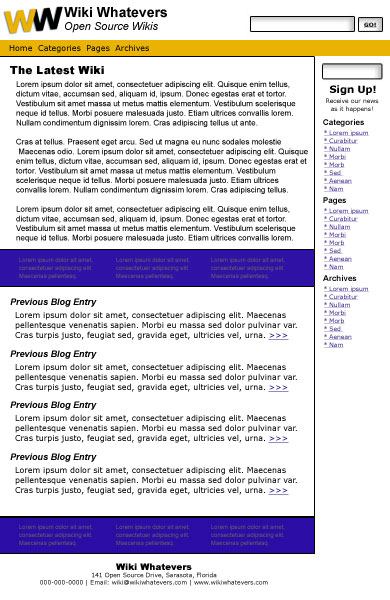
Figure 10: Layout in contrasting colours
You can see in the image above that the colours are far too dark and “heavy” for the site. So, I took the opacity in the navigation bar down to 75% and the opacity of the colour in the advertising copy bars all the way down to 20%. You can see the immediate difference below in Figure 11:
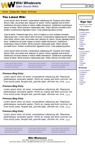
Figure 11: Layout with reduced opacity
The reduction of colour in the navigation bar brings it more into alignment with the colour in the logo. The reduction of opacity in colour for the advertising background brings it in line more with the link colours. Since the ads consist of links, this colour reduction and matching to the site’s links is appropriate. The fact that the colour behind the ads has been added is a good thing—if you use an advertising service like Google Adsense, you will learn that Google prefers that you make the ads stand out from the rest of the body copy—the colour addition helps to meet that criteria. I also used the #2B0DA4 dark contrasting colour for the tagline, and this addition helps to bring the blue contrasting colour around full circle on the page.
While this layout may look like it was easy to pull together, I spent some time using the colours from the contrasting colour scheme for backgrounds, to colour the headings and to change the ad layout several times. With each change, the colours seemed to overwhelm the simple layout, so I eliminated them and stayed with the black for all typography except the tagline. While I could use a “visited” colour link, I believe my best choice is to stay with a simple two-colour base that will accept colour images readily without creating a colour nightmare.
On the other hand, you can see how building a wireframe up front can simplify your work as well—once you have a “map” or architecture in place, the addition of colour is more or less like colouring “within the lines”. If you stick to your layout, you can use that layout to dictate your choices. In addition, if you keep it simple the design can be more elegant in the long run as well as more usable and accessible.
There is one last good reason to keep this layout simple—the inside pages will carry code snippets, and I’ll use a monospace font for that code to be in-keeping with best practices. This is another reason why I chose to use two different sans-serif typefaces that are similar in style. The application of a monospace font inside this site will add enough typeface variety, along with any advertising variants. Make sure you use the heading elements (h1, h2, h3, etc.) for headings and subheadings rather than making them bold (strong) or italicised (em). Using heading elements will make your site more accessible. You can alter how those headings appear in your style sheet (CSS).
A few things to note about the page above:
- I kept the company name at the top of the page in black, as that black helps to carry the black in the logo across the top of the page.
- I used a centered alignment in the top of the middle column to draw attention to the registration feature. Since the form for registering for a newsletter fills the width of that column, the centered copy is balanced by that alignment, and it makes the copy seem to “belong” to the shape created by that form.
- The centered alignment of the address at the bottom of the page in the footer may seem off-center, but I wanted that address to become part of the area that carries the body copy for the site. As the site grows, that right column will become filled with more links and possibly some images, and I want that area to be entirely separate from the main copy of the site. This separation alerts viewers that the right column is where they need to go to find more information.
Finally, as a finishing touch, I'll add the page’s images. Unless the client has an image to use, the image that you choose should “fit” within the scheme of the layout. In other words, try to find an appropriate image that reflects the colours you’ve chosen for the site. In this case, I chose to add a little humour to the layout with a stock photo of a geek. One reason I chose this photo is that the man in the image is looking straight at the viewer, which means that this image may catch the viewer’s eye before anything else on the site. Since this image is so important, I was happy that the colours in his shirt seemed close to the gold and blue contained in the site. Finally, his black glasses echoed the heavy black accents in the site’s headings. With all that said, I added a blue cast to the shadows and a yellow cast to the highlights of this photo in Photoshop to help it fit in more with the overall colour scheme.
I also added a tag line for containing the blog post tags and a date/time stamp so that viewers can see how recent the blog entries are. All these elements, as you’ll see below, add more “weight” and confusion to the site. This is just one more reason why you might try to keep the important and vital information as simple as possible—the viewer will have enough to deal with when they click on this site as it is. See Figure 12 below to examine the final result:
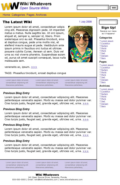
Figure 12: The final design, ready for client inspection.
The nice thing about web design is that it isn’t print design. Print is forever; the web constantly changes. So, this site may change over the years to reflect this group's growth. Mistakes can be corrected, and colours can be modified. With that said, it’s best to have the most perfect product online from the get-go. This goal of offering the best product possible is good for your reputation and for your client’s reputation as well.
As I build more pages, I’ll take the finished pages on to the next and final step before they go to the client once again.
Fourth step: testing
Testing a web page means that the designer will go through all web pages with a fine-toothed comb to look for a variety of errors so they can be fixed before the site goes “live”. You have several options for this testing, as several tests need to be conducted.
- Testing Typography and Links: You can use friends, forums, and professional editors to check for typographical and spelling errors. While those folks are looking over the pages for you, ask them to check links as well to make sure they work. A word of warning—most clients would not like the idea that their copy is out in the public venue before it goes “live” on the Web. In this case, build the cost of an editor into your billing on the front end and have that editor sign a nondisclosure agreement (NDA) so that he/she is held responsible for keeping that web site’s copy private.
- Test Code Validity: Use the W3C validators to check HTML and CSS code every time you add new code to web pages. Without this step, the next step is a moot issue, as one code error can throw a web page design off in any number of browsers. You might learn along the way that any code you add for advertising will not validate. Don’t try to change the code, however, as you may negate the value of the ads by creating errors in the ad code. Instead, most designers have learned to live with the fact that advertising code is the way it is, and not much can be done to change it. Thankfully, most advertising code will not affect your layout in the next step.
- Test Browser Compatibility: You may wonder if you need to rush out and purchase several different computers and different monitor sizes along with several different operating systems to test a web site. You don’t. Few web designers can afford that extravagance, so they use several options to test a web site’s compatibility across browsers. These options include downloading several versions of one operating system on one machine, the advice from friends and/or forums, and the use of services that provide screen captures. Screen capture services basically provide a screenshot of one web page at a time from several different machines. With this service you can see whether your type is too large for one resolution or too small for another. Or, you can discover whether your layout forces one user to scroll horizontally, or whether you’ve completely lost a column altogether in another browser. I use screen captures for testing in most cases, as the first two options have proven spotty at best. Plus, I don’t like to send my clients’ work out when I can keep their information private through the use of screen capture services. A few free web capture services exist, but I’ve learned that the queues are long and the options for a variety of testing environments may be limited. So, I spend a little money on BrowserCam, and this service has proven worth its salt over several years. This service also provides a free trial, so you can test their product out at no charge to understand how it functions.
- Test for Usability and Accessibility: You can find a number of online tools to test for accessibility. Some require the use of sound so that you can hear how a speech machine would "read" your page. Other test results may ask for a simple code change or a change in colours to provide more contrast for low-vision users. As far as usability, you can find tools and checklists online that will help you to make sure the site that you design is easy to use by the largest number of readers as well.
This testing is a tedious business, and you may discover in the process that your lovely design will stay lovely across some browsers, but may end up looking like last week’s spaghetti warmed over in some of the others. The most important thing to remember is the content—if the content is visible and legible in all browsers, then that fraction of a space that’s bothering you at the top of the header in that one browser isn’t that important. If the majority of that site’s users have no problem gaining access to the online materials within the site that you designed, then you’ve accomplished a goal that many designers neglect in favor of a design that they believe will win awards.
Summary
While colour and layout hold great appeal to the designer, other design elements must be dealt with as well. Typography, images, and the ability to blend in a client’s needs for advertising and monetisation all play a part in web site design. The demands placed upon a designer to go with the flow of a client’s desires, to meet the needs of a readership that demands accessible and usable sites, and still create a great design can seem overwhelming at times.
Even more frustrating is the lack of compatibility among different browsers. Although progress has been made over the past decade toward more compatibility, you must understand that the finished design may seem to take on a life of its own in various browsers. In addition, you should realise that users can change a web site with the click of a button in some browsers. Images can be eliminated, backgrounds and text colour changed, and anything with a hint of Javascript can be ignored by users.
On the other hand, the progress toward a more compatible environment and an exciting new era of web functionality can prove an exciting challenge to web designers today. And to think—it’s been less than thirty years since home computers were widely available on the retail market. Think about what the next decade might bring to the designer who is willing to stay abreast of all the changes!
Exercise questions
- What are the four main types of fonts?
- Which fonts are best for body copy and why?
- Why is it important to create enough contrast between body copy and the background of that copy?
- Name at least two ways to break up a page filled with body copy.
- Give one reason why it’s a good idea to add typography to a page before you add images.
- Name four types of alignment.
- Explain how alignment can help a web page look “cleaner”.
- What is an NDA and when should you use that document?
- Why is it important to check the spelling on a web page?
- Name four ways to test a site before it goes “live”.
About the author

Linda Goin carries a BFA in visual communications with a minor in business and marketing, and an MA in American History with a minor in the Reformation. While the latter degree doesn’t seem to fit with the first educational experience, Linda has used her 25-year design expertise on site at archaeological digs and in the study of material culture.
Accolades for her work include fifteen first-place Colorado Press Association awards, numerous fine art and graphic design awards, and interviews about content development with The Wall St. Journal, Chicago Tribune, Psychology Today, and LA Times. Linda is the author of several ebooks on web design, accessibility, and—as a sideline—also writes personal finance articles and ghostwrites for a few SEO pros.
This article is licensed under a Creative Commons Attribution, Non Commercial - Share Alike 2.5 license.
Comments
The forum archive of this article is still available on My Opera.
No new comments accepted.