Opera Mobile 10 developer’s introduction
Introduction
Opera Mobile is our web browser for high-end phones and we have just released version 10 for Windows Mobile and Nokia smartphones. In this article we take a look at the browser’s main new features, provide developers with information on making sites mobile-friendly, remote debugging with Opera Dragonfly, and give an overview of Opera Mobile 10’s new standards support.
This article is obsolete
It's retained for historical purposes only. Download the latest version of Opera or see what's coming soon in Opera.Next.
The table of contents for this article is as follows:
- Opera Mobile 10 features
- The Opera Mobile 10 user agent string
- Optimizing for mobile
- Improved remote debugging with Opera Dragonfly
- New standards support
- Summary
Opera Mobile 10 features

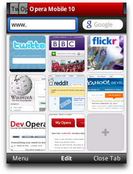
Figure 1: Tabs and Speed Dial on a keypad-style phone
Once you’ve installed Opera Mobile 10 and launched the application, the first thing you’ll notice is the new UI. Figure 1 shows the new tabs, icons and also Speed Dial – the feature we pioneered in our desktop browser. Speed Dial appears when you start the browser, open a new tab or select Start Page from the menu, giving you fast access to your favorite sites. And if you're already using Opera on your desktop or on another device, you can now keep your bookmarks, Speed Dial and search engines synchronized thanks to Opera Link.
A lot of work has gone into streamlining the look and feel of our browser products across different devices, so using Opera Mobile 10 will be a familiar experience to anyone who has already used Opera Mini 5.
Like its big brother on the desktop, Opera Mobile 10 also features Opera Turbo. If you are browsing the Web in an area with low or patchy mobile coverage and bandwidth, you can turn on Opera Turbo to compress web sites by up to 70%, depending on your circumstances.
If you dive into the Settings, you’ll find many more options, such as Mobile View, which displays content in a single column, as well as advanced privacy management settings and more. And just like its desktop counterpart, you can enter opera:config in the address bar for power-user tweaks.
The Opera Mobile 10 user agent string
Similar to Opera 10 for desktop, Opera Mobile 10 identifies as Opera 9.80, version 10.00 (to circumvent badly written browser-sniffing scripts which can't handle double-digit version numbers).
The user agent string for the Nokia version is:
Opera/9.80 (S60; SymbOS; Opera Mobi/498; U; en-GB) Presto/2.4.18 Version/10.00On Windows Mobile, the UA string reads:
Opera/9.80 (Windows Mobile; WCE; Opera Mobi/WMD-50286; U; en) Presto/2.4.13 Version/10.00In general, Opera can also be identified by using JavaScript to test for the presence of the window.opera object.
Optimizing for mobile
Generally, you shouldn’t sniff for browsers and serve different content to different user agents. Instead, a more sustainable and robust method is to make your sites work well across a variety of devices and screen sizes using common HTML and CSS hooks.
Viewport meta tag
When loading a Web page in Opera Mobile, you get a zoomed-out overview of the page and then can pan and zoom into selected content in just a few clicks. While this approach works fine for most websites, it is possible to further enhance the user experience for your visitors by presenting an zoomed-in view of the page by default. This approach works particularly well for Web applications, giving them more of an "application-like" feel.
By default Opera Mobile assumes a page to be 850 pixels wide, and the zoomed-out overview rescales these values accordingly to fit on the device screen. With a viewport meta tag in the head section of the page you can override this default width and instead set an arbitrary pixel value such as 320, 480, etc. For cross-device compatibility, we recommend setting the width to the device-width:
<meta name="viewport" content="width=device-width" />This adjusts the page width to fit in the full width of the screen, or put differently, it makes one CSS pixel equal to one device pixel.
A lot of websites use the viewport meta tag only on a different “mobile” URL, but it is worth pointing out that, particularly in combination with Media Queries, it is possible to just have one page that works well and is optimized for several screen sizes.
Media Queries
Media Queries are a CSS3 feature that allow you to specify under what conditions a style sheet or a particular set of CSS rules should be applied. For instance, to limit a set of styles to only apply to a screen which is 480px or less, you could use the following Media Query:
@media screen and (max-width: 480px) {
  background-color: red;
  font-size: 1.5em;
}
Note the relationship to the viewport width here: when the page is loaded in a desktop browser, the viewport width is the width of the browser window; when it is loaded in Opera Mobile 10, the viewport width defaults to 850 pixels unless overridden by the viewport meta tag.
You can try this out for yourself by loading our Media Queries + viewport example in Opera Desktop and then on Opera Mobile 10. On desktop, we get a three column layout for browser widths wider than 800 pixels — the page gets a different layout when the browser is resized. In Opera Mobile 10 running on a device with a physical screen that's less than 400 pixels wide (as an example, a Nokia 5800 in portrait mode has a width of 360 pixels), a viewport meta of width=device-width triggers the @media screen and (max-width: 400px) { … } style rules, and the three column page turns into a single column page.
Improved remote debugging with Opera Dragonfly

Figure 2: Opera Dragonfly element highlight
As with earlier Opera Mobile releases, Opera Dragonfly allows you to debug web pages being displayed on your mobile phone remotely from your desktop. To debug pages in Opera Mobile 10, open Opera Dragonfly in Opera Desktop (Page/View > Developer Tools > Opera Dragonfly) and follow the instructions in Daniel's remote debugging article (with video). As Opera Mobile 10 uses Presto 2.4, Opera Dragonfly may have to download a new compatible version before you can start debugging.
The main new feature in Opera Dragonfly and Opera Mobile 10 is the element highlight. This feature highlights the metrics of the currently selected element, so when you click on an element, it is highlighted along with alignment guides. When clicking on the Layout tab in the DOM inspector, you can hover over the different metrics such as the margin or padding to highlight that part of the element. The highlight colors are fully customizable (go to the Settings tab and click on the Spotlight heading.)
New standards support

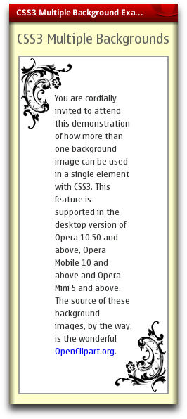
Figure 3: Example of multiple background images
Opera Mobile 10 is powered by the Presto 2.4 rendering engine, which has improved performance and better support for standards, details of which can be found in our Presto 2.4 documentation.
Please note that Opera Mobile 10 does not have Vega accelerated rendering enabled, so features such as border-radius, box-shadow, etc. that depend on our Vega graphics library currently aren’t supported. To give you a good overview of what works where, we have created a chart comparing the standards support in Opera Mini 5, Opera Mobile 10 and our latest desktop browser.
That being said, Presto 2.4 does bring new support for a few interesting CSS properties to Opera Mobile 10.
Multiple background images and more
With the CSS3 Backgrounds and Borders module it is now possible to have more than one image in the background of a single element. One use-case for this is having a decorative background that resizes nicely whatever the size of the containing element, as in this example of multiple background images (see Figure 3). It also demonstrates the ability to have separate repeating background images on either side of the page.
Incidentally, this example also makes use of media queries and the viewport meta tag so it should look good on a variety of screen sizes.
In addition to multiple background images, Opera Mobile 10 also supports other parts of the CSS3 Backgrounds and Borders module we've written about before, such as background-clip, background-origin and background-repeat.
CSS Transitions
CSS Transitions are supported as well, but it's worth pointing out that they may not work entirely as you'd expect: many current examples using transition effects are triggered with the :hover pseudo-class, which generally won't work on on touchscreen devices.
As a little demo, we've modified David's CSS Transition timing example, which now invokes the transition effect with a JavaScript timer rather than on :hover — however, the rest of the demo is exactly the same as in our previous article on CSS Transitions, showing the different easing algorithms that can be applied to a transition effect.
Summary
That wraps up our introduction to Opera Mobile 10. We’ve taken you through its main new features and exciting new web standards support. As always, let us know how you like it, and don't forget to check out the Opera Mobile 10, Opera Mini 5 and Opera 10.50 standards support chart!
This article is licensed under a Creative Commons Attribution-Noncommercial-Share Alike 3.0 Unported license.
Comments
The forum archive of this article is still available on My Opera.
-

Any updates to this one???
No new comments accepted.Werlen Makacka
Wednesday, January 23, 2013