A developer’s look at Opera Mini 5
Introduction
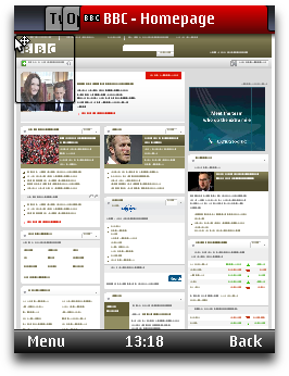
Figure 1: The Opera Mini 5 UI with 3 tabs open
This article introduces Opera Mini 5, our next-generation mobile Web browser. Like previous versions, Opera Mini 5 works on most modern phones — from high-end smartphones to basic feature phones. In fact, it will run on almost any phone with a JVM, and there are even native versions for Windows Mobile and Android (currently in beta).
Visit our Opera Mini & Opera Mobile page for details and download instructions.
Opera Mini can display regular web pages designed for desktop browsers even on low-spec devices, and thanks to our compression technology it drastically reduces the amount of data being transferred, saving you time and money. At present, it’s being used worldwide by over 50 million users, and adoption is only increasing. Read our State of the Mobile Web Report for more detailed coverage of the mobile web industry, including a breakdown of Opera usage on mobile in different countries, what sites are popular on mobile, and other analyses.
This article will briefly outline how Opera Mini 5 works, look at the new UI and features, and then provide developers with information on Opera Mini 5’s standards support and general advice on making sites mobile-friendly.
The table of contents is as follows:
- Server-side rendering
- Opera Mini 5 new features
- Opera Mini 5 standards support
- Identifying Opera Mini 5: The user agent string
- Optimizing for mobile
- Summary
Server-side rendering
Opera Mini 5 is a thin-client application: when you use it to request a web page (1), that request is sent off to a server-farm (2); a proxy server receives the requested web page (3), renders and reformats it, and then converts it to a light and efficient format developed by Opera called OBML (4). This is then sent to the Opera Mini client (5), which displays it on the phone screen (6).
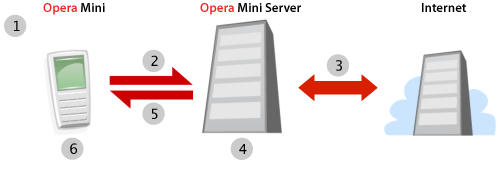
Figure 2: The Opera Mini request–response workflow.
As most of the complex processing is done on the server, Opera Mini 5 can run on relatively low-spec phones. In addition, the conversion to OBML can reduce the amount of data being transferred to your phone by up to 90%, meaning that, where bandwidth is at a premium, you can save a lot of time and money.
Note that, as all the processing is done on the server and what is sent to the client is a static snapshot of the web page, some sites that feature heavy Ajax functionality or background scripting may not behave quite like you’d expect. However, most sites will function without a problem — you can find out more about Opera Mini 5’s standards support later on in the article.
Opera Mini 5 new features
Opera Mini 5 has a bold new UI and many exciting features, and comes with support for both touchscreen- and keypad-style phones — see Figure 3.
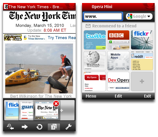
Figure 3: The Opera Mini 5 UI adapts to both touchscreen- and keypad-style phones.
As you can see, Opera Mini now features tabs as well as Speed Dial thumbnails. And if you're already using Opera on your desktop or on another device, you can now keep your bookmarks, Speed Dial and search engines synchronized thanks to Opera Link.
You can display pages using either regular desktop view, in which you can scroll around the page and zoom in and out, or Mobile View, which is reformats the page to a single column. The latter tends to work better for devices with narrow screens. You'll also notice that text is automatically wrapped to fit inside the screen width, making horizontal scrolling unnecessary when reading text.
Opera Mini 5 standards support
Opera Mini 5 now uses the Opera Presto 2.4 rendering engine, bringing its display capabilities in line with Opera Mobile 10.
Note that because Vega (Opera's graphics library) is not enabled on our proxy servers, things like border-radius, CSS transitions or graphically-intensive effects such as text-shadow blurring – which do work in Opera 10.50 for desktop – are not supported in Opera Mini 5.
In addition, there are a few more caveats specific to Opera Mini 5 that developers need to be aware of: HTML 5’s new form controls and CSS 3 Web Fonts are not supported. For SMIL and <canvas> animations, only the first frame is shown. The majority of JavaScript that is triggered onload should work just fine, except in cases where those scripts require asynchronous operations. JavaScript won't run client-side (for instance in response to user interaction) once the page has finished loading. Plug-ins, such as Adobe Flash, are not supported.
For more details, see the comparison chart of standards supported in Opera Mini 5, Opera Mobile 10, and our latest desktop browser.
With that out of the way, let's mention some of the more interesting new web standards supported in Opera Mini 5:
CSS3 Media Queries. These allow you to dynamically optimize CSS layouts and styling depending on device attributes such as screen width and height. See the Media Queries section for a basic example.
-
CSS3 colors: RGB(A) and HSL(A). Opera Mini 5 supports the RGB(A) and HSL(A) color models outlined in the CSS3 Color Module. You can find more details about these color models in our HSL, RGB and Alpha Transparency article.
CSS3 Selectors: Opera Mini has full support for all the selectors listed in the CSS3 Selectors Module.
CSS3 multiple background images: Opera Mini now enables you to have more than one image in the background of a single element. One use-case for this is having a decorative background that resizes nicely whatever the size of the containing element, as in this example of multiple background images. Incidentally, this example also makes use of media queries so it should look good on a variety of screen sizes. You can see a few more examples in our article on CSS3 borders, backgrounds and box-shadows.
SVG: Opera Mini 5 supports SVG (rendered as a raster image). You can try it out by loading this SVG based Opera logo in Opera Mini 5.
You can find more details about standards support in Opera Presto 2.4 on the Web specifications supported in Opera Presto 2.4 page.
Identifying Opera Mini 5: The user agent string
A browser can be recognized by its user agent string. Opera Mini 5 identifies as Opera/9.80, with Opera Mini/5.x included in the parentheses. Its user agent string is as follows:
Opera/9.80 (J2ME/MIDP; Opera Mini/5.0.18635/1030; U; en) Presto/2.4.15It is important to bear in mind that the user agent string's build or Presto number may be changed in the future, so sniffing for an exact match to any particular user agent string doesn’t always yield the desired results. The Opera Mini/5.x portion of the string is probably the most relevant bit, where x is the minor version number. Also note that in general, Opera can be identified by using JavaScript to test for the window.opera object.
We’d like to advise that, where possible, you shouldn’t test for browsers and serve different content. A more sustainable and robust approach is to make your sites work well across a variety of devices and screen sizes using Web standards and Media Queries. The following section has more details about this.
Optimizing for mobile
In this section we will take a brief look at specific techniques and tips for optimizing pages for mobile viewing.
Media Queries
With all the devices of different shapes and sizes on the market, you can’t guarantee what screen size your Web site will be viewed on. Design your sites to be fluid and adaptable, and use Web Standards and Media Queries to dynamically optimize the layout for different screen sizes.
Media Queries are a CSS3 feature that allow you to specify under what conditions a style sheet or a particular set of CSS rules should be applied. For instance, to limit a set of styles to only apply to a screen which is 480px or less, you could use the following Media Query:
@media screen and (max-device-width: 480px) {
  // insert CSS rules here
}
After the @media declaration, you first list the media types that this block of rules applies to. After that you can optionally define a series of expressions which set further condition on when the rules should be applied. In the example we’re limiting the scope of the style rules with max-device-width – this tests the physical width of the screen. You can also use max-width, which on a desktop browser would test the width of the browser window, but on mobile browsers checks the width of the virtual viewport. A list of supported media features can be found in the Opera Presto 2.4 Media Queries spec. Media Queries are also supported by recent versions of WebKit and Gecko.
Let’s have a look at a simple Media Queries example, as seen in Figure 4.
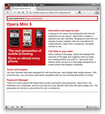
Figure 4: Media Query example on desktop.
The style block of this example (kept inside the HTML file for demonstration purposes) defines some general CSS, which we want applied in all situations, and sets a basic layout with a floated content sidebar. Note that other style rules not directly related to the demonstration of Media Queries have been omitted in the following listing.
body { […] padding: 0 5px; }
[…]
div.sidebar {
	width: 250px;
	padding: 150px 10px 10px 10px;
	float: left;
	font-size: 1.6em;
	[…]
	background: #c60f16 url(mediaqueries-mob.png) no-repeat center 10px;
	[…]
}
[…]
.screen { display: block; }
.mobile { display: none; }
This sort of layout works fine on large screens, but on small-screen devices we would like to keep the layout as a single column.
@media handheld,
	screen and (max-width: 480px),
	screen and (max-device-width: 480px)  {
		.screen { display: none; }
		.mobile { display: block; }
		body { padding: 0; }
		div.sidebar {
			width: auto;
			float: none;
			background: #c60f16 url(mediaqueries-mob-s.png) no-repeat left center;
			margin: 0;
			padding: 10px 5px 10px 160px;
			font-size: 1.3em;
		}
}
The Media Query includes three comma-separated expressions. The CSS in this block is applied if any of the following conditions are met:
- the browser identifies itself as a
handhelddevice. Opera Mini ignores this unless it is explicitly switched to Mobile View by the user - the browser window width or virtual viewport is 480 pixels or less
- the screen width of the device is 480 pixels or less.
To see the Media Query in action, view this example on Opera Mini 5, and try it on Opera desktop and reduce the width of the browser window below 480 pixels — see Figure 5.
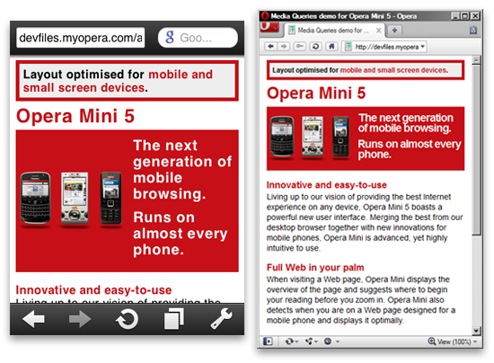
Figure 5: The Media Query example running on Opera Mini 5 and desktop with a narrow window width.
Other tips and caveats
-
Make sure your site is usable both via keyboard and mouse. Mobile phones can have touchscreens or keypads (which then use spatial navigation and virtual mouse pointers) – your Web site should work in both cases.
-
If you decide to create a separate mobile-specific version of your site, make sure that users can still easily reach the full desktop version and set it as their default via a cookie or profile preference.
If you don't have a phone on which you can use Opera Mini, you can use our online Opera Mini demo or run a copy of the browser locally with the MicroEmulator.
As a final point, it is a good idea to test your site in a number of mobile browsers and devices, even if it is just to get some familiarity with the different contexts in which users view your site.
You can find more tips on designing for mobile browsers in our Introduction to the mobile web article.
Summary
We hope you’ve enjoyed this overview of Opera Mini 5. We’ve taken you through its main new features and exciting new Web standards support. As always, let us know how you like it!
This article is licensed under a Creative Commons Attribution-Noncommercial-Share Alike 3.0 Unported license.
Comments
The forum archive of this article is still available on My Opera.
-

setTimeout & setInterval do not work in opera mini... is any replace...
No new comments accepted.http://www.facebook.com/permata.mutiara
Sunday, November 27, 2011