Understanding 3D Transforms
- Introduction
- Keeping it in perspective
- Two-sides to a transformed object
- The transform functions
- Learn More
Introduction
Opera 15 adds a lot of goodies under its hood, including three-dimensional CSS transforms (2D transforms have been available since Opera 10.50). In this article we'll dig in to 3D transforms in detail, looking at the fundamental differences between 3D and 2D transforms, the 3D transforms available, and some demos that show how these work.
Keeping perspective
What separates 3D transforms from 2D transforms is perspective (see Figure 1): creating the illusion of depth and space on a two-dimensional screen by translating points along or around a z-axis.
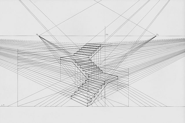
Figure 1: Staircase perspective drawing by Luciano Testoni.
If you've ever studied drawing, you've probably learned how to draw in perspective. Perspective is how you create the illusion of three dimensions when you only have two to work with. First, you create a point on your drawing surface known as the vanishing point. Then you draw guidelines from the edges of the surface to your vanishing point. As you continue to work, these guidelines determine the relative size of each object drawn, tricking the viewer's eye into perceiving depth or distance. Three-dimensional transforms work similarly.
If we think of our drawing surface as a coordinate system, we can also think of our vanishing point as the origin. In a three-dimensional coordinate system, the origin is the location where the x, y, and z axes are all equal to zero (0,0,0) (see Figure 2).
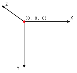
Figure 2: The origin of a three-dimensional coordinate system.
When our drawing surface is a viewport, the x-axis is horizontal, the y-axis is vertical, and the z-axis sits perpendicular to the screen. This is known as the global coordinate system. Point (0,0) sits at the top-left corner of the viewport, and the screen's plane sits at the zero point along the z-axis. A plane, you may remember from geometry class, is a flat, two-dimensional surface.
When we transform an object using the transform property, we create a local coordinate system for the object. Within this local coordinate system, the transform origin by default (you can change its position, as we'll cover later) lies at the object's center, or (50%, 50%, 0). That is 50% along the x — or horizontal — axis, 50% along the y — or vertical — axis, and 0 along the z-axis.
Before we get into the nitty-gritty of transforms, there are a couple more things you should know.
- Transforms are cumulative.
- A transformed object might not be rendered on screen.
Cumulative means that children inherit the transforms applied to their parents. In practical terms, this means, <div style="transform: rotateY(45deg) scaleZ(3)"></div> is the equivalent of a pair of nested div elements, with a rotation transform applied to the parent, and a scaling transform applied to the child. Cumulative also means that a list of transform functions are applied in the order they are listed.
Transforms may not be rendered for a couple of reasons. Usually it's because the transform applied has caused the coordinates of the object to exist outside of the viewport. With transforms along the z-axis, for example, this could mean the coordinates are “behind” the user. In other cases, a transform might not be applied because the cumulative transform matrix is non-invertible — in non-nerdy terms, the math just doesn't work out.
The perspective property
When we apply a transform, our drawing surface becomes a containing block. This can be the <body> element, a <div> element, or any other block-level element. Consider the following HTML and CSS.
<!DOCTYPE html>
<html lang="en">
<head>
    <meta charset="utf-8">
    <title>3D Transforms</title>
    <style type="text/css">
    #stage{
        perspective: 500px;
    }
    .facet{
        transform: rotate3d(-10,0,0,-45deg);
    }
    </style>
</head>
<body>
    <div id="stage">
        <div class="facet">1</div>
        <div class="facet">2</div>
        <div class="facet">3</div>
    </div>
</body>
</html>Note:In this article, we are using un-prefixed versions of relevant properties. Some current browsers, however, and some older browser versions, still require a prefix.
You've probably noticed that we applied our perspective property to #stage rather than to its child elements. That's because perspective sets the stage, so to speak, for the transforms applied to its children (Figure 3). Without the perspective property, your transforms may appear flat and two-dimensional (view perspective demo).
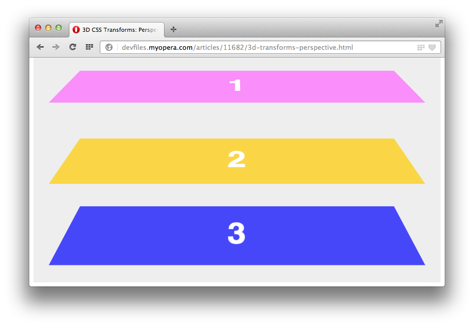
Figure 3: An example of a 3D rotation transform with the perspective property applied.
The perspective property sets the perceived distance between the viewer and the objects we’re transforming. Its value must be either none, or a positive length such as 300, 500px or 10rem. Lower values increase the amount of foreshortening while higher values decrease it (view a perspective change demo).
Setting the value of the perspective property to something other than none creates a containing block: absolutely-positioned child elements will then be offset relative to the transformed object, rather than the document root. The effect is similar to that of position: relative (view a 3D transforms containing demo). Setting a value for the perspective property also creates a stacking context. Transformed items may intersect with or overlap non-transformed objects on screen unless the z-index for each object is explicitly set.
The perspective-origin property
If we use our drawing analogy, we can think of the perspective-origin property as the position of the vanishing point on our drawing surface. Some examples of the property and valid values are as follows:
perspective-origin: 50% 20%;perspective-origin: 200em -800px;perspective-origin: left center;perspective-origin: right bottom;
Unlike the perspective property, negative values are allowed. If two values are provided, and neither is a keyword, the first value is the horizontal or x-offset, and the second value is the vertical or y-offset (view a perspective-origin demo). Let's modify our CSS from above to add a perspective origin.
#stage{
    perspective: 500px;
    perspective-origin: 200% 1500px;
}
As shown below in Figure 4, this CSS creates the effect of looking at our child elements towards a point that is 200% along the x-axis and 1500 pixels along the y-axis.
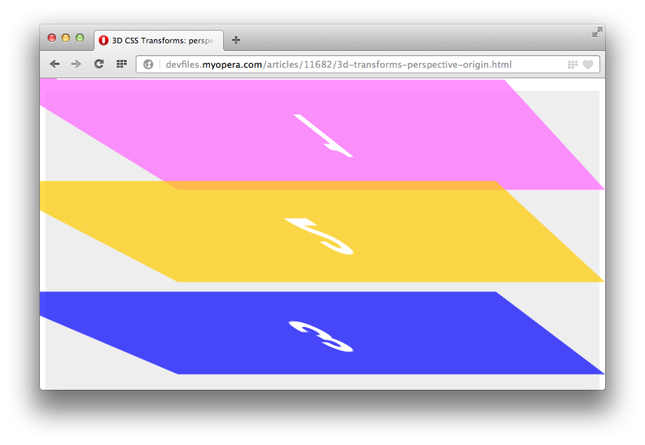
Figure 4: The parent element in this example has a style sheet of perspective-origin: 200% 1500px applied.
Like perspective, the perspective-origin property must be applied to the parent element. They are used to calculate the perspective matrix.
It's also possible to affect perspective using the perspective() transform function on an element. We'll cover that later, in the section on transform functions.
Two-sides to a transformed object: backface-visibility and transform-style
In all of the examples above, we've looked at what amounts to a single plane. So what do we do when we want to mimic both sides of an object, for example a playing card demo? This is where the transform-style and backface-visibility properties come into play.
Think about a playing card. It has two sides, one of which you can see at any given time and one you can't see. Let's look at the markup we might use to create a playing card.
<!DOCTYPE html>
<html lang="en">
<head>
<meta charset="utf-8">
<title>3D Transforms: A playing card</title>
<link rel="stylesheet" type="text/css" href="s.css">
</head>
<body>
<div id="deck">
<div class="card">
<div class="back"> </div>
<div class="front">A♠</div>
</div>
</div>
</body>
</html>Here we have our main container — <div id="deck"> — and our card container, <div class="card">. Nested within our card container are the faces of the card, <div class="back"> and <div class="front">.
Showing or hiding a face with backface-visibility
As mentioned above, at any given time a real playing card has a face you can see and a face you can't. The face you can't see is known as its back face. With 3D transforms, we can control the visibility of this back face using the backface-visibility property. Valid values are visible and hidden. Back faces are visible by default.
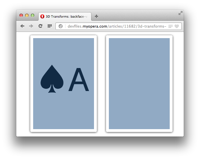
Figure 5: The card on the left has a backface-visibility of visible, while the one on the right has a value of hidden.
In Figure 5 above, the background color for both cards is transparent. The only difference between the two is that the card on the left has a backface-visibility value of visible, while the card on the right has a backface-visibility value of hidden (view the backface-visibility demo).
Setting a transform-style
As with a paper drawing, three-dimensional transforms map three dimensions of coordinates into the two dimensions of a screen. By default, transformed objects behave as a single plane. To mimic depth and dimension, we need to explicitly change that behavior, with the the transform-style property. Valid values for the transform-style property are flat and preserve-3d. The default is flat.
In Figure 6 below, we have three objects whose positions have been translated in the z-direction. Their parent element has also been rotated slightly. When the value of transform-style — applied here to the parent element — is preserve-3d, we see that the transformation shows three elements in faux three dimensional space.
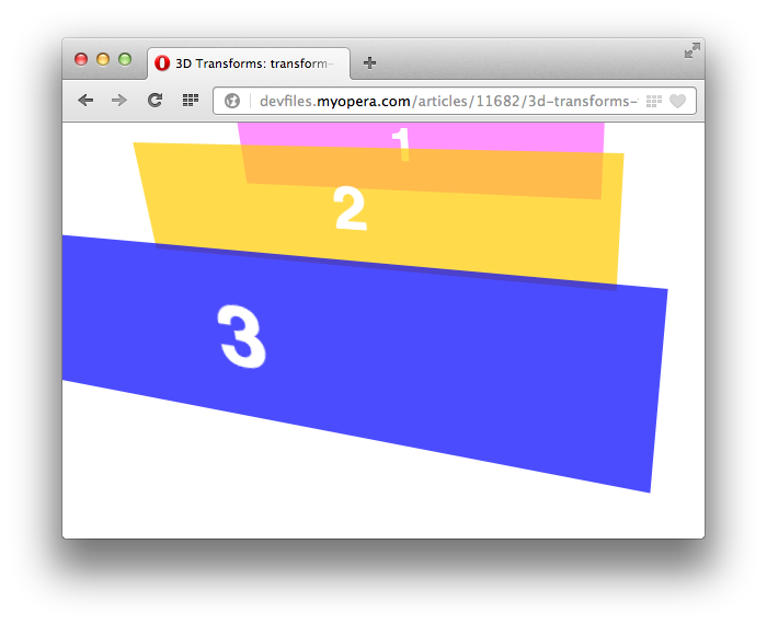
Figure 6: The parent element for these three objects has a transform-style value of preserve-3d.
Contrast that with Figure 7, in which the value of transform-style is flat. These same objects are now rendered as a flattened stack (see transform-style demo).
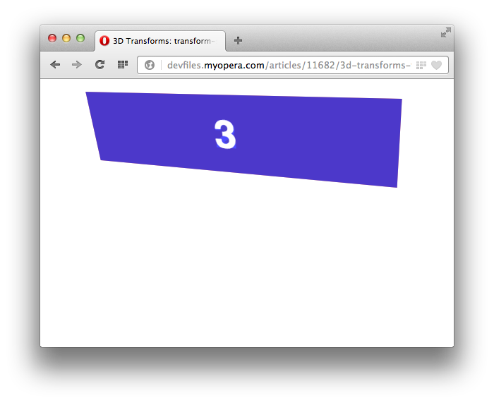
Figure 7: The parent element in this example has a transform-style value of flat, instead of preserve-3d.
Using transform-style: preserve-3d also establishes a stacking context but in some cases, a CSS property can override this. According to their respective specifications, the following properties and values require the user agent to create a flattened representation of child elements before they can be applied.
overflow: hiddenoverflow: scrollfilterwhen the value is other thannone
If your transform isn't rendering correctly, despite using transform-style: preserve-3d, one of these properties is probably the culprit.
The transform functions
Two dimensional transforms allow developers to manipulate an object along the x and y axes or planes. Three dimensional transforms add the ability to manipulate objects along the z axis (or in the z direction). As with 2D transforms, 3D transforms are set using the transform property. Its value must be one or more functions and their arguments. Some examples follow.
transform: rotate3d(0,100,40,15deg)transform: translateZ(-200px) scale3d(2,.5,9) rotateZ(-45deg)transform: perspective(200px) rotate3d(-82,100,40,0.785rad);
perspective()
The perspective() function represents the distance of the z-plane (z = 0) from the viewer. Its argument must have a length such as pixels or ems, and a value greater than zero. Using it causes points to be scaled in the X and Y directions based on their Z values (see Figure 8). Lower values create a more exaggerated perspective effect, while higher values result in a more subtle effect. Try the perspective function demo to get a sense of how it works.
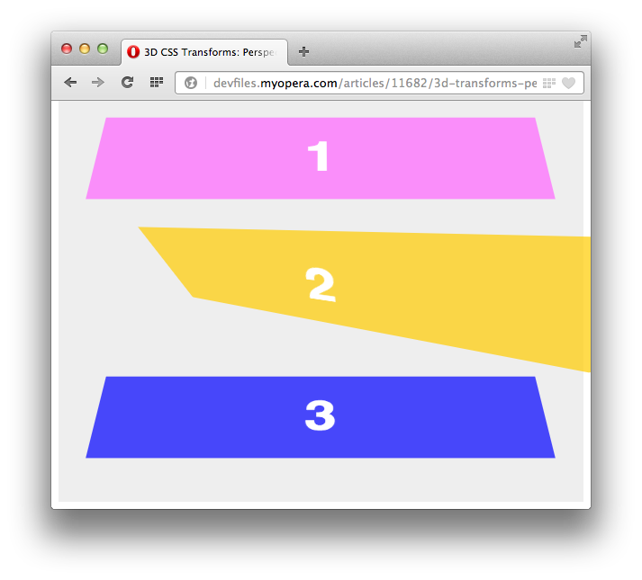
Figure 8: The second figure has a transform: perspective(200px) rotate3d(20,10,0,-45deg) style applied.
By using the perspective() function, you're creating a perspective projection matrix. What's a matrix? Keep reading.
Matrices, vectors, and matrix3d()
In mathematics, a matrix is a rectangle of values. An example of a 4-by-4 matrix is shown in Figure 9.

Figure 9: A 4-by-4 matrix.
Each transform function — perspective(), rotate3d(), and so on — can be described mathematically using a 4-by-4 matrix. The perspective projection matrix is shown below in Figure 10. The d stands for distance.

Figure 10: The perspective projection matrix.
matrix3d() is just a way to declare a 4-by-4 transform matrix using CSS. For two-dimensional transforms, you can use the matrix() or matrix3d() functions; three-dimensional transforms must use the latter. The matrix3d() function accepts 16 arguments. Those arguments correspond to the matrix values m11 through m44.
Consider the perspective projection matrix from above. If we apply a perspective transform of 200 pixels — transform: perspective(200px) — our distance or d value is 200. We can then divide -1 by 200 to arrive at -0.005. In other words, transform: perspective(200px) is the equivalent of transform: matrix3d(1, 0, 0, 0, 0, 1, 0, 0, 0, 0, 1, -0.005, 0, 0, 0, 1).
To create a compound transforms using matrix3d() you'll need to multiply the matrix for each function, then plug the resulting values into the function. This is actually what the browser does when it encounters multiple transform functions in a style declaration. It multiplies the equivalent matrices, and applies the product. Let's try transform: perspective(200px) scale3d(2,3,3). You may recognize the perspective matrix on the left. We will multiply it by the scaling matrix to find the matrix product (Figure 11).

Figure 11: Multiplying the perspective matrix (left) by the three-dimensional scaling matrix.
Our matrix product values are then used as arguments for the matrix3d() function. We could use transform: matrix3d(2, 0, 0, 0, 0, 3, 0, 0, 0, 0, 3, -0.015, 0, 0, 0, 1) instead of transform: scale3d(2,3,3) perspective(200px). My previous article Understanding the CSS Transforms Matrix covers this in a bit more depth.
Order and transform functions
Order matters when dealing with transform functions: transform: perspective(200px) scale3d(2,3,3) renders slightly differently than transform: scale3d(2,3,3) perspective(200px). Why? Because matrices, when multiplied, are not commutative. Changing the order of the matrices results in a different matrix product, and therefore a different transform matrix.
We can see how this works by using getComputedStyle() and getPropertyValue(). These functions will return the equivalent matrix for all transform functions applied to an object, as shown below.
var obj, matrix;
obj = document.getElementById('my_element');
matrix = getComputedStyle(obj).getPropertyValue('transform');
console.log(matrix);
If the transform applied is perspective(200px) scale3d(2,3,3), the equivalent matrix is matrix3d(2, 0, 0, 0, 0, 3, 0, 0, 0, 0, 3, -0.015, 0, 0, 0, 1). Let's flip the order, so that the transform is scale3d(2,3,3) perspective(200px) instead. Then our equivalent, computed matrix is matrix3d(2, 0, 0, 0, 0, 3, 0, 0, 0, 0, 3, -0.005, 0, 0, 0, 1).
Using getComputedStyle() has its limits of course. It only returns the computed value for a single element. It does not tell you the whether its parent element has also been transformed.
Since using matrix3d() can make your CSS more obtuse than necessary, it's best to stick to the transform functions. I'll assume you're already familiar with two-dimensional transforms. For the rest of this article, we'll focus exclusively on 3D transform functions. If you need a primer on two-dimensional transforms, read CSS3 transitions and 2D transforms, our previous article on the subject.
Translating objects with translateZ() and translate3d()
Translation transforms offset the rendering position of an object by the distance provided. You may already be familiar with the translateX(), translateY(), and translate() functions. These functions translate objects along the x-axis, y-axis, or both in the case of translate(). With 3D transforms, we now have two more translation functions at our disposal: translateZ() and translate3d().
As its name suggests, translateZ() causes an object to be offset by the specified distance along the z-axis. The z-axis, of course, is an imaginary line that sits perpendicular to the plane of the screen. Translating along the z-axis affects the perception of distance (view the translateZ demo). Positive lengths appear closer to the viewer (and objects are larger). Negative lengths appear to be farther away (and objects are smaller).
translate3d() works similarly, but accepts three arguments: an x-offset, a y-offset, and a z-offset value. It's a more succinct way to translate an object along all three axes. A transform value of translate3d(200px,300px,-400px), for example, is the equivalent of transform: translateX(200px) translateY(300px) translateZ(-400px).
Scaling objects with scale3d() and scaleZ()
We can scale objects in the x (width) or y (height) dimensions using the scaleX(), scaleY() or scale() functions. With support for 3D transforms, we can also scale in the z (distance) dimension using scaleZ() or in all three dimensions at once using scale3d(). I'll focus on transformations along the z-axis in this section. Be aware, however, that transform: scale3d(2,1,3) is equivalent to transform: scale(2,1) scaleZ(3) and transform: matrix3d(2, 0, 0, 0, 0, 1, 0, 0, 0, 0, 3, 0, 0, 0, 0, 1).
Scaling along the z-axis can be a bit tricky to understand at first. As with all transforms, it has to do with matrix and vector multiplication.
Whenever we apply a transform, the browser multiplies the transform matrix by the coordinates for each of the object's points. This product determines where and whether the transformed object will be rendered. (Remember, if the coordinates exceed the dimensions of the viewport, the object won't be rendered.)
In most cases, when we transform our objects, our z-coordinate is 0. When we apply a z-axis scaling transform to our object, as shown in Figure 12, our z-coordinate remains zero.

Figure 12: We're multiplying a 3D scaling matrix — the equivalent of scaleZ(3) by the coordinates of a point at (100,200,0).
In order to see a visual effect of scaling along the z-axis, the product of our transform matrix and our object's vertices must result in a z value other than zero. Typically this occurs when we use multiple transform functions, and/or nest transformed objects. In Figure 13, we're finding the cumulative transform matrix for transform: scaleZ(10) rotateY(20deg) (which is equivalent to transform: scale3d(1,1,10) rotateY(20deg)).

Figure 13: Multiplying the matrix for a 20 degree rotation along the y axis by the matrix for a scale along the Z axis.
Now, if we multiply this new matrix transform by the coordinates of a point located at (100,200,0), we can see that we now have a z value that's greater than zero (see Figure 14). The transformed coordinate value of our point is (94,200,34).

Figure 14: Finding the transformed coordinates of a point at (100,200,0).
As with two-dimensional scaling, positive numbers greater than 1 increase the value of the z-coordinate. Positive numbers that are greater than zero but less than 1 will decrease them. Negative values for scaling along the z axis will cause the object to appear flipped or inverted. You can get a sense of how these values interact in the 3d scaling demo.
Rotating objects with rotateX(), rotateY() and rotateZ() and rotate3d()
As these function names suggest, rotateX(), rotateY() and rotateZ() rotate an object around the x, y or z axis. Rotations using rotateX() spin elements around a horizontal axis (Figure 15), while those using rotateY() spin elements around a vertical axis.
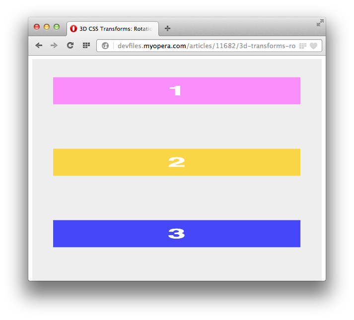
Figure 15: Using rotateX() to tilt objects.
Rotations using rotateZ() are like those of a pinwheel or the hands of an analog clock (Figure 16). They spin around the z-axis, behaving exactly like the 2D rotate() transform function. In fact, rotateZ() and rotate() are aliases. If you are only rotating around the z-axis, rotate() offers the broadest compatibility with older browsers. You can see how each of these functions work in this 3D rotation demo.
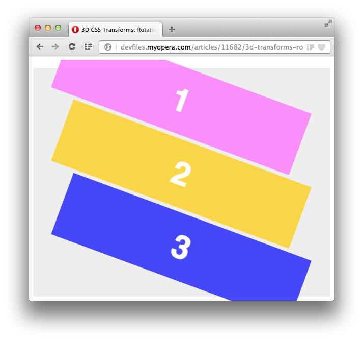
Figure 16: Using rotateZ() to tilt objects.
Each of these functions accept a CSS angle as an argument. Valid values may be degrees (e.g. 45deg), radians (e.g. .21rad), gradians (e.g. 100grad), or turns (e.g. .25turn). Units are defined in the angles section of the CSS Values and Units Module Level 3 specification.
rotate3d() is a bit more complicated, accepting four parameters. The first three must be numbers, either positive or negative. Together they form an [x,y,z] direction vector. The fourth parameter must be an angle, and determines the angle of rotation in the direction specified by the direction vector. See Figure 17 for an example.
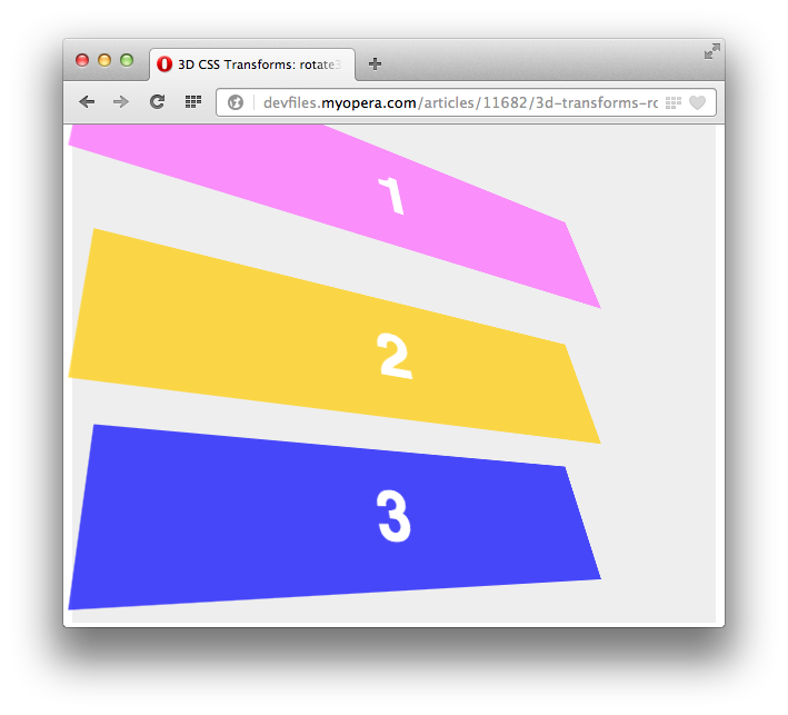
Figure 17: Rotating around two axes using rotate3d(1,1,0,45deg).
In Figure 17, we've tilted these objects by 45 degrees along both the x and y axes. This is actually the equivalent of transform: rotateX(45deg) rotateY(45deg). Similarly, rotate3d(0,0,1,45deg) is equivalent to rotateZ(45deg) and rotate(45deg).
Here's where things get a bit tricky. Because of how the 3D rotation matrix gets calculated, a significantly larger input doesn't create a significantly deeper rotation. A transform of rotate3d(1,1000,1,45deg) renders differently from rotate3d(1,100,1,45deg) — but not by as much as you might expect.
What's the deal? Once again, it's the matrix. Let's use getComputedStyle() here to illustrate the point. The equivalent matrix for rotate3d(1,1000,1,45deg) is as follows (values have been trimmed to 7 decimal places).
matrix3d(0.7071070, 0.0009999, -0.7071057, 0, -0.0004142, 0.9999994, 0.0009999, 0, 0.7071063, -0.0004142, 0.7071070, 0, 0, 0, 0, 1)Compare that to the matrix of rotate3d(1,100,1,45deg), shown below.
matrix3d(0.7071360, 0.0099987, -0.7070067, 0, -0.0041420, 0.9999414, 0.0099987, 0, 0.7070653, -0.0041420, 0.7071360, 0, 0, 0, 0, 1)As you can see, the largest difference between the two matrices are the fifth and tenth parameters. They're 10 times greater in the first matrix than the second, but the values are still small. As a result, when the matrix is applied, the effect is slightly, not wildly different. By manipulating each value in the rotate3d() demo, you can get a better sense of how they interplay.
Learn More
I hope I've cleared up how three-dimensional transforms work without throwing too much linear algebra and geometry at you. Understanding the underlying math goes a long way toward understanding how transforms work and where they might go wrong. I found the following resources helpful.
- CSS Transforms specification from the World Wide Web Consortium
- Transformation matrix from Wikipedia
- Affine transformation, also from Wikipedia
- Geometric Transformations by Dr. Ching-Kuang Shene of Michigan Technological University
This article is licensed under a Creative Commons Attribution-Noncommercial-Share Alike 3.0 Unported license.
Comments
No new comments accepted.