Styling XFN and rel-license links
Introduction
Before the official creation of Microformats, the XHTML Friends Network (XFN) was created by Eric Meyer, Matt Mullenweg, and Tantek Çelik in 2004 to define the human relationships between the authors of websites.
If you have a blogroll on your website or a list of "friends" on a social network, chances are you have real relationships with at least some of the people "behind" those links. Some might be close friends, colleagues, and family members, while others might be just people you have talked to couple of times.
XFN attempts to weave a web, if you will, of relationships between all of these links by creating a standardized method of defining relationships within the very HTML link itself.
To see how XFN works, let's take a look at a sample bit of HTML code:
<ul>
  <li><a href="http://www.example.com/" rel="friend met">Friend's Site</a></li>

  ...

</ul>
The rel attribute within an anchor element defines the relationship the HTML document has to the page that link points to. The relevant relationship here is friendship, which makes the statement that I'm a friend of the author of the linked page.
Moreover, this is a friend that I've actually met. Well, actually I am marking it as having met her anyway, even though she doesn't even know I exist ... we both order the same drink during lunch every other Tuesday at the local pub, and that's it! Anyhow, I digress...Now, in addition to friendship, XFN defines a variety of relationship types including colleague, acquaintance, neighbor, sweetheart, crush, and other familial relationships.
The XFN standard allows us to combine these and other types of relationship in pretty much any way we want. There are many blogs, social communities and tools that take advantage of XFN such as Cork'd, Dopplr and Last FM. For more information about XFN and visualizing the connections, check out Brian Suda's XFN article.
You can download a complete set of example files that demonstrate the techniques illustrated in this article.
Basic example: some XFN-marked up links
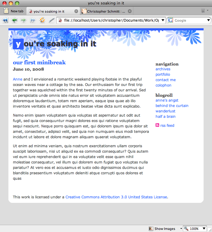
Suppose we have a basic blog post, with a blog-roll in the sidebar as shown in Figure 1:

Figure 1. A blog post with a blogroll.
We have marked up our blog-roll links to indicate the relationship we have to the authors of the respective Web sites (although we might wonder as to the wisdom of admitting to both a sweetheart and a crush simultaneously!):<ul>
<li><a href="http://anne.example.com/" rel="sweetheart met">anne's angst</a></li>
<li><a href="http://www.example.com/" rel="friend met">behind the curtain</a></li>
<li><a href="http://wanderlust.example.com/" rel="colleague">wanderlust</a></li>
<li><a href="http://halfbrain.example.com/" rel="crush muse">half a brain</a></li>
</ul>Styling Relationships
Now, we want to style these links so that these relationships are represented visually, to the user. How can we do this?
Note that there are two elements of a relationship captured by the XFN labels: the nature of the relationship - sweetheart, friend, and so on - and the more basic fact of whether we've physically met the person.
The latter element is easier to style: a simple text marker such as an asterisk, *, next to those we've met could be a sufficient clue. The nature of the relationship is more difficult to represent visually, particularly if we want to keep the indicator simple). Let's first tackle the latter.
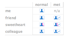
One way to represent these relationships is through icons, which we can place next to the links that include an XFN relationship. Fortunately for us, a set of XFN icons has been developed by Wolfgang Bartleme and Chris Messina for just this purpose, as shown in Figure 2 (also available at the above link).

Figure 2. A set of icons for XFN relationship links.
Not only have they created general XFN icons, but they have also created individual icons for many of the relationships defined through XFN. They provide a potential standardized icon set for recognizing XFN-related data.
To start designing with these new graphics, we want to attach these icons to their respective links by applying CSS rules to the right attribute selectors. That is, we want to attach particular icons depending on the values of the rel attribute. For example, let's take a look at the first blog-roll link:
<a href="#" rel="sweetheart met">anne's angst</a>The rel attribute contains two values: "sweetheart" and "met". And there are two XFN icons corresponding to the sweetheart relationship: one for those sweethearts we haven't met and those we have.
Of course, here we want to display the latter icon. How to do that?
We want to first target those links that have "sweetheart" as a rel value. So, we could begin with the following selector:
a[rel="sweetheart"]This, however, would only target links where the value of the rel attribute exactly matches "sweetheart". This would not pick out the above link, as the value is "sweetheart met" (not "sweetheart"). Let's use the ~= operator instead:
a[rel~="sweetheart"]This matches any set of words that that contains the string "sweetheart".
However, our selector still isn't quite right yet. This selector would pick out any sweetheart, including those we haven't met. So, we want to make it a bit more specific.
a[rel~="sweetheart"][rel~="met"]Now, this CSS selector only styles those links that we've designated as a sweetheart that we've met. Now that we've pinpointed the right links, how do we style them? The most straightforward way is to attach an icon using the :before or :after pseudo-selectors. These can be used to easily generate content before or after an element.
a[rel~="sweetheart"][rel~="met"]:after {
  content: url(../images/xfn-sweetheart-met.png);
}
Here, we've told the browser to place the image specified in the URL (the XFN icon) after the link. We'll want to add similar rules for all of the other possible XFN combinations that we'd want to style:
a[rel~="friend"]:after {
    content: url(../images/xfn-friend-met.png);
}

a[rel~="friend"][rel~="met"]:after {
    content: url(../images/xfn-friend-met.png);
}

a[rel~="colleague"]:after {
    content: url(../images/xfn-colleague.png);
}

a[rel~="colleague"][rel~="met"]:after {
    content: url(../images/xfn-colleague-met.png);
}

a[rel~="sweetheart"]:after {
    content: url(../images/xfn-sweetheart.png);
}

a[rel~="sweetheart"][rel~="met"]:after {
    content: url(../images/xfn-sweetheart-met.png);
}

a[rel~="crush"]:after {
    content: url(../images/xfn-sweetheart.png);
}

a[rel~="crush"][rel~="met"]:after {
    content: url(../images/xfn-crush-met.png);
}
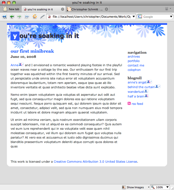
Note that there aren't actually any "crush" icons; I'll leave that icon creation as an exercise to the reader. In the meantime I'm just using the sweetheart icons as a substitute. When we're done, our page looks like Figure 3:

Figure 3. Inserting XFN icons after links.
Now all of the links in our blogroll (as well as a link within our blog post) sport XFN icons to indicate our relationship to the individuals referred in our listing. Note the check-mark in those icons representing those that we've met.
While this method works for attaching these icons to our links, we may wish to have a bit more control over the positioning of the icons. For the more particular among us, we could set the icons as a background image, rather than as generated content after the element. Let's explore this technique in the next section.
Introducing Rel-license
Another microformat that defines the relationship of a link to a web page is the rel-license format. You are undoubtedly familiar with the varieties of license that apply to content on the web. From strictly copyrighted works to the looser GNU license and Creative Commons licenses, artists, photographers, programmers and authors have an array of options for displaying and protecting their work on the web.
Many web pages include links to the licenses pertaining to the work therein, and the rel-license format provides a standardized way to identify licenses within a web document. Not only can you then use CSS to style these links (as we demonstrate shortly), but third-party web applications can crawl the web for works containing particular licenses. Check out http://search.creativecommons.org/ for a demonstration.
To style rel-license links, first, let's take a look at an HTML sample:
This work is licensed under a <a rel="license" href=http://creativecommons.org/licenses/by/3.0/us/>Creative Commons Attribution 3.0 United States License</a>.This links to a version of the popular standard Creative Commons license. Like the XFN links, we will add a small icon next to the link representing the type of license the web page is protected under, in this case the Creative Commons logo.
Instead of using the :after pseudo-selector to generate the icon, we will set the icon as the link's background image as this approach has better browser support:
a[rel="license"] {
    padding-left: 16px;
    background: url(../images/cc_small.png) no-repeat left;
}
Note: The use of :after to generate content works in the Safari, Firefox and Opera browsers, but not in IE7.
We have again used the attribute selector to pick out links whose rel attribute has a particular value: here, "license". We then take that link and add a bit of padding to it (to make room for the icon). Finally, we add the icon as our background image, set it to the left of the link and stop it from tiling.
When we're done, our link looks as seen in Figure 4:

Figure 4. Icon is inserted before link.
Note how there is a bit more space between the link and the icon here than in the XFN examples. Using the background-image technique lets us control where the icon is with respect to the link.
Summary
The techniques discussed above provide you with a couple of good methods of spicing up your microformat links, adding usability to your documents via subtle visual indicators.
This article is licensed under a Creative Commons Attribution, Non Commercial - Share Alike 2.5 license.
Comments
The forum archive of this article is still available on My Opera.
No new comments accepted.