Opera Mobile 10 beta 2 developer’s introduction
This article is deprecated; instead, we refer to Mobile-friendly: The mobile web optimization guide and An introduction to meta viewport and @viewport.
Introduction
Opera Mobile is our web browser for high-end phones and we have just released the second beta of version 10, which can be installed on Windows Mobile and Nokia smartphones. To find out whether your phone will run it and how to download it, visit our Opera Mobile section. As well as being a double-digit Opera Mobile release, Opera Mobile 10 beta 2 is also the first Opera browser to use our Presto 2.4 rendering engine, which features enhanced standards support.
Opera Mobile is a complete web browser installed on your mobile phone — all the code rendering and JavaScript interaction happens on your mobile. This is in contrast to Opera Mini, where the rendering happens on the server and a compressed version is then sent to the handset.
Opera Mobile 10 features
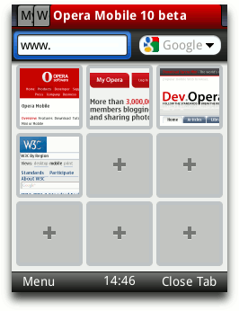
Figure 1: Opera Mobile 10 beta 2 UI
Once you’ve installed Opera Mobile 10 and launched the application, the first thing you’ll notice is the new UI. Figure 1 demonstrates the new tabs, icons and also Speed Dial, the popular feature we pioneered in our desktop browser. Speed Dial has now been ported to Opera Mobile and appears when you start the browser, open a new tab or select Start Page from the menu, giving you fast access to your favorite sites. And if you're already using Opera on your desktop or on another device, you can now keep all your bookmarks, Speed Dials and settings synchronized thanks to Opera Link.
A lot of work has gone into streamlining the look and feel of our browser products across different devices, so using Opera Mobile 10 will be a familiar experience to anyone who has already used Opera Mini 5 beta 2 (or newer).
Like its big brother on the desktop, Opera Mobile 10 also features Opera Turbo. If you are browsing the Web in an area of low or patchy bandwidth, you can turn on Opera Turbo to compress web sites by up to 70%, depending on your circumstances.
If you dive into the Settings, you’ll find many more options, such as Mobile view, which displays content in a single column, as well as advanced privacy management settings and more. And just like its desktop counterpart, you can enter opera:config in the address bar for power user tweaks.
The Opera Mobile 10 beta 2 user agent string
Similar to Opera 10 for desktop, Opera Mobile 10 beta 2 identifies as Opera 9.8, version 10.00. The user agent string for the Nokia version is as follows:
Opera/9.80 (S60; SymbOS; Opera Mobi/315; U; en-GB) Presto/2.4.15 Version/10.00And for the Windows Mobile version:
Opera/9.80 (Windows Mobile; WCE; Opera Mobi/WMD-50286; U; en) Presto/2.4.13 Version/10.00Note that in general, Opera can be identified by using JavaScript to test for the window.opera object.
Optimizing for mobile
Generally, you shouldn’t sniff for browsers and serve different content to different user agents. Instead, you can make your sites work well across a variety of devices and screen sizes using common HTML and CSS hooks. This section has more details on how to do this.
Viewport meta tag
When loading a Web page in Opera Mobile, you get a zoomed-out overview of the page and then can pan and zoom into selected content in just a few clicks. While this approach works fine for most websites, it is possible to further enhance the user experience by presenting an already-zoomed in view of the page to give it a more application-like feel.
By including a viewport meta tag in the head section of the page, you can override the default width a page gets on mobile — Opera Mobile assumes this is 850 pixels — and instead sets an arbitrary pixel value such as 320, 480, etc. For cross-device compatibility purposes and easy calculating, we recommend setting the width to the device-width variable, as follows:
<meta name="viewport" content="width=device-width" />This adjusts the page width to fit in the full width of the screen, or put differently, it makes one CSS pixel equal to one device pixel.
A lot of websites use the viewport meta tag only on a different “mobile” URL, but it is worth pointing out that by combining it with Media Queries, it is possible to just have one page that works well and is optimized for several screen sizes.
Media Queries
Media Queries are a CSS3 feature that allow you to specify under what conditions a style sheet should be applied. They are included using the @media at-rule, a media type, and optional expressions that limit the scope of the style sheet. For instance, to limit a style sheet to only apply to a screen with a viewport of 480 pixels or less, you could use the following Media Query:
@media screen and (max-width: 480px) {
  background-color: red;
  font-size: 1.5em;
}
Note the relationship to the viewport width here: when the page is loaded in a desktop browser, the viewport width is the width of the browser window; when it is loaded in Opera Mobile 10 beta 2, the viewport width is defined by the viewport meta tag, unless there is none present, in which case it defaults to 850 pixels.
You can try this out for yourself by loading our Media Queries + viewport example in Opera Desktop and then on Opera Mobile 10 beta 2. On desktop, we get a three column layout for browser widths wider than 800 pixels — the page gets a different layout when the browser is resized. On Opera Mobile 10 beta 2, a viewport of width=device-width (in the case of the Nokia 5800 in portrait mode this translates to 360 pixels) triggers the @media screen and (max-width: 400px) {} style rules to be applied, and the three column page turns into a single column one.
Improved remote debugging with Opera Dragonfly
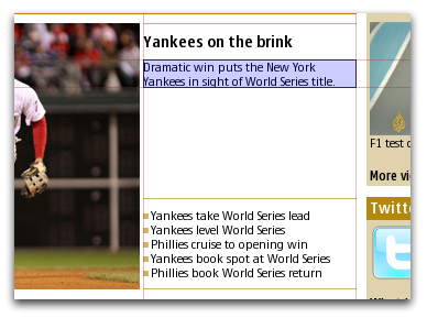
Figure 2: Opera Dragonfly element highlight
As with earlier Opera Mobile releases, Opera Dragonfly allows you to debug your web pages directly on your mobile phone. To debug pages in Opera Mobile 10 beta 2, open Opera Dragonfly in Opera Desktop (Tools > Advanced > Developer Tools) and follow the instructions in the Dev Opera remote debugging article. As Opera Mobile 10 uses Presto 2.4, Opera Dragonfly will have to download a new compatible version before you can start debugging.
The main new feature in Opera Dragonfly and Opera Mobile 10 beta 2 is the element highlight. This feature highlights the metrics of the currently selected element, so when you click on a element, it is highlighted along with alignment guides. When clicking on the Layout tab in the DOM inspector, you can hover over the different metrics such as the margin or padding to highlight that part of the element. The highlight colors are fully customizable (go to the Settings tab and click on the Spotlight heading.)
New standards support
Opera Mobile 10 beta 2 is the first Opera browser release to feature our new Presto 2.4 rendering engine. The new engine supports everything featured in Presto 2.3, plus some new additions.
For this beta release, we have not enabled Vega accelerated rendering yet, so features such as border-radius, box-shadow, etc. that depend on our Vega graphics backend don’t work for now. Also note that this is an early version of Presto 2.4 and not all standards features have been included in this release. We have more in the pipeline for future Opera Mobile 10 versions, so stay tuned.
That being said, Presto 2.4 brings new support for a couple of interesting CSS properties to Opera Mobile 10 beta 2; we explore these in the sections below.
Background-origin
background-origin and background-repeat (see below) are part of the CSS3 Backgrounds and Borders module and are closely related. Both showcases also use some oh-so-handy Media Queries so the layout is optimized for both mobile and desktop users.
The first showcase demonstrates background-origin. This property specifies the starting point of any background image you apply to an element; the values it can take are as follows:
padding-box: Positions the background image relative to the outer edge of the padding (inner edge of the border). This is the default behaviorborder-box: Positions the background image relative to the outer edge of the bordercontent-box: Positions the background image relative to the outer edge of the content (inner edge of the padding)
The example shows three divs with the same background image applied to them and a similar double border. Each one has a different background-origin value set on it. From left to right, these are background-origin: padding-box, background-origin:border-box and background-origin:content-box. Figure 3 shows the different effects these have.
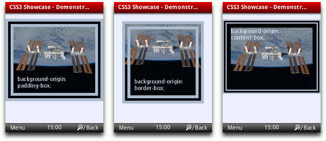
Figure 3: The difference between background-origin:padding-box, background-origin:border-box and background-origin:content-box.
Background-repeat
The second showcase highlights two new values for background-repeat, namely round and space, both introduced to tidy up repeated background images that don’t fit neatly into your container.
round: The background image is resized to fit in the container a whole number of times.space: Whitespace is inserted between background images to fit in the container a whole number of times.
In the two examples in Figure 4 the background images both have the same width of 100 pixels. In the first example, the dinosaur would normally appear two and a half times horizontally; the effect of round is to shrink the image so that three instances can fit neatly into the container.
The second example works in a similar way but whitespace is resized instead of images. Again, the dinosaur would normally appear two and a half times horizontally, but the use of space has resulted in just two images being displayed with padding between them.
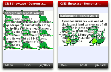
Figure 4: The difference between background-repeat:round and background-repeat:space.
Word-wrap
the word-wrap property is nice and straightforward taking either of two values, normal or break-word. The default setting is normal, meaning that lines are only broken at allowed break points such as spaces, for example. Changing this to break-word forces words to be broken if they would otherwise overflow beyond their container, as in Figure 5.
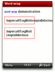
Figure 5: Word-wrap demo
word-wrap should not be confused with text-wrap, which sets the mode for text wrapping. Also note that word-wrap is only effective if text-wrap is set to normal (default) or suppress.
Summary
That wraps up our introduction to Opera Mobile 10 beta 2. We’ve taken you through its main new features and exciting new web standards support. As always, let us know how you like it!
This article is licensed under a Creative Commons Attribution, Non Commercial - Share Alike 2.5 license.
Comments
The forum archive of this article is still available on My Opera.
No new comments accepted.