New form features in HTML5
Introduction
HTML5 includes many new features to make web forms a lot easier to write, and a lot more powerful and consistent across the Web. This article gives a brief overview of some of the new form controls and functionalities that have been introduced.
- Bad form?
- Introducing our example
- New form controls
- New attributes
- New output mechanisms
- Validation
- Styling with CSS3
- Cross browser?
Bad form?
Let's face it – HTML forms have always been a pain. They are not much fun to mark up and they can be fiddly to style – especially if you want them to be consistent cross-browser and fit in with the overall look and feel of your site. And they can be frustrating for your end users to fill out, even if you create them with care and consideration to make them as usable and accessible as possible. Creating a good form is more about damage limitation than pleasurable user experiences.
Back when HTML 4.01 became a stable recommendation, the web was a mostly static place. Yes, there was the odd comment form or guest book script, but generally web sites were there for visitors to simply read. Since then, the web has evolved. For many people, the browser has already become a window into a world of complex, web-based applications that try to bring an almost desktop-like experience.

Figure 1: Some complicated non-native form controls, faked with JavaScript.
To fill the need for the more sophisticated controls required for such applications, developers have been taking advantage of JavaScript libraries and frameworks (such as jQueryUI or YUI). These solutions have certainly matured over the years, bringing rich functionality to web pages and even starting to incorporate screenreader support through bridging technologies like WAI-ARIA. But essentially, they're a workaround to compensate for the limited form controls available in HTML. They “fake” the more complex widgets (such as date pickers and sliders) by layering additional (not always semantic) markup and a slew of JavaScript on top of pages.
HTML5 aims to standardise some of the most common rich form controls, making them render natively in the browser and obviating the need for these script-heavy workarounds.
Introducing our example
To illustrate some of the new features, this article comes with a basic HTML5 forms example. It's not meant to represent a "real" form (as you'd be hard-pressed to find a situation where you need all the new features in a single form), but it should give you an idea of how the various new aspects look and behave.
Note: the look and feel of the new form controls and validation messages differs from brower to browser, so styling your forms to look reasonably consistent across browsers will still need careful consideration.
New form controls
As forms are the main tool for data input in Web applications, and the data we want to collect has become more complex, it has been necessary to create an input element with more capabilities, to collect this data with more semantics and better definition, and allow for easier, more effective error mnagement and validation.
<input type="number">
The first new input type we'll discuss is the number type:
<input type="number" … >This creates a special kind of input field for number entry – in most supporting browsers this appears as a text entry field with a spinner control, which allows you to increment and decrement its value.

Figure 2: A number input type.
<input type="range">
Creating a slider control to allow you to choose between a range of values used to be a complicated, semantically dubious proposition, but with HTML5 it is easy — you just use the range input type:
<input type="range" … >
Figure 3: A range input type.
Note that, by default, this input does not generally show the currently selected value, or even the range of values it covers. Authors will need to provide these through other means – for instance, to display the current value, we could us an output element together with some JavaScript to update its display whenever the user has interacted with the form:
<output onforminput="value=weight.value"></output><input type="date"> and other date/time controls
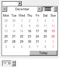
HTML5 has a number of different input types for creating complicated date/time pickers, for example the kind of date picker you see featured on pretty much every flight/train booking site out there. These used to be created using unsemantic kludges, so it is great that we now have standardized easy ways to do this. For example:
<input type="date" … >
<input type="time" … >
Respectively, these create a fully functioning date picker, and a text input containing a separator for hours, minutes and seconds (depending on the step attribute specified) that only allows you to input a time value.

Figure 4: date and time input types.
But it doesn't end here — there are a number of other related input types available:
datetime: combines the functionality of two we have looked at above, allowing you to choose a date and a timemonth: allows you to choose a month, stored internally as a number between 1-12, although different browsers may provide you with more elaborate choosing mechanisms, like a scrolling list of the month namesweek: allows you to choose a week, stored internally in the format 2010-W37 (week 37 of the year 2010), and chosen using a similar datepicker to the ones we have seen already
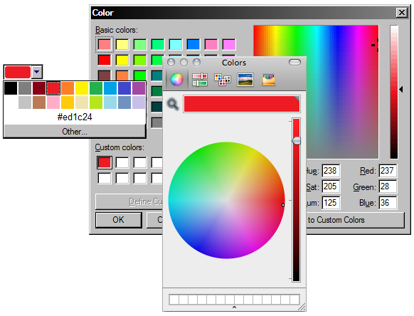
<input type="color">
This input type brings up a color picker. Opera's implementation allows the user to pick from a selection of colors, enter hexadecimal values directly in a text field, or to invoke the OS's native color picker.

Figure 5: a color input, and the native color pickers on Windows and OS X.
<input type="search">
The search input type is arguably nothing more than a differently-styled text input. Browsers are meant to style these inputs the same way as any OS-specific search functionality. Beyond this purely aesthetic consideration, though, it's still important to note that marking up search fields explicitly opens up the possibility for browsers, assistive technologies or automated crawlers to do something clever with these inputs in the future – for instance, a browser could conceivably offer the user a choice to automatically create a custom search for a specific site.

Figure 6: A search input as it appears in Opera on OS X.
<datalist> element and list attribute
Up until now we have been used to using <select> and <option> elements to create dropdown lists of options for our users to choose from. But what if we wanted to create a list that allowed users to choose from a list of suggested options, as well as being able to type in their own? That required fiddly scripting – but now you can simply use the list attribute to connect an ordinary input to a list of options, defined inside a <datalist> element.
<input type="text" list="mydata" … >
<datalist id="mydata">
    <option label="Mr" value="Mister">
    <option label="Mrs" value="Mistress">
    <option label="Ms" value="Miss">
</datalist>
Figure 7: Creating an input element with suggestions using datalist.
<input type="tel">, <input type="email"> and <input type="url">
As their names imply, these new input types relate to telephone numbers, email addresses or URLs. Browsers will render these as normal text entry inputs, but explicitly stating what kind of text we're expecting in these fields plays an important role in client-side form validation. Additionally, on certain mobile devices the browser will switch from its regular text entry on-screen keyboard to the more context-relevant variants. Again, it's conceivable that in the future browsers will take further advantage of these explicitly marked-up inputs to offer additional functionality, such as autocompleting email addresses and telephone numbers based on the user's contacts list or address book.
New attributes
In addition to explicit new input types, HTML5 defines a series of new attributes for form controls that help simplify some common tasks and further specify the expected values for certain entry fields.
placeholder
A common usability trick in web forms is to have placeholder content in text entry fields – for instance, to give more information about the expected type of information we want the user to enter – which disappears when the form control gets focus. While this used to require some JavaScript (clearing the contents of the form field on focus and resetting it to the default text if the user left the field without entering anything), we can now simply use the placeholder attribute:
<input type="text"… placeholder="John Doe">
Figure 8: A text input with placeholder text.
autofocus
Another common feature that previously had to rely on scripting is having a form field automatically focused when a page is loaded. This can now be achieved with the autofocus attribute:
<input type="text" autofocus … >Keep in mind that you shouldn't have more than one autofocus form control on a single page. You should also use this sort of functionality with caution, in situations where a form represents the main area of interest in a page. A search page is a good example – provided that there isn't a lot of content and explanatory text, it makes sense to set the focus automatically to the text input of the search form.
min and max
As their name suggests, this pair of attributes allows you to set a lower and upper bound for the values that can be entered into a numerical form field, for example number, range, time or date input types (yes, you can even use it to set upper and lower bounds for dates – for instance, on a travel booking form you could limit the datepicker to only allow the user to select future dates). For range inputs, min and max are actually necessary to define what values are returned when the form is submitted. The code is pretty simple and self-explanatory:
<input type="number" … min="1" max="10">step
The step attribute can be used with a numerical input value to dictate how granular the values you can input are. For example, you might want users to enter a particular time, but only in 30 minute increments. In this case, we can use the step attribute, keeping in mind that for time inputs the value of the attribute is in seconds:
<input type="time" … step="1800">New output mechanisms
Beyond the new form controls that users can interact with, HTML5 defines a series of new elements specifically meant to display and visualise information to the user.
<output>
We've already mentioned the output element when talking about the range input – this element serves as a way to display the result of a calculation
, or more generally to provide an explicitly identified output of a script (rather than simply pushing some text into in a random span or div with innerHTML, for instance). To make it even more explicit what particular form controls the output relates to, we can – in a similar way to label – pass a list of IDs in the element's optional for attribute.
<input type="range" id="rangeexample" … >
<output onforminput="value=rangeexample.value" for="rangeexample"></output>
<progress> and <meter>
These two new elements are very similar, both resulting in a gauge/bar being presented to the user. Their distinction is in their intended purpose. As the name suggests, progress is meant to represent a progress bar, to indicate the percentage of completion of a particular task, while meter is a more generic indicator of a scalar measurement or fractional value.

Figure 9: A progress indicator bar.
Validation
Form validation is very important on both client- and server-side, to help legitimate users avoid and correct mistakes, and to stop malicious users submitting data that could cause damage to our application. As browsers can now get an idea of what type of values are expected from the various form controls (be it their type, or any upper/lower bounds set on numerical values, dates and times), they can also offer native form validation – another tedious task that, up to now, required authors to write reams of JavaScript or use some ready-made validation script/library.
Note: for form controls to be validated, they need to have a name attribute, as without it they wouldn't be submitted as part of the form anyway.
required
One of the most common aspects of form validation is the enforcement of required fields – not allowing a form to be submitted until certain pieces of information have been entered. This can now simply be achieved by adding the required attribute to an input, select or textarea element.
<input type="text" … required>
Figure 10: Opera's client-side validation in action, showing an error for a required field that was left empty.
type and pattern
As we've seen, authors can now specify the kinds of entries they expect from their form fields – rather than simply defining text inputs, authors can explicitly create inputs for things like numbers, email addresses and URLs. As part of their client-side validation, browsers can now check that what the user entered in these more specific fields matches the expected structure – in essence, browsers evaluate the input values against a built-in pattern that defines what valid entires in those types of inputs look like, and will warn a user when their entry didn't match the criteria.

Figure 11: Opera's error message for invalid email addresses in an email input.
For other text entry fields that nonetheless need to follow a certain structure (for instance, login forms where the usernames can only contain a specific sequence of lowercase letters and numbers), authors can use the pattern attribute to specify their own custom regular expression.
<input type="text" … pattern="[a-z]{3}[0-9]{3}">
Styling with CSS3
In concert with HTML5's built-in form validation, the CSS3 Basic User Interface Module defines a series of new pseudo-classes that can be used to differentiate required fields and to change the appearance of form controls dynamically based on whether or not they have been filled in correctly:
:requiredand:optionallet us explicitly style controls based on whether or not they have a required attribute:validand:invalidwill apply styles to form controls subject to client-side validation:in-rangeand:out-of-rangespecifically works with controls that feature a min and/or max attribute
In our example form, we're only applying specific validity and range styles on text, email, url and number inputs when they are currently focused, so users would get some immediate visual feedback while entering information into those fields, but without affecting the overall look of the form in general.
input[type=text]:focus:valid,
input[type=email]:focus:valid,
input[type=number]:focus:in-range { outline: 2px #0f0 solid; }

input[type=text]:focus:invalid,
input[type=email]:focus:invalid,
input[type=number]:focus:out-of-range { outline: 2px #f00 solid; }
Figure 12: :valid and :invalid styles being applied dynamically as an email address is entered.
Cross browser?
On the desktop, Opera currently has the most complete implementation of new input types and native client-side validation, but support is on the roadmap for all other major browsers as well, so it won't be long before we can take advantage of these new powerful tools in our projects. But what about older browser versions?
By design, browsers that don't understand the new input types (like date or number) will simply fall back to treating them as standard text inputs – not as user-friendly as their advanced HTML5 counterparts, but at the very least they allow for a form to be filled in. However, as with most of the new HTML5 functionalities, we can offer a nicer fallback for users of browsers that aren't quite up to speed with HTML5 forms by doing basic JavaScript-based feature-detection and, only if needed, proceed to load external JavaScript libraries to “fake” the support for more complex form control widgets and validation. This way, we can code for the future, while not alienating any of our users.
This article is licensed under a Creative Commons Attribution-Noncommercial-Share Alike 3.0 Unported license.
Comments
The forum archive of this article is still available on My Opera.
-

Came across this while reading up about HTML5 form support, and thrilled to see that the browser I've been using for over a decade now has the most complete support for this key feature. However, it'd be great if there could be a clear distinction between the indeterminate state and progress=0.
-

HTML5 is the future, no doubt about that, these days only problem is the Cross Browsers Compatibility. I don't know what kind of result this would be having on different browsers. Lets try and see. Thanks for your efforts.
-

Thank your for this tutorial on HTML5. As a beginner, it is very useful.
-

great article! CSS3+HTML5 definitely love Forms!
No new comments accepted.Mahesh Jagadeesan
Thursday, May 17, 2012
Wijdan Rohail
Thursday, January 3, 2013
operafan59
Friday, February 8, 2013
tobto
Wednesday, February 27, 2013
лечение простатита