Cross-device development techniques for widgets
24th April 2012: Please note
Starting with Opera 12, Opera Widgets will be turned off for new users and completely removed in a later release. If you're interested in building addons for Opera, we recommend going with our extensions platform — check out our extensions documentation to get started.
This article looks at techniques, code examples, and tips for doing cross-device development of widgets. The techniques are grouped into the following sections: Usability, Architecture, Layout, Images and effects, Network, Client-server communication, DOM, and JavaScript.
- Usability
- Architecture
- Layout
- Images and effects
- Network
- Client-server communication
- DOM
- JavaScript
- Resources
Usability
This section deals with how you organize the user interface in such a way that it is easy to learn and easy to use. In the technical aspects of cross-device development, this means considering among other things the input mechanism being used and the use of labelling.
Keep the widget simple
A widget should have a limited set of functions and focus on doing these functions well. Each view should be simple and clutter free. The more complicated user interface elements are and the more information present of each view, the more difficult it is to adapt the widget to different devices.
Offer larger click surfaces
In the case of virtual cursors (or example on mobile) or remote controls (for example on the Wii), it is important to make sure buttons and other clickable surfaces are easy to spot and easy to hit. Tiny buttons require precision to hit, which makes the widget difficult to use. One way to handle this is to resize controls and/or change font sizes in the case of different media using media queries, for example:
@media tv {
  #updateButton {
    font-size: 18px;
  }
}
Replace or enhance text input
Devices such as mobiles often have cumbersome keyboards, which means entering text is difficult. Your application should be prepared to supply alternatives to text input or at least simplify the input mechanism. In general, text input should only be used for long and unpredictable text. You should consider replacing all predictable text input with lists or similar controls regardless of device – there will always be a usability gain here. Less predictable text inputs, for example blog entries, obviously require proper text input. You should consider whether your application or parts of it is suited for cross-device usage in this case.
If you wish to retain text input controls, there are some ways of improving them:
- Enhance the text field with auto completion and a list of options.
- Replace or overlay a standard text-input field with a
selectelement containing common options.
The HTML5 specification defines several extensions to existing HTML form controls. Most interesting in this case are the datalist element, list attribute and autocomplete attribute.
The datalist element allows you to connect a text field to a list of options presented when the user starts to type. The autocomplete attribute used with a form control is on by default and determines if autocompletion should be allowed for that control.
The following example shows how to use the datalist element:
<input id="country" name="country" type="text" list="countries">
<datalist id="countries">
  <option label="Norway" value="no">
  <option label="Sweden" value="se">
  <option label="Denmark" value="dk">
</datalist>
In this case, the browser will render a select box connected to the text field. When the user types, suggestions are taken from the datalist and displayed in a select box below the text field. The rendering and suggestions are done natively, which should result in good performance. In this example, the datalist element is static, but its data could be loaded through Ajax and the element constructed through the DOM.
This may not be enough – some times you may want to get rid of the text input altogether and replace it with a select box with predefined values. The following code snippet shows an example of how to do this:
if ( isHandheld ) //We don't want the user to type a country on a handheld
{
    var countries = { 'no' : 'Norway', 'se' : 'Sweden', 'dk' : 'Denmark' };

    //Construct the new select box
    var countrySelect = document.createElement('select');
    countrySelect.name = 'country';
    countrySelect.id = 'countries';
    var opt;

    for ( country in countries )
    {
        opt = countrySelect.appendChild(document.createElement('option'));
        opt.value = country;
        opt.textContent = countries[country];
    }

    //Replace the input field with the select box
    var countryInput = document.getElementById('countries');
    countryInput.parentNode.replaceChild( countrySelect, countryInput );
}
In this example, any labels related to the form control will point to the new select box. Note that you may need to change styling when doing this kind of replace.
Use hover effects for improved usability, but do not rely on them
Hover effects are great for telling the user that something can be activated – they may for example add outlines, change a background image in the control, or give it an outline or increased border. There is however and issue with them – input devices such as touch screens will never be able to make use of such mechanisms. You should therefore strive to make your UI easy to understand and manipulate regardless of the availability of hover effects. Adding hints about what can be manipulated can be done by giving controls in your application font colours or background colours that make them stand out, borders, or increased font size or font weight.
Below is an example of how to make things stand out using CSS:
#updateButton {
  font-weight: bold;
}
/*Improve the usability by adding more hints*/
#updateButton:hover {
  outline: 4px solid blue;
}
Architecture
This section deals with how you organize your code into modules and how these modules process data in your application.
Use model-view-controller and separate data from views
In order to more easily adapt widgets to different devices, you should split your widget code into multiple parts. The MVC pattern is a good example of this. The format of data is defined in the model, while how that data is presented is defined in the view, separating the two concerns. The view is responsible for creating markup and styles based on the data in the model. The controller will listen for changes in the view, inform the view, and ask the view to update itself. For example:
var contacts = [];  //A very simple model
//...
// Some controller code
document.getElementById('addContactButton').addEventListener( 'click', function () {
{
    //Get data from the view
    contacts.push( { 'name' : name, 'number' : number } );
    view.showContactList(); //Ask the view to update the info
}, false );
One advantage of using this model is that you can implement multiple views on top of the same data, for example adapted for different types of devices.
Build views when you need them, and throw them away when you are done.
Specific views, such as “tabs” in a widget, should be constructed when they are needed. If you construct all tabs in the beginning, the application will take longer to load. Furthermore, in keeping with the MVC pattern, they should be destroyed rather than hidden. This means should avoid display: none.Instead, rebuild the view from scratch every time the it is shown. This helps you avoid inconsistencies with the data in your views.
Layout
This section deals with how you organize the elements in the user interfaces of your applications. Different devices have different display capabilities, screen sizes, and so on. In order to be a cross-device widget, it will need to be able to adapt itself to the circumstances.
Use media types and media queries to adapt layout
We recommend the following policy: Use media queries to detect the screen capabilities of the device and adapt the layout accordingly. Use the handheld media type as a fallback to recognize older devices with small screens. Media queries are a powerful and forward compatible feature, while media types, especially handheld, are a bit too coarse and limiting to be useful in the long run.
Many mobiles identify themselves with a ‘handheld’ media type in CSS. You can add style sheets or rules that only apply if this is the case.
Using a @media rule in CSS:
@media handheld {
  // style rules here
}
Importing a stylesheet to be used in handheld mode:
@import url(somefile.css) handheld
Linking to a style sheet and specifying it’s media type in HTML:
<link rel="stylesheet" type="text/css" media="handheld" href="somefile.css">
Note that the industry is moving away from the handheld media type as it is too broad a category. We recommend checking for it to be backwards compatible, but mainly rely on media queries to get more specific information about the screen. While the media type may help you to identify a handheld device, you don’t know if the handheld has a small screen like on some mobile phones, or a larger one, like on portable entertainment systems. In addition, different mobile device browsers have a vastly differing degree of standards support, so a single handheld style sheet might be far beyond the capabilities of some browsers or not befitting of their rendering ability.
Media queries allow you to style your page based on more specific capabilities, or media features, of the device. Examples include screen size (the width, height, device-width and device-height properties), DPI (the resolution property), and availability of color (the color and monochrome properties).
In the following example, the style rules will be used if the device has a maximum available width of 240 pixels or less, regardless of the media type.
@media all and (max-width: 240px ) {
  //... style rules here
}
Make the widget fullscreen on small screens
On devices with small screens, widgets are usually displayed one at a time, and unless your widget is very small then it is possible that your widget will need scrollbars on some devices to use it properly. This is a semi-adequate solution built into the mobile Opera build, but you could improve the experience considerably by making the widget fill the screen if the device has enough screen space available – this will make it feel more like a native application.
One way to do this is to detect the “handheld” media type through script. There is no default JavaScript function to enable this but you can do it by adding this library script to your page, which creates the global function testMediaQuery(). This function accepts a string representing a CSS3 media query and returns a boolean true if it matches the device (otherwise false). You can use this to determine whether or not to make the widget fullscreen – if so, then it would be a good idea to remove the drop shadow as well. The following code would do what we need in this case:
var isHandheld = testMediaQuery("handheld"); // boolean
var minWidth = 240;
var minHeight = 220;
// find out what minimum dimensions your widget can function at
if ( isHandheld )
{
    var width = Math.max( minWidth, screen.availWidth );
    var height = Math.max( minHeight, screen.availHeight );
    window.resizeTo( width, height ); // perform resizing
}
You should check for the size of the screen as well, in case the device doesn’t identify itself with the handheld media type. After applying this script to the My Opera widget, I took a screenshot of the widget in both a landscape and a portrait mobile (running in the Widget Emulator) – see Figure 1.
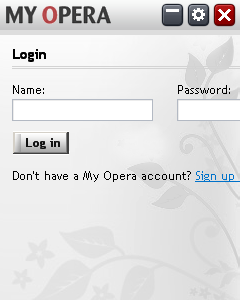
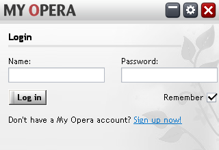
Figure 1: The My Opera widget, with our full-screen code added.
As you can see, this has partially solved the problem. The widget now looks OK on a landscape mobile, but the portrait mobile is now unusable because the form elements are outside the screen. If you log in you will also realize that several other parts of the widget are not working correctly either, mostly involving elements not fitting on the screen. By using a style sheet with the CSS selector for “handheld” (@import url(style/handheld.css) handheld;), all of these issues can be solved very quickly. Figure 2 shows the result after only a dozen or so CSS rules:
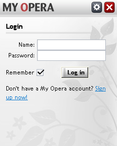
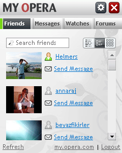
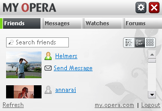
Figure 2: You can fix positioning issues fairly easily with a few, well-placed CSS rules.
The widget now functions nicely. The changes made include:
- Making the login form wrap.
- Hiding the minimize button (it is not necessary on mobiles).
- Giving the friends list a maximum height so it does not run off the page.
- Shrinking the text-size of the main tab buttons so they fit horizontally on one line.
And, remember, after all this, the widget still looks like it does on the desktop!
While we use the handheld media type here, it is not absolutely necessary. You can simply check for the size of the screen and adapt the widget regardless of the type of device it is running on.
Images and effects
This section deals with how to use images and how to optimize their usage to consume the least amount of resources. This is useful for devices with weak CPUs, poor color depth, and poor resolutions.
See the article on Optimizing widget graphics for mobiles and devices for details on making graphics files.
Use 8-bit PNGs with a palette
If you can adapt your images without visible loss of quality, we recommend changing images to use 8-bit colors with a palette. Less colors help save memory and improve performance in your widget.
Depthdither for Photoshop can be used to reduce the color depth effectively.
Use transparency sparingly
For desktop widgets it is common to apply some sort of partially transparent border around the widget to give shadow effects or similar. Transparency can be a source of cool visual effects, but partially transparent elements or images may exact a heavy toll on weak processors. Additionally there are different levels of support for image transparency – support is lacking on Linux for example. We recommend avoiding transparency in most cases, and removing it from styles if the device is identified as not being a desktop.
Use time-based rather than frame-based animations
When you create a widget it is always fun to add animations to menus, view transitions, and so on. The most effortless way to achieve this is to use a library, but if you are creating animations manually, a common technique is to move an element say 20 times in quick succession, perhaps taking half a second in total. This will likely create a very smooth result on your own setup, but what if a user’s device is unable to draw so quickly? The result will be a very slow animation that locks the device up for moments at a time, leaving the user frustrated and likely to walk away.
How can we continue using animations while keeping our less CPU-privileged users happy? A simple solution is to ensure that there is an option on the config side of your widget to turn off the animations, although this is not ideal as your potential user may have given up on your widget in frustration before he/she discovers it. Another solution is to ensure your animations are time-based rather than frame count-based. This is quite easy to implement:
function animate()
{
    var startTime = new Date();

    // constants:
    var C_ANIMATION_DURATION = 500; // milliseconds (half a second)
    var C_ANIMATION_DISTANCE = 200; // pixels (how far we want to move the item)

    var interval = setInterval(function()
    {
        // calculate milliseconds since we started
        var elapsedTime = (new Date()).getTime() - startTime.getTime();

        if (elapsedTime >= C_ANIMATION_DURATION)
        {
            // ensure we don't animate too far
            elapsedTime = C_ANIMATION_DURATION;
            clearInterval(interval); // stop the animation
        }

        moveItemToPosition(elapsedTime/C_ANIMATION_DURATION*C_TOTALDISTANCE);

    }, 30); // 30 ms is fast enough to trick the eye
}
This will give the result of a smooth animation if the device can handle it, but otherwise a very quick animation of possibly 2 or 3 frames will occur, and the one thing you can be sure of is that the animation will never take longer than the time you designate under any circumstances. Of course, the best solution is to implement both time-based animations and the option to disable animations altogether.
Network
This section deals with how to optimize data for transfer across potentially poor or unstable network connections.
Set timeouts when using XMLHttpRequests
Unless otherwise specified, XMLHttpRequests will expire after quite some time, following the browser’s built in timeouts. To be more flexible and responsive to the user in an environment where the network connection may be unstable, it makes sense to add timeouts to AJAX calls. The exact time will need to be adapted to the device at hand. The following is a simple example of how this can be done:
var xhr = new XMLHttpRequest ();
xhr.open('GET', url, false);
xhr.onreadystatechange = function () {
    if ( this.readyState==4 )
    {
        clearTimeout(timeout);
        //Handle the data
    }
}
var timeout = setTimeout(
    function ()
    {
        xhr.abort();
        callback({type:'error',value:'Connection timed out'});
    },
    60*1000 //Timeout of one minute
);
xhr.send();
You should also allow the user to cancel requests if they take too long, as the user may be aware that the device is offline.
Make network traffic more concise
In cases where the network connection is slow or unstable, or where transferring data costs money, you will want to limit the amount of data you transfer. Consider the following advice:
- Use XML (Structured markup, parsed into DOM objects on the receiving end) when the size of data does not matter as much, and you need a structured format that might be shared with other applications.
- Use JSON (JavaScript Object Notation – string versions of JavaScript objects, evaluated as objects on the receiving end) when data size needs to be kept as small as possible, but you have enough CPU and memory to deal with the evaluation of the data into JavaScript objects.
- Use CSV (comma-separated values – values consistently separated by delimiters such as commas or semicolons) when you have many similar objects, the order of values is important, you want data to be as small as possible, and you do not have much CPU or memory with which to work.
- Use query string-like formats (names and values separated like CGI query strings: param1=value1¶m2=value2) when you have one have one object with properties, the size of the data needs to be as small as possible, when you do not have much CPU and memory to work with, and you do not have the need for complex data.
Let us explore each of these options in more detail.
XML has long been a corner stone of the Web, especially through the advent of Ajax. On the plus side, you get data in a structured format, which is often automatically parsed into a DOM object. This is the case for the responseXML property of an XMLHttpRequest object. The format is in widespread use, which means integration with other Web services may be easier. On the downside, XML is usually quite verbose and will need to be parsed to become useful. Data in an XML format is also error prone, as it needs to be well-formed. An example of XML data can look like this (pretty printed for clarity):
<person>
  <name>Rune Halvorsen</name>
  <age>28</age>
</person>
JSON, originally conceived by Douglas Crockford, has also been around for a long time. The plus side to JSON is that it can readily be translated into JavaScript objects, and the format is structured, but less verbose than XML. The downside is that JSON data needs to be evaluated (by calling eval() in JavaScript) in order to become objects. Evaluation is an expensive process in terms of CPU and memory, as an entirely new scripting environment is created to cater for one eval() call. JSON data looks like this:
{ 'name' : 'Rune Halvorsen', 'age' : 28 }
Note that the spaces around the items and operators can be removed.
CSV is an extremely simple format. On the plus side, it is usually very concise, which means less data to transfer. The format is easy to parse, using straightforward string splitting. The downside is that the format does not have much structure, which means it is not appropriate for complex data. If you want more structure, you will need to write your own parser. CSV data can look something like this:
#name;age
Rune Halvorsen;28
Hans S. Tømmerholt;26
Query string formats map values directly to names in a dictionary-like way.
name=Rune Halvorsen;age=28
Client-server communication
This section deals with how to configure the server-side part of an application, for example when developing your own backend.
Set up a proxy
The most common approach is to have the widget retrieve data directly from a Web site such as Flickr, Facebook, or similar. This works well when the user has a fast internet connection, but it might be problematic if the bandwidth is limited, as on mobile phones or other devices. The problem becomes worse if the widget relies on data from multiple sites for creating a mashup. In this case it might make more sense to supply your own proxy backend to download, cache and reformat the data, and deliver it to the device.
Use HTTP compression
In order to reduce network activity, you should set up your server to compress data. Opera will always inform the server that it supports compressed content by sending the following header with all requests:
Accept-Encoding: deflate, gzip, x-gzip, identity, *;q=0
For this to work, however, the server from which you are downloading data will need to be configured properly.
For Apache 2 the relevant module is mod_deflate. When enabled, this module uses compression for text/plain, text/html and text/xml by default. See the Apache documentation for more information on this module. See this tutorial for information on setting it up.
For IIS, HTTP Compression must be enabled in the IIS Manager. When enabled, the server will use compression for .txt, .html and .htm files. See the documentation for IIS 6.0 for more information.
Use persistent connections
Setting up and tearing down connections for individual files takes time; you should instead use persistent HTTP connections. In this case, the connection will be kept open, for example when loading style sheets and script files along with a Web page. Opera will by default request the connection to be kept alive, and Apache and IIS have persistent connections enabled by default. Refer to the Apache or IIS 6.0 documentation for details on how to control the behavior.
DOM
This section deals with general optimization techniques you can employ when working with the Document Object Model.
Prepare new elements before adding them
Adding an element to the DOM will always force a reflow, as the browser will need to work out where to put it. This means it is wise to always complete the construction of a new element and all its children and styles before adding it to the document. This way, one reflow is enough.
The following is an example of how not to do this:
var div = document.createElement('div');
container.appendChild(div);
var a = document.createElement('a');
a.href = "#foo";
div.appendChild(a);
a.style.display = 'block';
a.style.width = '200px';
The example can be corrected as follows:
var div = document.createElement('div');
var a = document.createElement('a');
a.href = "#foo";
a.style.display = 'block';
a.style.width = '200px';
div.appendChild(a);
container.appendChild(div);
Use DocumentFragments
The DocumentFragment object acts as a container for several elements. When you add the fragment to your document, all its children will get added. This is great when you want to avoid adding several individual elements to a document, but do not want to use a container element around them. The fragment is a subclass of Node, which means it has methods like appendChild and insertBefore:
var frag = document.createDocumentFragment();
var p1 = document.createElement('p');
//...
var p2 = document.createElement('p');
//...
frag.appendChild(p1);
frag.appendChild(p2);
//...
document.body.appendChild(frag);
In the example above, only the two p elements will be added to the body and only one reflow will occur.
JavaScript
This section deals with general optimization techniques for JavaScript.
Optimize your JavaScript code: Avoid eval(), Function () and global variables
As performance is critical on many devices you need to write your code carefully for it to be efficient. See the article on Efficient JavaScript for some tips. Some more points are as follows:
- Avoid the
eval()function, theFunctionconstructor and passing strings tosetTimeout(). These create a new scripting environment which may be costly for performance. - Avoid global variables. Local variables are found more quickly, as the script does not need to look through the scope chain to find them.
Resources
- Packing and deploying your Opera Widget – dev.opera.com article on how to deploy your widgets
- widgets.opera.com – find and share widgets here.
- The Web Forms 2.0 spec.
- Description of the MVC pattern
- CSS 2 Media types from the CSS level 2 recommendation at the W3C.
- The CSS 3 Media queries spec.
- The Test Media Query JavaScript library on dev.opera.com.
- Optimizing widget graphics for mobiles and devices
- Depthdither homepage
- Efficient JavaScript article on dev.opera.com.
- Apache 2 documentation on mod_deflate.
- Tutorial on mod_deflate by Falko Timme at Howtoforge.com.
- Microsoft IIS 6.0 documentation on using HTTP Compression for Faster Downloads.
- Apache 2 documentation on the KeepAlive directive
- Microsoft IIS 6.0 documentation on Enabling HTTP Keep-Alives
- JSON – JavaScript Object Notation.
- Exceptional performance techniques at the Yahoo! Developer Network.
This article is licensed under a Creative Commons Attribution, Non Commercial - Share Alike 2.5 license.
Comments
The forum archive of this article is still available on My Opera.
No new comments accepted.