29: Text styling with CSS
11th October 2012: Material moved to webplatform.org
The Opera web standards curriculum has now been moved to the docs section of the W3C webplatform.org site. Go there to find updated versions of these docs, and much more besides!
12th April 2012: This article is obsolete
The web standards curriculum has been donated to the W3C web education community group, to become part of a much bigger educational resource. It is constantly being updated so that it remains current with modern web design practices and technologies. To find the most up-to-date web standards curriculum, visit the web education community group Wiki. Please make changes to this Wiki yourself, or suggest changes to Chris Mills, who is also the chair of the web education community group.
- Previous article—Inheritance and Cascade
- Next article—The CSS layout model—boxes, borders, margins, padding
- Table of contents
Introduction
Because the Web is a collection of documents — some dynamic, some static, some functional — the conventions under which they’re formatted are borrowed from our best point of reference: six centuries of printing tradition. This includes typography. The Web however is a new and different medium, and web site typography needs a largely very different skill set to print design, and is subject to a lot more limitations.
This article builds upon the knowledge gained earlier on in the course, providing you with a detailed guide to styling text effectively using CSS. There are several examples linked to below, which will demonstrate the techniques discussed—here you can download all the article 29 examples.
The article structure is as follows:
- Web typography review
- CSS font properties: changing the look of your text
- CSS text and alignment properties: altering composition
- text-align and justification
- Changing tracking: the letter-spacing and word-spacing properties
- Indenting initial lines: the text-indent property
- Capitalisation: the text-transform property
- Link styling and showing deletions: the text-decoration property
- Leading adjustment and line-height
- Supplanting pre and br: the white-space property
- Summary
- Further reading
- Exercise questions
Web typography review
On the Web, designers have much less control over presentation than they do in other media. This is most obvious when it comes to document canvas properties such as size, resolution, and contrast. There are also severe limitations on the quality of Web typography, which were discussed in the article about typography fundamentals.
Other subjects that deserve an introduction are contrast, legibility, and readability—I’ll go through these now.
Contrast
Type contrast, the ease with which passages can be distinguished from whitespace and adjacent passages, is influenced by a number of factors such as luminosity, colour, size, and composition. It is mentioned here for the sake of pointing out that low contrast copy should be set at the largest practicable size.
Legibility and readability
In a design context legibility is the ease with which a text passage can be scanned for specific pieces of information, while readability is the ease with which a passage can be comprehended. Design decisions that enhance one quality or the other are listed in Table 1.
| Goal | Line length | Gutters (space between columns of text) & leading |
Type choice | Justification |
|---|---|---|---|---|
| Readability | moderate | increased | serif | right-ragged [left] |
| Legibility | short | normal | sans-serif | variable, often full |
Optimal column width will be discussed in the next article - The CSS layout model.
CSS font properties: changing the look of your text
Typesetting involves the manipulation of text with respect to both composition and the look of individual letters and words. The latter class of tasks is handled by the CSS font properties, which will be discussed below.
font-size and unit type selection
Since documents typically vary type sizes more than typefaces, and variant fonts are usually handled well by user agent stylesheets, the primary property of interest is font-size. When used in a rule, it’s followed with a value that specifies a unit measurement, or sometimes a keyword size (such as small or medium).
How it’s done
The most important font-size declaration in a stylesheet looks something like this:
body {…
	font-size: 14px;
	…}
Inheritance causes all type size specifications in a document to be based upon the size declared for the document body, whether in the browser’s stylesheet or in yours.
The typical browser default of 16 pixels is a good starting point for the size of your body copy, but most visitors can read smaller type with ease. As a result, many designers choose smaller sizes—around 11–14 pixels.
Inheritance applies to type sizing when a relative size is specified, and when a keyword size is specified for an element with a non-keyword-sized parent.
What unit types can be applied to CSS text properties?
In stylesheet rules, the unit types most commonly applied to text are pixels (px), ems (em, explained below), percentages (%), and points (pt). The behaviour of text resized with these units is described in Table 2.
| Unit | Definition¹ | Usage |
|---|---|---|
| CSS ems | Δ = x | 1.333em |
| Keywords | UA defined² | large, &c. |
| Percentage | Δ = x ÷ 100 | 133.3% |
| Pixels | absolute unit | 16px |
| Points | absolute unit | 12pt |
¹ Δ is the ratio of change in type size from the inherited value.
² Only the nearest non-keyword size value is inherited.
Other available unit types include size keywords, picas (pc, one pica equals exactly 12 points), and exes (ex). Many of the other unit types supported by CSS2 are also available, but are rarely used when working with text.
What’s the use of so many different unit types?
As pointed out in Table 2, there are relative and absolute sizing units. Keywords take on both characteristics — absolute sizing with respect to one another, but relative to the non-keyword value they inherit. The best practices to follow for their use are as follows:
- Absolute sizes (
px, standardized units such aspt) are best used in layouts that do not change in relation to document canvas properties — so-called “fixed”, “static”, or “Ice” layouts. - Relative sizes (
em,%) should be used in non-static layouts, and in situations where a compromise needs to be struck between site usability and the designer’s control over the layout. - Keyword sizes (explained below) should be used when usability trumps all other design considerations.
Absolute sizes and usability
Older versions of Internet Explorer do not allow the visitor to resize text that has been set at absolute sizes, and the text resizing interfaces of some browsers that do allow that degree of user control can be hard-to-find (Opera and Firefox users have it easy, with Shift + Ctrl/Cmd + plus/minus and Ctrl/Cmd + plus/minus respectively). Because of these constraints, it’s a common practice to set the font-size of body to a relative value, usually in em units that are assumed to be controlled by the browser default.
What is the physical equivalent of a desktop pixel?
The most accurate answer to this question is that there is no such thing. Pixels are a unit of display hardware resolution, and nothing more. However…
Despite the fact that it is strictly impossible to define or predict the literal size of a pixel, high-strung commercial project sponsors tend to be unpleasantly surprised when they discover that the design of their site takes on a different look on client hosts that are configured differently to their own, and yell at the web designer because of this. For that reason, it can be helpful to understand how pixels behave—I’m giving you this as ammunition, ready for those times when anyone you are creating a web site for complains that the text doesn’t look exactly the same on different machines.
Software publishers have an informal understanding that 96 ppi (pixels per inch) is a reasonable measurement. Thus 16 pixel body copy will print at a size of one-sixth of an inch, or 12 points. On the increasingly typical 17″ 1280x800 liquid crystal display, such 16 pixel copy will have an approximate size of 13 points on screen, but on a similar 15″ notebook display, its size will be 11.44 points.
These measurements are effective at default settings. Most environments allow the end user to set a custom ppi measurement, so edge cases will arise.
In conclusion: a pixel is a pixel, but everything else is variable.
Ems, percentages, and points, according to CSS
Traditionally, the em is equivalent to the height of an uppercase “M” in the font to which it applies. However, in CSS the em unit is actually equivalent to the total height of one line; in other words for an element that has had its font-size set to 14 pixels:
1em = 100% = 14px
In typical environments, this statement above can be expanded to:
1em = 100% = 14px = 10.5pt
Increasing or decreasing sizes work multiplicatively, so if you have a second element that you want to set to a size of 16 pixels, given normal inheritance all of the following would obtain the desired result:
1.143em = 114.3% ≈ 16px = 12pt
A brief note about the official CSS 2.1 Recommendation
You will find yourself directed on occasion to consult the World Wide Web Consortium’s Candidate Recommendation for the CSS 2.1 Specification. Like all W3C Recommendations, this document can be considered the definition of a Web standard; some are followed more faithfully than others, by browser manufacturers as well as web developers.
While knowledge of W3C Recommendations in both breadth and depth is good to have, this course has been written to give you a concise but easy to digest introduction to web development/design, and the W3C recommendations can be a bit verbose, to say the least. All cases here in which you are directed to visit the CSS 2.1 Recommendation point to material that’s too obscure to justify accurate explanation in this article.
Size keywords
You can also use size keywords, as briefly mentioned above. There are seven of them, from xx-small up to xx-large, with medium being the middle (and default) value. The full list of all seven values is spelled out in Table 3 below, which includes all of the keywords supported by the various CSS properties discussed in this article.
The CSS 2.1 Recommendation provides a wealth of additional detail about font-size keywords.
Demonstration 1
From time to time, this text will link to a progressively styled demonstration document that will display the CSS properties under discussion, in actual use. This first instance shows the example document HTML completely unstyled
Links:
New rules
body { font-size: 14px; }
h1 { font-size: x-large; }
.sectionNote { font-size: medium; }
.attribution { font-size: small; }
font-family and typeface selection
With text sized to your satisfaction, you can move onto selecting a typeface or two. This is accomplished with the font-family property, which is used as shown in Demonstration 2 below.
When providing a value for the font-family property, you should follow these rules:
- Faces must be named exactly as they are named in the font library of the client host, using the non-variant font as a guide.
- All named faces must be separated by commas, with or without trailing whitespace.
- In cases where the name of a face contains more than one word, it must be enclosed by single or double quotes. Example:
'Times New Roman'. - Faces should be named in order of ascending likelihood of availability. For example, if you want Macintosh users to see a page set in Palatino, your property-value declaration should probably read as follows:
font-family: Palatino, Georgia, serif;. Palatino is exactly what you want, but some users may not have it; Georgia is much more likely to be available, and is similar to Palatino; serif refers to a generic default serif font—if neither Palatino nor Georgia are available, the system will fall back to its default serif font. - As a fail-safe, a
font-familyvalue should always end with the appropriate generic name, as explained above. The typefaces used in generic families by MacOS 10.5 are displayed in Figure 1.
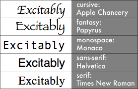
Figure 1: Default “generic” typefaces in MacOS 10.5, as rendered at 24px by Safari 3.1.
The CSS 2.1 Recommendation lists several more typefaces that might apply to each generic family.
Demonstration 2
Now that the size of the text is predictable, we want to optimize the typefaces used. The title is best set in a sans serif face for legibility, and the narrative itself in a serif face.
Links:
New rules
body { font-family: Palatino,'Palatino Linotype',Georgia,
            sans-serif; }
h1 { font-family: Helvetica,Arial,sans-serif; }
blockquote { font-family: Helvetica,Arial,sans-serif; }
font-style, font-variant, and font-weight: changing the details
The font-style property manipulates italicisation without resorting to the i element; its three valid values are italic, oblique, and normal.
The italic and oblique values deliver functionally identical results in the most recent versions of all mass-market Web browsers, even though there is a meaningful technical difference between the two styles, as explained in the Glossary that accompanies this course.
Why use the font-style property, when the em and i elements seem adequate?
Each of those elements has specific uses: the em to provide emphasis, and i to serve as an alternative to <span style="font-style: italic;">…</span> in those few instances when its use would be appropriate. Generally <i> isn’t appropriate at all, as it is a presentational element, but there are certain pieces of copy that are italicised by convention, such as book titles (although this is still arguable; some think the cite element is more appropriate for book titles. Do what seems most appropriate). <em> is generally more appropriate, because it specifies emphasis as a concept, rather than italics as a specific style—the actual look of emphasis may vary between different browsers.
There are situations where the use of em and its cousin strong may require a different approach. For example, suppose you wanted to emphasize copy by enlarging it. The consistent step for providing strong emphasis would then be to add italicisation, resulting in rules such as the following:
em {
	font-size: large;
	font-style: normal;
}

strong {
	font-size: large;
	font-weight: normal;
	font-style: italic;
}
The preceding stylesheet rules would deliver results similar to the following:
The quick red fox jumped over the lazy brown dog.
Demonstration 3
There are no italicised words or passages in the demonstration copy, and the attributions already contain the necessary italicisation due to use of the cite element. Given the lack of options, the title is the best candidate for italicisation.
Links:
New rules
h1 { font-style: italic; }
.sectionNote { font-style: normal; }
font-variant as another tool for making short passages stand out
The font-variant property has two possible values, small-caps and normal. “Small caps” (also known as “copperplate” letters) are used by some designers to highlight the opening phrase of a long narrative, or to provide emphasis for quoted signage, such as the following:
Abandon all hope, ye who enter here.
Demonstration 4
Links:
New rules:
.opening { font-variant: small-caps; }
font-weight: boldness and the lack thereof
The font-weight property allows you to alter the level of boldness of any passage of text to which it is applied.
The commonly supported values of the font-weight property are normal and bold. While the CSS 2.1 Recommendation provides several other values, the current state of Web typography support makes those other values functionally meaningless to all but specialist users.
Demonstration 5
Boldfacing the name of an author is a design technique more often used in periodicals, but it still fits in various situations on the web.
Links:
New rules:
.author { font-weight: bold; }
The font shorthand property
Many text properties can be provided in the value for a single property, if needed, in a manner similar in nature to background properties.
A font shorthand rule looks like this:
h1 {
	font: italic normal bold x-large/1.167em Helvetica,Arial,sans-serif;
}
For the best results, the value you supply for this property should include your intended values for all of the following individual properties in the following order, separated by spaces:
font-stylefont-variantfont-weightfont-size, followed if necessary by a slash and the value ofline-height(see below)font-family, which in this instance can also be a reserved word specifying a system font; multiple values should be separated by commas but not spaces
| property | Values |
|---|---|
| font-family | cursive, fantasy, monospace, sans-serif, serif |
| font-size | xx-small, x-small, small, medium, large, x-large, xx-large |
| font-style | italic, normal, oblique |
| font-variant | normal, small-caps |
| font-weight | bold, normal |
| line-height | normal |
| text-align | center, justify, left, right |
| text-decoration | line-through, none, overline, underline |
| text-transform | capitalize, lowercase, none, uppercase |
| white-space | normal, nowrap, pre, pre-line, pre-wrap |
CSS text and alignment properties: altering composition
A stylist working with letters and words is dealing in details: lines, curves, dots, pixels, and the other cellular bits of a design. A design is a whole thing however; it has bigger components which are brought into focus by composition controlled principally through the CSS layout model. In addition to that layout model, CSS also implements text and alignment properties that influence composition. The rest of this article will discuss those properties.
text-align and justification
As is the case with word processing environments, the text-align property supports four justification values: left, right, center, and justify. The last of these provides full justification: visible text margins that are consistent on both the left and right sides of a block of copy.
Proper justification of copy written in Western alphabets
The best general usage of the different available alignments is as follows:
- Left justification is best suited to long passages of narrative.
- Right justification is best used on the leftmost column of data tables and multiple column layouts. When the adjacent column is then left justified and placed on the other side of an appropriately wide gutter, the result is to improve the legibility of both columns.
- Full justification works well for small blocks such as block quotations and teaser copy. When used on long passages of narrative set to optimal width bestride wide margins, full justification also improves the apparent coherence of your layout.
- Centering is typically used for interface elements and serial lists such as those found in site footers.
Demonstration 6
Since the demonstration is built around fiction originally sourced from a book, why not give it full justification?
Links:
New rules:
p { text-align: justify; }
blockquote p { text-align: left; }
Changing tracking: the letter-spacing and word-spacing properties
These properties are fairly self-explanatory; they allow you to alter the amount of whitespace between letters and words, respectively.
The most common use of letter-spacing is to provide subtle emphasis analogous in effect to that provided by font-variant: small-caps; it may also be used to subtly alter the composition of interface elements.
The word-spacing property is best used to deliberately change the number of words likely to appear on a single line of copy. For example, it might be used if you have a copy block of typical width, but atypical type size.
In print, letterspacing and word spacing are also applied on an ad hoc basis to avoid composition flaws, but on the Web this technique has limited usefulness.
In addition to unit values, these properties support the normal value.
Using em units for good control
When you change the letterspacing of text, a little nudge carries for a long distance; the default letterspacing tends to be between one-tenth and one-twentieth of an em, so letter-spacing values that do more than double or halve the default might well result in illegible copy.
Demonstration 7
The sign copy discussed near the end could use some subtle emphasis… and since the pull quote is set in a larger size, it can be improved using some word spacing.
Links:
- Add letterspacing to the proposed sign greetings in the penultimate paragraph of the passage
- Demo 7 stylesheet
New rules:
q { letter-spacing: .143em; }
.pullQuote { word-spacing: .143em; }
Indenting initial lines: the text-indent property
The text-indent property makes it possible to indent paragraphs in the traditional style of printed matter. There are also a number of advanced layout techniques that are made possible by this property and its support of negative values.
The values supported by this property are the same as those supported by font-size, with the addition of normal.
Demonstration 8
On the same rationale that the passage was fully justified, maybe it should have all of its paragraphs indented.
Links:
New rules:
p { text-indent: 1.429em; }
blockquote p { text-indent: 0; }
Capitalisation: the text-transform property
Just as the font-variant property gives you access to copperplate letters, the text-transform property deals specifically with capitalisation. Its allowed values provide for all-caps, all-lowercase, or all-initially-capitalised rendering of text. See Table 3 above for a list of supported values.
Demonstration 9
Links:
New rules:
.author { text-transform: uppercase; }
Link styling and showing deletions: the text-decoration property
This property makes it possible to put lines over, under, and through text. Its most common use is to manipulate default link underlines, however wikis, satire, and other settings will beg use of strikethroughs. In these cases you will want to employ the ins (insert) and del (delete) elements, which provide equivalent styling to the following:
ins {
  text-decoration: underline;
}

del {
  text-decoration: line-through;
 }
Even without custom stylesheet rules, ins and del style markup as follows:
Borders, not underlines, with acronym and abbr
Among some designers it is popular to alter the appearance of acronym and abbr elements so that they appear with what appears at first glance to be a dotted underline. However, this effect is actually accomplished with a border-bottom value. (Remember that some browsers supply this automatically, but others, such as IE 6, don't).
Demonstration 10
Links:
- Remove the underline from the link to the Gutenberg E-Text source for the demonstration copy
- Demo 10 stylesheet
New rules:
.source a { text-decoration: none; }
Leading adjustment and line-height
It’s well-known that placing some whitespace between lines of text tends to increase its readability, because the increased space ensures that ascenders and descenders (see Figure 2 for explanation) on adjacent lines will not compete for visual focus.
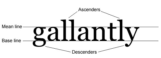
Figure 2: Ascenders are the parts of letters that rise above the mean line of the text; descenders are the parts of letters that drop below the base line that the text sits on.
There’s a loose relationship between the font-size of an element and its line-height, but by default, all user agents insert a small amount of leading into each line of text — usually 10–15% of the height of the letters themselves. Because this default changes from one typeface to the next, the line-height property supports a value of normal in addition to numeric values.
It is also worth noting that unlike most CSS properties, line-height accepts numeric values without units, which are then rendered as a ratio of the default.
Demonstration 11
The relationship between leading and readability has been bandied about a lot, so here’s the proof.
Links:
New rules:
           p { line-height: 1.5; }
.attribution { line-height: 1.5; }
Supplanting pre and br: the white-space property
Forced linebreaks are a presentational element in the strictest sense, though there are many circumstances in which they’re a desirable element of a site design. In tandem with browsers’ habit of breaking lines on arbitrary spaces, exercising the desired degree of control with markup alone can be a challenge.
The pre element is provided to deal with these challenges, though it presents challenges of its own, which is why CSS offers the white-space property. Its supported values, which are listed in Table 3, allow the stylist to choose whether or not the browser will render whitespace and linebreaks that have been added to source markup or inserted as generated content.
The CSS 2.1 Recommendation provides exhaustive details about the suggested implementation and use of the white-space property.
Summary
An excellent site design requires a high level of attention to detail and proper adjustment of the interaction of numerous elements, not the least of which is type.
The suite of font and text properties supported by current browsers’ implementations of CSS gives nearly the highest level of control over typesetting that existing output hardware will allow, and it’s up to the conscientious site stylist to learn how to use them. As a result of using those properties successfully, sites go into production that can aspire to approach standards of quality in typesetting more commonly associated with the print medium we’ve developed over the span of centuries, in spite of the fact that the Web hasn’t yet been around for longer than a single generation.
Further reading
- Bos, Bert, et al. 2007. Cascading style sheets level 2 revision 1 (CSS 2.1) specification. World Wide Web Consortium. http://www.w3.org/TR/2007/CR-CSS21-20070719 etc. (accessed 28 May 2008).
- Chaparro, Barbara, et al. 2004. Reading online text: a comparison of four white space layouts. Wichita State University Software Usablity Research Laboratory Usability News. http://www.surl.org/usabilitynews/62/whitespace.asp (accessed 28 May 2008).
- Dean, Paul. 2008. Extreme type terminology. I Love Typography, the Typography Blog. http://ilovetypography.com/2008/03/21/extreme-type-terminology/ etc. (accessed 28 May 2008).
- Horton, Sarah, and Lynch, Patrick. 2002. Web style guide: basic principles for creating web sites, 2nd edition. New Haven, Conn.: Yale University Press.
- Roselli, Adrian. 2002. A simple character entity chart. Evolt.org. http://www.evolt.org/article/A_Simple_Character_Entity_Chart/17/21234/ (accessed 28 May 2008).
Exercises
- List three HTML elements, other than
bandi, which are typically rendered with variant fonts by default. Briefly describe the intended purpose of the elements you listed, and explain how the use of a variant font is appropriate to those elements’ purposes. - Subjectively test the readability of a long text passage of your choice, at varying
line-heightvalues. Briefly summarize your results. - Apply
text-transform: uppercase;to a single paragraph of the passage used for the previous exercise, and repeat your subjective test for readability. Briefly summarize your results. - Briefly explain the advantages and disadvantages of anti-aliasing, using the typography review in this article for guidance.
- Describe the order in which typefaces should be specified, in a
font-familyvalue. - In a closed-book setting, choose at least three properties described in this article and list at least one valid value (other than defaults) for each. Demonstrate or describe the results of the use of these property/value pairs in a stylesheet.
- Create an element, populate it with copy, and assign it a
font-sizevalue of9px. Open the document containing this element in Internet Explorer, and cycle through the type sizes provided in the View → Text Size menu. Evaluate the suitability of these results on sites with large numbers of middle aged and elderly visitors.
- Previous article—Inheritance and Cascade
- Next article—The CSS layout model—boxes, borders, margins, padding
- Table of contents
About the author

Ben Henick has been building Web sites in one capacity or another since September 1995, when he took on his first Web project as an academic volunteer. Since then, most of his work has been done on a freelance basis.
Ben is a generalist; his skillset touches on nearly every aspect of site design and development, from CSS and HTML, to design and copywriting, to PHP/MySQL and JavaScript/Ajax.
He lives in Lawrence, Kansas, with three computers and zero television sets. You can read more about him and his work at henick.net.
This article is licensed under a Creative Commons Attribution, Non Commercial - Share Alike 2.5 license.
Comments
The forum archive of this article is still available on My Opera.
No new comments accepted.