Styling hReview Microformats
Introduction
The hReview Microformat gives us an agreed convention for adding markup structure and semantics to reviews — reviews of products, people, websites, events, and other things. In this article, you will learn how to style hReviews with CSS (the final example is shown in Figure 1) and create a versatile rating star system that integrates seamlessly with the hReview structure.
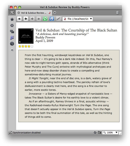
Figure 1: Finalized rendering of an hReview microformat.
You can download the complete code for the hReview example in this article and play with it yourself. Feel free to reuse it, as long as you credit the original source and author.
The markup
Let's begin by looking at the HTML structure of our review:
<div class="hreview">
     <div class="brief">
         <div class="item">
         <a class="url fn" href="http://veilandsubdue.com"><img src="images/cdcoversm.jpg" alt="Veil & Subdue Album Cover" class="cover" />Veil & Subdue: The Courtship of the Black Sultan</a>
         </div><!--end item-->
     <p class="summary">
         “A delicious, dark and haunting journey!”
     </p>
     <div class="reviewer vcard fn">
         Buddy Powers
     </div>
     <abbr class="dtreviewed" title="20090401">April 1, 2009</abbr>
     </div><!--end brief-->
     <div class="rating">
          <div title="4">
          4 out of 5
        </div>
     </div><!--end rating-->
     <div class="description">
          <p>
    From the first haunting, windswept keystrokes on <span class="fn product"><em>Veil & Subdue</em></span>, one thing is clear — it’s going to be a dark ride indeed.
          [...]
          </p>
     </div><!--end description-->
</div><!--end hreview-->
We won't go into the details of hReview markup here (see Microformats.org for the basics), but note that we've wrapped the entire review in a div with a class attribute of hreview. This defines the enclosed text as a Microformatted review.
Note the following line of code to represent the date of the review:
<abbr class="dtreviewed" title="20090401">April 1, 2009</abbr> This presents us with a potential accessibility problem, in that screen readers will read out the abbr title attribute in a really horrible way. You can read more about the accessibility issue on webstandards.org. The HTML 5 time element was developed to use with microformats in order to get over this problem, but it's not part of the microformat convention yet.
In addition to the hReview fields represented by class and title attributes here (item, reviewer, rating, and so on), we've also wrapped up a portion of the information in a div labeled brief. This chunk of information is styled separately. In its unstyled state, the hReview content looks like Figure 2.
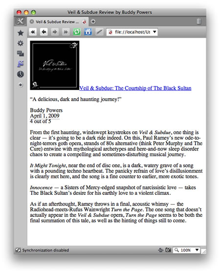
Figure 2: The default rendering of the hReview content.
Text sizing and positioning
Let's begin by centering and sizing the hreview div:
body {
     text-align: center;
     line-height: 1.3;
     font-family: 'palatino linotype', palatino, serif;
     font-size: 15px;
     color: #2b2b28;
}

.hreview {
     width: 500px;
     margin: 30px auto;
     text-align: justify;
}
Here we've centered the div by setting the text-align property to center for the parent element (here, the body element), then setting the left and right margins to auto for the hreview div.
After centering the hReview div, we've set the width of the div and set the text-alignment, as shown in Figure 3. (Unless we specify otherwise, the centered text-alignment is inherited from the body element).
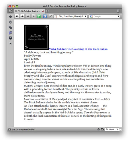
Figure 3: Centering and basic styling of the hReview.
Sizing and positioning the CD cover
Next we want to size the CD cover and move the summary, date, and author text next to the cover. This is quickly accomplished by sizing and floating the cover image:
.item img {
     width: 75px;
     float: left;
     margin-right: 10px;
     margin-bottom: 5px;
}
After setting the width and floating the image to the left, we add a bit of margin to the right and the bottom of the image, so the text isn't flush up against it. Now all of the following text wraps nicely around the floated image, as shown in Figure 4.
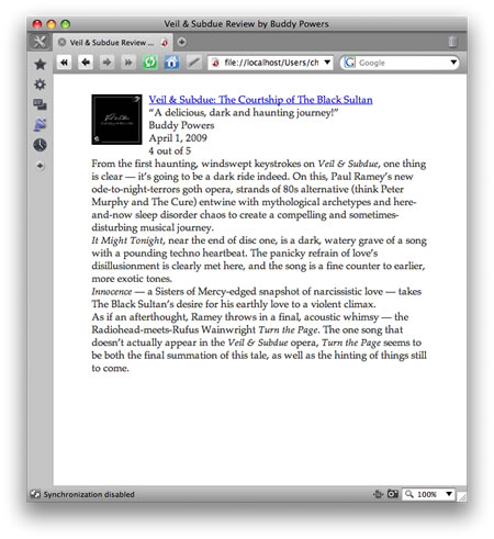
Figure 4: Floating the image to the left.
Text styling
Our information is starting to look a lot more organized and reader-friendly, but we should still style the main text of the review so that it is visually distinguished from the rest of the information:
.description {
     border: 2px solid #a19e96;
     padding: 15px 30px;
     background-color: #e3dfd3;
     font-family: "Verdana" sans-serif;
     font-size: 12px;
     line-height: 1.6;
}
After adding border to this div, we've added some padding to pull the text in from the edges, added a light brown background color, and changed the font properties to contrast with the proceeding review section, as seen in Figure 5.
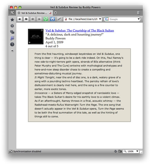
Figure 5: Additional styling added to the description.
The star rating
We now want to tackle the most challenging part of our review: the rating stars. We could simply replace the "4 out of 5" text with an image depicting four out of five stars. But that's a bit shortsighted — it would be better to create a flexible system to let us specify and display a variety of ratings.
To do this we're going to adopt David Topper's method of creating rating stars with CSS. Instead of using embedded CSS as his method employs, we're going to externalize the CSS onto our style sheet.
The CSS star rating system will let you assign a rating from 1 to 5 in .5 increments (implementing the rating field already standardized in the hReview format) and it replaces the asterisks ("*") with star rating images.
There are two star GIFs provided to use in our rating system:
 and
and 
The empty star (star_gray.gif) and the full yellow star (star_yellow.gif) are both 15 x 15 pixels in size. These serve as the background images for the two div elements used in the rating section of the HTML document.
Let's refresh our memories as to the relevant part of the HTML:
<pre.<div class="rating">
<div title="4">
4 out of 5
</div>
</div>
We'll style the outer rating div first:
.rating  {
  clear: both;
  margin-bottom: 10px;
  width: 75px;
  background: url(images/star_gray.gif) 0 0 repeat-x;
  text-indent: -9999px;
}
Here we have cleared the div, so that it doesn't end up wrapped along the edge of the CD cover image: we want the ratings beneath the cover. We also created a bit of a margin on the bottom, and set the width to equal the width of the CD cover image. This width is, coincidentally, just the right size to fit five of the empty rating stars horizontally across (15px x 5 = 75px).
We next set the empty star GIF as the background image, tiling it horizontally. Finally, we've "indented" the text far off of the page: a common technique used to replace text with images using CSS. Now the "4 out of 5" text effectively disappears, leaving only the tiled GIF visible.
Next, we're going to style the inside nested div so that the yellow star tiles across the empty stars, as shown in Figure 6.
.rating div {
  height: 15px;
  background: url(images/star_yellow.gif) 0 0 repeat-x;
}
This tiles the yellow star across, covering the empty stars we just placed there.

Figure 6. The yellow stars overlapping the outlines of the stars beneath it.
This essentially creates a 5-star rating, which is great if everything we review is stellar. But, most of our reviews (including this one) are less than five stars.
In those cases, we want to show only a portion of the five yellow stars, while revealing the rest of the empty stars underneath. To do this, we can set the width of this nested div as a percentage of the width of the parent rating div. In this case, the CD we reviewed is four stars, so we want to set the width of the div to 80%:
.rating div {
    width: 80%;
}
In this case the yellow stars only fill up 80% of the 75-pixel parent div, leaving the remaining 20% (or, 5th star) as an empty star as shown in Figure 7.

Figure 7. The star rating system showing 80% approval.
Fabulous! We've created our "4 out of 5 star" rating.
This works great for this example. But what about future reviews, which may have 3 stars, 2 stars, or 4 1/2 stars? We want to be able to use the same CSS for any possible variation. We can do this by styling the title attribute selector. Recall that in our HTML, we included a title attribute with the value of the rating:
<div title="4">
          4 out of 5
</div>
We can attach a CSS property to specific values of this attribute by targeting the title attribute selector. In this case, we want to set the width of the div to 80% when its title attribute value equals 4:
.rating div[title="4"] {
     width: 80%;
}
So, this width property only applies when the title attribute in the HTML has a velue of 4. Similarly, we can target all of the title attribute selectors matching the other possible ratings:
.rating div[title="1"] {
     width: 20%;
}

.rating div[title="1.5"] {
     width: 30%;
}
.rating div[title="2"] {
     width: 40%;
}

.rating div[title="2.5"] {
     width: 50%;
}

.rating div[title="3"] {
     width: 60%;
}

.rating div[title="3.5"] {
     width: 70%;
}

.rating div[title="4"] {
     width: 80%;
}

.rating div[title="4.5"] {
     width: 90%;
}
So, for example hen the title attribute value equals 1.5, the yellow stars only fill up 30% of the 75-pixel parent gif (or 1 1/2 stars worth). And so on with the other nine variations as shown in Figure 8.
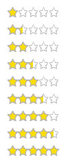
Figure 8. Example of how the star rating system grows.
Summary
In this article we have looked at a great way to style an hReview with CSS. The cleverest part of it by far is the versatile CSS star rating system, which has two great pluses:
- We didn't need to add new class or title attributes: this method makes use of the classes and attributes we already created when designing our hReview.
- Secondly, all of the possible ratings are created using two small GIF files (thus relinquishing the need to load a new image file for each rating). This makes for an elegant and stylish technique for polishing up our hReviews.
This article is licensed under a Creative Commons Attribution, Non Commercial - Share Alike 2.5 license.
Comments
The forum archive of this article is still available on My Opera.
No new comments accepted.