Styling Forms with Attribute Selectors - Part 2: adding in some CSS3
Introduction
In the first part of this article, I talked about attribute selectors and how use them to pinpoint CSS rules onto specific form elements. In this article, I'll continue to talk about styling form controls, but this time using CSS3 selectors to style form controls under specific conditions - if the form control is enabled, disabled or checked.
Disabled HTML Form Controls
Disabling HTML form controls has been around since version 4 of HTML. What does disabling a form control mean? It means three things happen:
- The disabled form control does not receive focus
- The disabled form control is skipped in tabbed navigation
- The information the form control contains does not get sent
The markup for a disabled HTML form control looks like the following example:
<input name="disabled" type="text" value="Hello, world!" disabled>Since XHTML mandates that all attributes should be paired with a value, the markup needs to be tweaked in order to be valid. Therefore the markup for disabling a form control should really look like this:
<input name="disabled" type="text" value="Hello, world!" disabled="disabled" />Enabled HTML Form Controls
What is an enabled HTML form controls? It is the default state of any control that isn't disabled through the disabled attribute or a script that effectively makes it disabled via the Document Object Model (DOM).
Technically, enabled form controls are form controls that are submitted, do receive focus and allow their data to be sent to the server when the form is processed successfully.
Here is an example of a simple enabled control followed by a disabled HTML form control (the output of this is shown in Figure 1.)
<p>Enabled:<br />
<input name="enabled" type="text" value="Hello, world!" />
</p>

<p>Disabled:<br />
<input name="disabled" type="text" value="Hello, world!" disabled="disabled" />
</p>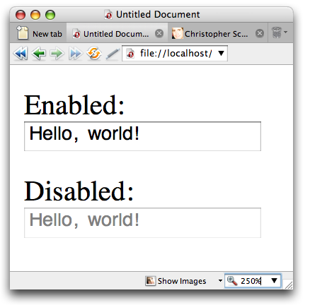
Figure 1. The difference in default styling of enabled and disabled form controls
Styling Disabled HTML Form Controls
Let's review the basic HTML structure of the form I created in the first part of this article. It's the same as the original in the first part, but in this case I'm disabling the form elements in the bottom section and therefore need to include the disabled attribute (as shown in Figure 2.)
<form action="script.php" method="get">
<input class="submit" type="submit" value="Submit" />
</form>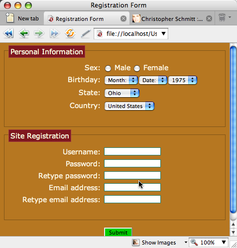
Figure 2. Our example form layout, with disabled form controls in the bottom portion of the form.
In Figure 2, even though I'm clicking on an input control to bring focus to it, the browser keeps me from doing that - the disabled attributes are doing their job as expected.
There's a stylistic issue here however - the form fields are bright white and therefore might look like they can be filled in, when currently they can't. To improve this situation, I added the following simple rule to my CSS design:
input[type="text"]:disabled {
  opacity: .7;
}
This rule gives the result shown in Figure 3.
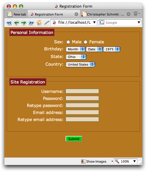
Figure 3. Lowering the opacity of the form controls to make them look disabled.
The filter property - needed for IE support
The CSS3 opacity property has been implemented in the latest Opera browser, and is also supported by Safari, Firefox, and Netscape.
While IE doesn't support the CSS3 selectors discussed in this article, it is possible to get a similar transparency effect in IE using Microsoft's proprietary filter property in addition to the opacity filter to achieve greater cross-browser support:
H3 {
  opacity: .7;
  filter: alpha(opacity=70);
}
Lowering the opacity of the disabled field does a couple of things. First it lessens the presence of the form field, seemingly moving it into the background of the Web page, which reinforces the notion that the element shouldn't be touched - this is what we want. We don't want to confuse site visitors any more than we have to.
Second, the opacity helps create consistent color schemes. By lowering the opacity instead of citing a specific color, the background color comes through the translucent input fields, so the elements look like they belong with the rest of the site design even if the background color changes.
Stepping Further
I can also add pseudo-elements in conjunction with the pseudo-classes to add a text warning to our users:
input[type="text"]:disabled:after {
  content: "(disabled - do not use)";
  font-size: .9em;
  color: #CCCCCC;
  display: block;
}
The result of applying this rule is shown in Figure 4:
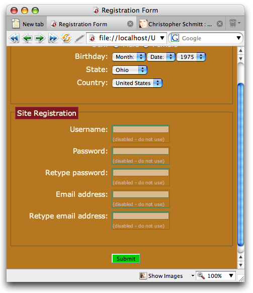
Figure 4. Adding more feedback for the user.
Enabling Styles
Styling enabled elements is more straightforward. We don't need to add extra markup to make the elements disabled for a start. The below CSS rules add some styling to the radio buttons:
option:enabled {
  color: #9F393F;
}

input:enabled {
  background: #21B6A8;
  color:#9F393F;
}
This produces an output as seen in Figure 5:
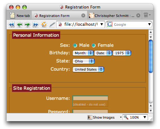
Figure 5. Styled radio buttons
Checking Styles
With CSS3 selectors we can now style checked form elements just as easily as any other radio button, like so:
input[type="radio"]:checked {
  background: #9F393F;
}
Now try running the example and clicking a radio button, and you'll see a result like Figure 6.
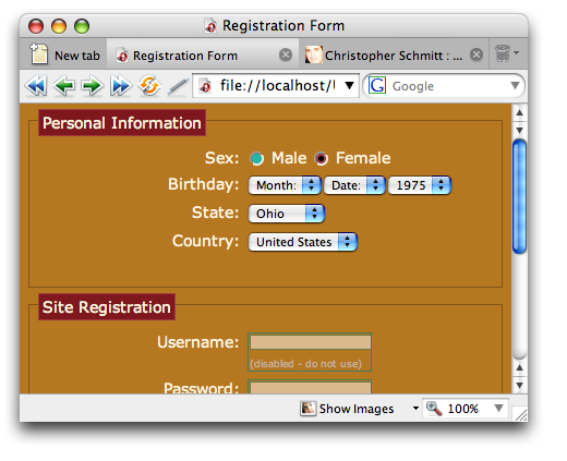
Figure 6. Styling checked controls.
CSS3 Support - Opera came out on top
At the time of writing, the only browsers that support the :disabled, :enabled and :checked selectors are Opera 9.5 and to some extent Firefox 2 and 3, however I didn't have robust support for the selectors in Firefox like I did in Opera 9.5. The stepping further approach of coupling content auto-generation after the :disabled selector doesn't work. Also, the coloring of the text from the :enabled CSS rule occurred only after I clicked on the form controls.
In Conclusion
This wraps up our two-part article series on styling forms. We've covered attribute selectors as well as new CSS3 selectors that offer greater control over styling Web forms than ever before.
This article is licensed under a Creative Commons Attribution, Non Commercial - Share Alike 2.5 license.
Comments
The forum archive of this article is still available on My Opera.
No new comments accepted.