Starting with a sound structure – predictable HTML layouts using the YUI
Introduction
In my previous article I introduced you to the YUI, talked about why and how it was created and explained the principles behind it, as well as what parts comprise it. This time we'll plunge right in, create an HTML document using the YUI grids component.
Starting with a structure
When you build a house you need a solid foundation, and the same goes for web pages. While it is true that most desktop browsers will try to display almost anything that vaguely looks like HTML, there is no point in giving in to that commodity - sloppy code takes longer to load, is inaccessible, and often won't run on some low power browsers, eg mobile browsers. In addition, you cannot develop in a structured fashion or work with other developers in a distributed manner when you don't follow a standard. Following the W3C standards first and foremost does not mean doing the right technical thing, but instead means you create code that can be validated and easily converted to other output formats (PDF, XML dialects and so on). Valid HTML also means you can predictably style the document using CSS and add extra functionality using JavaScript and the DOM.
An HTML starting point
Without further ado, let's get started by creating a basic HTML starting point for the YUI grids to build on:
<!DOCTYPE HTML PUBLIC "-//W3C//DTD HTML 4.01//EN" "http://www.w3.org/TR/html4/strict.dtd">
<html dir="ltr" lang="en">
<head>
  <meta http-equiv="Content-Type" content="text/html; charset=utf-8">
  <title>Starting on the right foot... HTML Template</title>
  <link rel="stylesheet" type="text/css" href="http://yui.yahooapis.com/2.3.1/build/reset-fonts-grids/reset-fonts-grids.css"></head>
<body>
    <div id="doc">
        <div id="hd">Header, baby, yeah!</div>
        <div id="bd">Nice body</div>
        <div id="ft">Groovy footer</div>
    </div>
    <script type="text/javascript"></script>
</body>
</html>
HTML documents should always start with a DOCTYPE - I'm using HTML 4.01 strict as that provides us with the strictest possible rules while being supported by most browsers. The DOCTYPE is immensely important because it determines how browsers show web pages. Using the right DOCTYPE forces the browser to follow the W3C guidelines; using the wrong one makes it draw assumptions as to how something should be shown to the user. This is called Doctype Switching and there is a lot of information on it available here.
Next up we define the language (en for English) and the reading direction of the document (ltr for left-to-right) in the html element and open the head element. Inside the head element we define the encoding of the document in a meta tag (utf-8 is the safest bet there as it includes Latin, Asian, Hebrew, Arabic and Eastern European languages) and include the title element, which describes the current document (and gets indexed by search engines).
Adding YUI-specific styles and elements
Next up in our basic HTML template is alink element that points to the style sheet we want to apply. In this case we use the combined YUI CSS component file that includes CSS Reset, Fonts and Grids.
In order to use the YUI CSS grids we need four div elements to the main document: a container div with an id of doc, which contains three smaller containers for:
- Page header (
id hd) - Page body (
id bd) - Page footer (
id ft)
At the end of the document body we add a script element to include our JavaScript. This is a bit of a break in tradition as most (including my older) best practice tutorials tell you never to add a script inside the body, but instead keep them in the head.
There are however two good reasons why it makes sense to add scripts at the end of the body:
First of all you can be sure that HTML content you want to alter using JavaScript will be loaded by the time the JavaScript is accessed Second, browsers stop rendering the page when they load scripts. Adding scripts at the end of the body means your scripts don't slow down the initial rendering of the page and that means your page appears to load a lot faster to end usersDefining your page grid
You can find the document I have built so far in gridstemplate.html - download it and open it in a browser and you'll see that the YUI CSS components have already worked some magic. The reset component has got rid of all the browser differences in rendering and the font component has reset the font to the equivalent of 13 pixels whilst still rendering it resizable.
Defining the overall page width
The doc id made the whole document 750 pixels wide and centred it horizontally in the browser (defined in the YUI CSS). This is the standard for most older pages on the Yahoo! network and if you want to fully support users running a 800x600 pixels resolution with their browsers in full screen width, it makes sense to use it. If I don't want this width, all I need to do is change the id - doc2 makes the document 950 pixels wide, doc3 makes it as wide as the browser window and doc-custom allows you to define your own width. For this example I will choose doc2 as I can fit more into a wider window.
Choosing the main template
So far I have set up our rendering and font defaults and defined the width of the page. This is all well and good, but it doesn't constitute a layout – all I have created so far is a header and footer with a body in between. In order to create a multicolumn layout I need another container with the id yui-main and two divs with the class yui-b (which stands for for "block".) I then use the yui-main container to enclose the main block and keep the other one outside. I end up with the following:
<!DOCTYPE HTML PUBLIC "-//W3C//DTD HTML 4.01//EN" "http://www.w3.org/TR/html4/strict.dtd">
<html dir="ltr" lang="en">
<head>
    <meta http-equiv="Content-Type" content="text/html; charset=utf-8">
    <title>Two column grids template</title>
    <link rel="stylesheet" type="text/css" href=" http://yui.yahooapis.com/2.3.1/build/reset-fonts-grids/reset-fonts-grids.css">
</head>
<body>
<div id="doc2">
    <div id="hd">Header, baby, yeah!</div>
    <div id="bd">
        <div id="yui-main">
            <div class="yui-b">
                Main Content
            </div>
        </div>
        <div class="yui-b">
            Secondary Content
        </div>
    </div>
    <div id="ft">Groovy footer</div>
</div>
<script type="text/javascript"></script>
</body>
</html>
This still shows the two containers one above the other, but the YUI again comes to the resue here - it contains a series of predefined layout templates, accessed through different classes. All I need to do to apply a layout to my page is add one of the following classes to my main container div (the one with the id of doc2):
- yui-t1 - Two columns, narrow on left, 160px
- yui-t2 - Two columns, narrow on left, 180px
- yui-t3 - Two columns, narrow on left, 300px
- yui-t4 - Two columns, narrow on right, 180px
- yui-t5 - Two columns, narrow on right, 240px
- yui-t6 - Two columns, narrow on right, 300px
- yui-t7 - One full-width column
If I for example add a class of yui-t6 to the main container div I'll have a grid with a secondary content area of 300 pixels on the right and a main content column that spans the rest of the main container (that I defined as 950 pixels.) You can find the following code in the file twocolumn.html.
<!DOCTYPE HTML PUBLIC "-//W3C//DTD HTML 4.01//EN" "http://www.w3.org/TR/html4/strict.dtd">
<html dir="ltr" lang="en">
<head>
    <meta http-equiv="Content-Type" content="text/html; charset=utf-8">
    <title>Two column grids template</title>
    <link rel="stylesheet" type="text/css" href=" http://yui.yahooapis.com/2.3.1/build/reset-fonts-grids/reset-fonts-grids.css">
</head>
<body>
<div id="doc2" class="yui-t6">
    <div id="hd">Header, baby, yeah!</div>
    <div id="bd">
        <div id="yui-main">
            <div class="yui-b">
                Main Content
            </div>
        </div>
        <div class="yui-b">
            Secondary Content
        </div>
    </div>
    <div id="ft">Groovy footer</div>
</div>
<script type="text/javascript"></script>
</body>
</html>

<>
Defining standard and special grids
The above takes care of the main layout blocks - the only thing left, layout wise, is to define the layout within our main blocks. In YUI this is done using grids (split into 2 types - standard grids and special grids.) Each grid has units and is defined as a div with the class yui-g for standard grids and yui-ga to yui-gf for special grids. Each grid needs the right amount of nested unit containers with the class yui-u. If I wanted for example to split our main content into two equal columns using a standard grid, I'd use the following (found in standardgrids.html):
<!DOCTYPE HTML PUBLIC "-//W3C//DTD HTML 4.01//EN" "http://www.w3.org/TR/html4/strict.dtd">
<html dir="ltr" lang="en">
<head>
    <meta http-equiv="Content-Type" content="text/html; charset=utf-8">
    <title>Nested grid template</title>
    <link rel="stylesheet" type="text/css" href=" http://yui.yahooapis.com/2.3.1/build/reset-fonts-grids/reset-fonts-grids.css">
</head>
<body>
<div id="doc2" class="yui-t6">
    <div id="hd">Header, baby, yeah!</div>
    <div id="bd">
        <div id="yui-main">
            <div class="yui-b">
                <div class="yui-g">
                    <div class="yui-u first">First</div>
                    <div class="yui-u">Second</div>
                </div>
            </div>
        </div>
        <div class="yui-b">
            Secondary Content
        </div>
    </div>
    <div id="ft">Groovy footer</div>
</div>
<script type="text/javascript"></script>
</body>
</html>
Notice that I use a class of first to define which of the grids should be the first one on the left. This is independent of the order in the source document. The above example shows the unit with the text content First on the left. If I shifted the first class to the other unit that one would be shown on the left instead. This is an amazingly powerful tool and one of the coolest things YUI grids offers you.
The special grids allow for different numbers of columns and space distribution:
- yui-gb - Special grid, 1/3 - 1/3 - 1/3
- yui-gc - Special grid, 2/3 - 1/3
- yui-gd - Special grid, 1/3 - 2/3
- yui-ge - Special grid, 3/4 - 1/4
- yui-gf - Special grid, 1/4 - ¾
So if I wanted to add another grid below the one I've already defined containing three columns, all I would need to do is to add another grid using the yui-gb class and three units.
<!DOCTYPE HTML PUBLIC "-//W3C//DTD HTML 4.01//EN" "http://www.w3.org/TR/html4/strict.dtd">
<html dir="ltr" lang="en">
<head>
    <meta http-equiv="Content-Type" content="text/html; charset=utf-8">
    <title>Nested grid template</title>
    <link rel="stylesheet" type="text/css" href=" http://yui.yahooapis.com/2.3.1/build/reset-fonts-grids/reset-fonts-grids.css">
</head>
<body>
<div id="doc2" class="yui-t6">
    <div id="hd">Header, baby, yeah!</div>
    <div id="bd">
        <div id="yui-main">
            <div class="yui-b">
                <div class="yui-g">
                    <div class="yui-u first">First</div>
                    <div class="yui-u">Second</div>
                </div>
                <div class="yui-gb">
                    <div class="yui-u">Second</div>
                    <div class="yui-u">Third</div>
                    <div class="yui-u first">First</div>
                </div>
            </div>
        </div>
        <div class="yui-b">
            Secondary Content
        </div>
    </div>
    <div id="ft">Groovy footer</div>
</div>
<script type="text/javascript"></script>
</body>
</html>
As you can see this already makes it very flexible. It gets even better when you remember that you can nest grids and create lots and lots of different combinations that way.
The lazy way of using YUI grids
At first glance this can look a bit overwhelming and complex, however the flexibility you gain by using these containers, ids and classes is pretty impressive. In addition, you can be sure that, when a new browser comes out and becomes widely used, the YUI will get an update and your layout will still work.
If you don't feel like memorizing all these classes and ids you can just refer to the handy cheatsheets available on the YUI site. Another, even lazier way is to use the YUI grids builder, a WYSIWYG editor that allows you to choose your template, define your grids and copy and paste the final code into your main code editor.
Adding extra hooks for styling and functionality
While this is enough to define a layout I have not yet looked at styling it. You can use the element names and classes, but in order to achieve a specificity high enough to, for example, style the sidebar differently from the main content you need to use rather contrived selectors like .yui-b and #yui-main .yui-b. To save a lot of headaches and to add another hook to use in JavaScript later on it makes a lot of sense to add some ids to label the different sections of the document, as shown below:
<!DOCTYPE HTML PUBLIC "-//W3C//DTD HTML 4.01//EN" "http://www.w3.org/TR/html4/strict.dtd">
<html dir="ltr" lang="en">
<head>
    <meta http-equiv="Content-Type" content="text/html; charset=utf-8">
    <title>Template with ID hooks</title>
    <link rel="stylesheet" type="text/css" href=" http://yui.yahooapis.com/2.3.1/build/reset-fonts-grids/reset-fonts-grids.css">
</head>
<body&rt;
<div id="doc2" class="yui-t6">
    <div id="hd">Header, baby, yeah!</div>
    <div id="bd">
        <div id="yui-main">
            <div class="yui-b">
                <div class="yui-g" id="introduction">
                    <div class="yui-u first">First</div>
                    <div class="yui-u">Second</div>
                </div>
                <div class="yui-gb" id="showcase">
                    <div class="yui-u first">First</div>
                    <div class="yui-u">Second</div>
                    <div class="yui-u">Third</div>
                </div>
            </div>
        </div>
        <div class="yui-b" id="sidebar">
            Secondary Content
        </div>
    </div>
    <div id="ft">Groovy footer</div>
</div>
<script type="text/javascript"></script>
</body>
</html>
This'll make it a lot easier to style the sections differently and apply some JavaScript functionality to make the interface more usable.
To be continued
In this article I looked at creating a sturdy HTML base for my example, described why this is important and how you can add a few divs with the right class names to created hundreds of different layouts using the YUI CSS grids component. You can then add some styling to create a nice looking site with this, as shown in Figure 1.
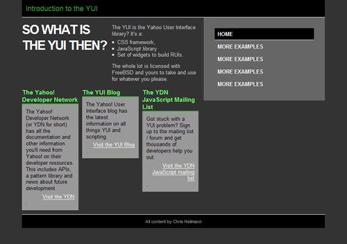
Figure 1: The styling is quite nice, but the CSS columns by default do not line up, and are as high as their text content.
This is all well and good, but it does have it's problems. The columns are not the same height and the right column does not extend all the way down to the footer. This is something that could be fixed with CSS but it would mean a lot of hacking. It is much easier to achieve this with a bit of JavaScript and we'll talk about how to do that in the next article in this series.
This article is licensed under a Creative Commons Attribution, Non Commercial - Share Alike 2.5 license.
Comments
The forum archive of this article is still available on My Opera.
No new comments accepted.