Progressive Enhancement with CSS 3: A better experience for modern browsers
Introduction
The latest releases of cutting-edge browsers (such as Safari 3 and Opera 9.5) implement some of the decorative declarations from the proposed CSS 3 specification. Opacity, shadows and tiger-striping effects are now available without the use of JavaScript, server-side code or extra markup. But with some older browsers still in everyday use, it can be a little frustrating to think that you might not get the chance to use them for another few years.
In this article I will look at how you can use graceful (or, progressive) enhancement techniques to make use of CSS3 features in browsers that support them, while ensuring that your code will still provide a satisfactory user experience in older browsers that do not yet support those features.
The full code for the example featured in this article can be found here.
What is progressive enhancement?
To understand the concept of progressive enhancement, you first need to understand the method of graceful degradation, which is summarised nicely by the following quote:
Graceful degradation means that your Web site continues to operate even when viewed with less-than-optimal software in which advanced effects don't work.
Graceful enhancement approaches the same methodology from the opposite direction; instead of providing fallback states to ensure sites operate on less-than-optimal software, we take advantage of features in newer software in order to provide an enhanced experience, while ensuring that the basic state still works on older devices. This is, of course, the ideal way to implement the new CSS 3 declarations.
An example
For this example, I'm going to build a simple navigation menu that will look a little prettier depending on the CSS support in your favourite browser.
I should note that in this example I'm using no graphics, no hacks, and no browser-specific prefixes; all the enhancements are using stable, implemented declarations. Having said that, some of the choices I've made are specifically for example purposes, and may not be best practice for production sites.
The Markup
I'm starting with a simple unordered list-based navigation menu, written in POSH:
<ul>
<li><a href="">Lorem Ipsum</a></li>
<li><a href="">Lorem Ipsum</a></li>
<li><a href="">Lorem Ipsum</a></li>
<li><a href="">Lorem Ipsum</a></li>
<li><a href="">Lorem Ipsum</a></li>
</ul>
The Baseline Style
I'm going to apply a baseline style that uses only simple descendant selectors. This will apply a border to each list item, and a change of background on mouseover. This should work in every graphical browser made in the last five or six years (and perhaps even older).
The CSS for this is straightforward:
ul {
background-color: blue;
border-bottom: 1px dotted #999;
list-style: none;
margin: 15px;
width: 150px;
}

li {
background-color: #fff;
border: 1px dotted #999;
border-bottom-width: 0;
font: 1.2em/1.333 Verdana, Arial, sans-serif;
}

li a {
color: black;
display: block;
height: 100%;
padding: 0.25em 0;
text-align: center;
text-decoration: none;
}

li a:hover { background-color: #efefef; }
The only oddity you might notice is the blue background on the <ul>; this will be explained later. With these styles, we have a baseline appearance which will display in IE6 as shown in Figure 1.
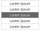
Figure 1: This baseline appearence will display in IE6 and other older browsers.
Applying the Enhancements
IE7 was the first of the series of IE browsers to support all of the CSS 2.1 attribute selectors, which are also implemented in pretty much every other browser release. We can use one of these - the child selector - to begin the process of enhancement. As IE6 doesn't support the child selector, it will ignore the following rules:
body > ul { border-width: 0; }

ul > li {
border: 1px solid #fff;
border-width: 1px 0 0 0;
}

li > a {
background-color: #666;
color: white;
font-weight: bold;
}

li:first-child a { color: yellow; }

li > a:hover { background-color: #999; }
With these rules added to the CSS, the list now looks like Figure 2:
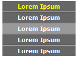
Figure 2: The list now has coloured backgrounds and bolder text, and the first link is highlighted in a different colour.
IE7, Firefox, Safari and Opera all display like this.
Adding more emphasis
The next step is to add a little more emphasis, by using a property that IE doesn't recognise: Opacity. We don't need to use any special selectors for this, as IE will simply ignore any properties it doesn't support:
li { opacity: 0.9; }

li:hover { opacity: 1; }
Figure 3 shows this property working in Opera; you can see that the list items inherit a blue tint from the background on the <ul>. On mouseover, each element becomes fully opaque.
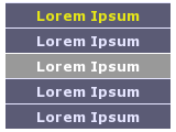
Figure 3: Adding opacity to our example.
You could, of course, use IE's filter property to gain the same effect in IE as well. For the purposes of the tutorial, I'll stick to standard CSS, as filter is not standard therefore it won't validate.
Firefox 2 supports opacity, but with more recent browsers we can go even further. With Safari and Opera, we can decorate the text and hint at depth by using the text-shadow property:
li a:hover { text-shadow: 2px 2px 4px #333; }As Figure 4 shows, the moused-over element now gains a little shadow and seems to stand out from the page slightly.
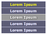
Figure 4: Adding text shadows with CSS3.
Finally, we can take advantage of Opera's full support for the new CSS 3 selectors and add one more layer of enhancement: alternating background colours using the nth-child selector:
li:nth-child(2n+1) a { background-color: #333; }

li:nth-child(n) a:hover {
background-color: #aaa;
color: #000;
}

li:first-child > a:hover { color: yellow; }
Figure 5 shows Opera's tiger-striped menu.
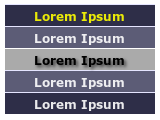
Figure 5: A tiger-striped menu, created using nth-child.
The Result and Summary
Figure 6 is a side-by-side comparison of how the initial markup is viewed in IE6, IE7, Firefox, Safari and Opera, after applying the CSS rules used in this article. As you can see, as the browser's support for CSS becomes more sophisticated, the menu becomes more styled and complicated, and using progressive enhancement, the menu remains usable even in six-year-old browsers.

Figure 6: The result in IE6, IE7, Opera and Firefox.
Of course, many browsers have a myriad other properties which I haven't used here but could easily be implemented, for example RGBA colours and SVG as background images. And Opera 9.5 is still only in pre-release at the moment, so who knows what else is to come?
This article is licensed under a Creative Commons Attribution, Non Commercial - Share Alike 2.5 license.
Comments
The forum archive of this article is still available on My Opera.
No new comments accepted.