Opera Mobile 9.7 - features and standards support
This article is obsolete
It's retained for historical purposes only. Download the latest version of Opera or see what's coming soon in Opera.Next. See Web specifications support in Opera.
Introduction
We are proud to announce the release of the Opera Mobile 9.7 beta on Windows Mobile! You can download the beta and try it out right now for free — we'd love to know what you think.
In this article, I'll give you a brief rundown of the new features available on Opera Mobile 9.7, then jump into looking at Opera Mobile 9.7 web standards support, and how this support can help you optimize sites so they display better in the browser. Along the way I’ll also cover the Opera Mobile 9.7 user agent string, Google Gears support, and Opera Dragonfly support (ie how to use it to debug sites directly on mobile).
New features
This release has many improvements over its predecessor, including:
- New rendering engine: Opera Mobile 9.7 uses our Opera Presto 2.2 rendering engine, which gives improved speed, 100/100 on the Acid 3 test, and many new standards support improvements, as you'll see below
- Improved support for Opera Widgets: Opera Mobile supports Opera Widgets, Opera's self-contained, cross-device applications built using web standards. Browse to the Opera Widgets homepage using Opera Mobile 9.7 beta and try some out
- Widget Manager: This release also features a new Widget Manager with improved usability and design, which runs independently from the browser
- Opera Mobile 9.7 supports Opera Turbo: This is a simple but effective feature that, when turned on, compresses pages by up to 80%, giving you a faster browsing experience if you are in a low or patchy bandwidth area. It does not use the same compression technology as Opera Mini, but it is similar. You can read more about Opera Turbo on labs.opera.com
- Google Gears support: Gears is an open source project that allows improved web applications with features such as offline storage and worker threads to help tired processors handle number crunching. Read more about it below
The new UI looks like Figure 1.

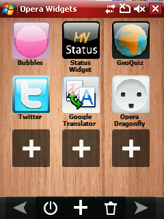
Figure 1: Opera Mobile 9.7’s new UI.
Download all the code examples for this article.
Bug fixes
We've also ironed out some of the issues with the 9.51 Beta:
- Installation on storage cards is now possible, and this beta will happily coexist with previously installed versions of Opera Mobile
- This beta has better IME support (although a lot of non-standard 3rd party IME applications still make support levels less than we'd like)
- This release also has better performance and feedback when clicking links
Opera Mobile 9.7 user agent string
Opera Mobile 9.7 identifies using the following string:
Opera/9.7 (Windows Mobile; HTC PPC; Opera Mobi/35166; U; en) Presto 2.2.1Where buildnumber is replaced by the actual four digit build number. Note that the PPC part of the string is read from the registry on the phone; on some phones it may be modified to something different by the handset manufacturer, eg HTC PPC.
Web standards support
This is the easy part—Opera Mobile 9.7 is powered by the same core rendering engine as Opera Desktop 10, so its web standards support is basically the same as that of its desktop-based cousin.
Cross device development techniques
Opera Mobile 9.7’s standards support means that it can run any web site that you would expect the major desktop browsers to support—it is a fully-featured web browser running on a mobile device. There are however physical constraints to be aware of such as screen size, which can result in a different user experience when your site is viewed on mobile devices. These call for some extra thought when developing your web sites:
- Create sensible layouts: this applies for web pages as a whole—having sensible, simple layouts increases usability on desktop browsers as well as mobile browsers, but it is particularly important for page elements such as forms—you should aim to keep them small enough so that each section of the form will fit on a single screen, and allow the user to select their options from lists wherever possible, to keep inputting text down to a minimum.
- Use different controls: You can’t always guarantee that mobile users are controlling your site with a (virtual) mouse, and it is a lot more difficult to enter large amounts of data using a mobile keypad, therefore you should plan carefully, for example by allowing the user to select options from a list wherever possible, rather than having to type in all the data they are required to specify.
- Different screen sizes: Your viewport will obviously be a lot smaller on mobile devices than it is on desktop. The excellent zoom function of Opera Mobile 9.7 helps a great deal in navigation around large pages, but you can also employ techniques to make the mobile experience better, such as CSS 3 media queries, and the
viewport metatag. You’ll learn more about these below.
Media queries
Media queries are a CSS 3 construct that allow you to wrap a set of CSS rules in a condition so that they are only applied to the markup if the condition is met by the browser viewing the page — for example "only apply these rules if the device viewport width is less than 480 pixels". The following example specifies this rule:
img {
  margin: 0 0 10px 10px;
  float: right;
}

@media all and (max-device-width: 480px) {
  img {
    margin: 10px auto;
    float: none;
    display: block;
  }
}
On devices with only a small screen width available, it makes sense to just display images below text, not float them to the right. Opera Mobile 9.7 has support for media queries.
Let's have a look at a slightly more involved example. I've created a simple two-column example — see Figure 2.
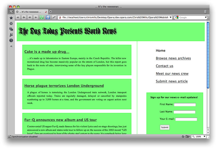
Figure 2: A simple two column example web site.
You can check out the example live, or study the code by downloading the code download for this article. This is floated using the following rules in the CSS:
#content {
  float:left;
  width:60%;
  padding:0px 10px 10px 30px;
  border-right:1px solid #0f0;
}

#sidebar {
  float:right;
  width:30%;
  margin-bottom:10px;
  padding:30px 10px 10px 0px;
}
However, if you look lower down the CSS, you'll come across the following set of rules:
@media all and (max-width: 750px), all and (max-device-width: 750px) {

  h1 {
    font-size: 200%;
  }

  #content {
    width: 100%;
  }

  #sidebar {
    float:none;
    width: 100%;
    padding: 0 0 0 0;
  }


  li {
    padding: 5px 0px 5px 0;
    font-size: 100%;
  }

  #nav {
    float:right;
    width: 250px;
  }

  .news-item {
    margin: 10px 10px 10px -40px;
  }

  div#signup-form {
    width: 275px;
  }

}
They are encased inside a Media Query (@media all and (max-width: 750px), all and (max-device-width: 750px) {}) that says "for all media types, apply these rules if the browser width is equal to or less than 750 pixels, or if the width of the viewing device screen is less than 750 pixels" (this last bit is required for mobile devices). The result of this is that if the browser window is less than 750 pixels, the layout dynamically changes to that seen in Figure 3.
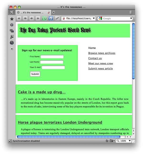
Figure 3: Our simple two column example web site has been dynamically changed using a Media Query!
The most important things that this media query does are getting rid of the two column layout by setting the sidebar's float property to none, and causing the form to float alongside the navigation by setting its float value to right.
But that's not all. We've got another Media Query below the first one, which looks like this:
@media all and (max-width: 540px), all and (max-device-width: 480px) {

 #nav {
    float:none;
    width: 250px;
  }

}
This Media Query says "for all media types, if the maximum width of the browser window gets below 540 pixels, or if the maximum width of the device's screen gets below 480 pixels, apply the rules inside". If you view the example site using Opera Mobile 9.7, it should look something like Figure 4.

Figure 4: Now the float has been removed from the form in the sidebar!
The second Media Query simply removes the float from the form and reduces its width, so that it is even narrower, and will work better on small screen mobile devices.
The viewport meta tag
The viewport meta tag contains information about the preferred settings of the viewport for viewing the HTML page it is contained within. Just like any other meta tag, viewport sits inside the head element of your HTML page—browsers that support it use the information to display the web page more appropriately for that device, while browsers that don’t simply ignore it. It was originally created by Apple to improve the way web pages display on the iPhone, but we have added support for it in Opera Mobile 9.7 because it is a good way of optimizing display information for different mobile devices. The tag looks like so:
<meta name = "viewport" content = "width = device-width, height = device-height" />All it contains is the meta attribute, which specifies that this is a viewport meta tag, and the content attribute, which contains a comma-delimited list of the different values you want to specify for this page. The different pieces of information you can specify are as follows:
widthandheight: These specify the width and height that the viewport should be set at for this web page. The values can be set in pixels, or even better, you can use thedevice-widthanddevice-heightvalues, respectively, to specify that the width and height should be set as the full width and height of the device’s screen. The default value ofwidthis 980 pixels, and it can be set from 200 to 10,000 pixels. The default value ofheightis calculated from the width of the device and its aspect ratio, and it can be set from 223 to 10,000 pixels.initial-scale: This sets the initial scale of the web page when it is first displayed. By default it just fills up the whole screen of the device, unless you deliberately set it otherwise.
Note that the user-scalable, minimum-scale and maximum-scale attributes are not supported at this point. Also, as the presence of the viewport meta tag in the page’s head section indicates the author has taken care of optimizing for mobile, small screen rendering is not applied. This means that viewport-enabled pages will look exactly the same whether “Mobile view” is switched on or off.
Web Fonts — Web typography just got easier
One big sore point among Web designers for a number of years now has been the lack of fonts available to use on Web sites. Sure, you can make use of any font installed on your machine via CSS, but there is no guarantee that it will be installed on your site visitors’ machines. In fact, there are very few fonts that you can guarantee to be installed across all major platforms, and you often need to specify different platform—specific variations for serif or sans serif fonts, and test them on their respective platforms to make sure your design holds up.
But this is hopefully going to change in the near future, with Web Fonts. Web Fonts is a CSS 3 module that allows you to download a specified font file along with a Web site and then make use of it on that Web site, so it doesn’t need to be installed on your site visitor’s computers. To include the font along with the Web site download, you use the following syntax:
@font-face {
  font-family: "My font gothic";
  src: url("http://www.myweb.com/fonts/myfont.ttf") format("truetype");
}
You declare your custom font inside a @font-face construct (do it at the start of your stylesheet, before you set any fonts), then refer to it in your stylesheet as normal, for example:
p {
  font-family: "My font gothic";
  ...
}
Andreas has created a Web Fonts example, which uses the Forgotten Futurist and Minya Nouvelle fonts. Access the web fonts example at the link above using a supporting browser, and you should see something like Figure 5.
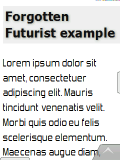
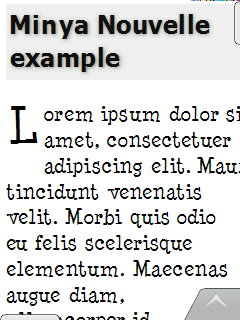
Figure 5: Our Web Fonts example, running in Opera Mobile 9.7.
More free fonts are listed on the Free Font Manifesto page and on Larabie Fonts. More complex examples can be found on this Web Fonts demo page.
The selectors API
The selectors API specification defines DOM APIs designed to make selecting DOM elements a lot simpler.
Let's look at an example—the following line selects all of the elements in a document with a class of alert:
document.querySelectorAll(".alert");The next line selects the first div element in a document:
document.querySelector("div");The use of CSS-like syntax for the argument makes things a bit easier for non-JavaScript experts.
As you can see above, there are two new methods supported in Opera Presto 2.2: querySelector() and querySelectorAll(). The former returns the first matching element within the tree, and the latter returns a collection of all matching elements as a NodeList. The current specification defines that the methods are available on the Document, Element and DocumentFragment nodes, however our implementation currently only supports it on the Document and Elements nodes.
The querySelector() method is useful for situations where only the first matching element is needed, and is designed to be more efficient than the alternative querySelectorAll() method in such cases.
To see how much easier this is compared with traditional APIs, consider this example HTML fragment:
<ul id="fruits">
  <li><input type="checkbox" name="fruit" value="apples"> Apples</li>
  <li><input type="checkbox" name="fruit" value="oranges"> Oranges</li>
  <li><input type="checkbox" name="fruit" value="bananas"> Bananas</li>
  <li><input type="checkbox" name="fruit" value="grapes"> Grapes</li>
</ul>
After the user has filled out the form containing those check boxes, suppose you want to get the list of all the checked items. Using traditional APIs, this would require obtaining a list of all the input elements and iteratively checking which ones were checked.
var fruits = document.getElementById("fruits");
var checkboxes = fruits.getElementsByTagName("input");
var list = [];
for (var i = 0; i < checkboxes.length; i++) {
  if (checkboxes[i].checked) {
    list.push(checkboxes[i]);
  }
}
Using these new APIs, the operation can be reduced to a single line of code!
var list = document.querySelectorAll("#fruits input:checked ");
This returns a node list containing all the input elements that were checked by the user. Your script can then perform any operation you like with them.
Gears support
Go to the Gears web site and click the “Install Gears” button. This makes all the Gears APIs available, so users can take advantage of advanced functionality when they surf to Gears-enabled web sites.
The idea is that as a developer using Gears your web site should contain a piece of code that detects whether Gears is installed on a visiting browser, before your web application tries to access Gears APIs. The code should first initialize Gears by including gears_init.js, then do a check to see if google.gears is defined, which it will be if Gears is installed. If it isn’t, your code should probably redirect the user to the Gears installation page, or serve them up a more basic version of your application, depending on what is most suitable for your situation. If Gears is installed, then it should just continue running the rest of the code.
Allowing your users to go offline
At the basic level, allowing your users to access a site offline is incredibly simple (it gets a bit more complex when you start involving dynamic data sources). All you need to add to your regular web site is:
- Some kind of special user interface functionality to give users with Gears installed the option to store the web site locally so it can be used offline.
- A manifest file, which is a JSON file that resides in the root of your web site’s server location. This file contains a
versionvalue, which allows Gears to track whether the site has been updated, and a series ofurlvalues, which are relative paths to all the files Gears needs to store locally for the web site to work offline.
When the user then selects the option to store the site locally, they will be able to access the site and work with it normally while offline, even down to accessing the same URL.
When you update your Gears-enabled web site, you should increase the version number inside the manifest file by a sensible iteration of your choosing. When Gears detects a new version number, it will automatically download a fresh copy of the site to the user’s computer. Google Code has a full tutorial on taking your site offline with Gears.
Enhancements on desktop and mobile web applications
Creating web applications that provide a smooth, responsive user experience is enough of a challenge over desktop, but on mobile devices it is even more difficult. Mobile networks have high latency and low bandwidth compared to desktop computers, meaning that you need to be extra careful with the amount of code an application requires, as well as the number of round trips to the server. Mobile devices have also less processing power than desktop computers, so you need to optimize very carefully. One last point to consider is that JavaScript is not great at integrating with mobile context and taking advantage of the hardware it is running on—it is not easy for it to access the user’s location, phone camera or address book.
Gears can solve many of these issues. You can ease the strain on your processor by splitting up JavaScript calculations into separate worker threads, which are background processes defined by Gears that can perform tasks on behalf of the browser. You can make applications more responsive by downloading data (it provides offline database functionality via SQLite) and code onto your device and allowing much of your application’s functionality to run offline. On top of this, you can also use Gears to create application shortcuts for your web applications that will be visible in the file system.
The Gears APIs
You can find more out about the Gears APIs on the Gears web site, but here is a quick rundown of what’s available:
- Database API: This allows persistent client side data storage, using a SQLite database, meaning that data can be stored on the client while the application is online, and then used to continue working while the application is offline.
- Desktop API: Provides functionality for integrating Gears applications with the desktop, for example creating shortcuts that will access web applications.
- Factory API: The
Factoryclass is used to instantiate all other Gears objects, so it’s basically the central controlling API for the whole application. The easiest way to create aFactoryobject is to usegears_init.js, as mentioned above. - HttpRequest Module API: This API implements a subset of the standard W3C XMLHttpRequest specification, to make Ajax-type functionality available in the offline application, both in the HTML pages and background worker threads.
- LocalServer API:
LocalServeris what allows Gears to cache an application’s files locally and serve them without having a network connection available. It in effect creates a virtual server for controlling Gears applications. - Timer API: This API implements the standard Timer API found in the browser’s
Windowobject inside Gears. This make timers available in the offline application, both in the HTML pages and background worker threads (see Worker Pool API below). - WorkerPool Module API: Provides a way to define background worker processes—these allow JavaScript calculations/processing to be done in the background, taking some of the strain away from the browser, so that the application runs more smoothly, and the UI is less likely to become unresponsive. This is invaluable for mobile applications.
- Geolocation API: This API provides the best estimate of the user’s position using a number of so called location providers. The
getCurrentPositionandwatchPositionmethods allow web applications to retrieve a user’s current position or watch how it changes over time. ThelastPositionproperty allows to quickly and cheaply obtain the user’s last known position.
Opera Dragonfly support
Using Opera Dragonfly’s remote debugging feature, you can debug content running directly in an instance of Opera Mobile 9.7, from an instance of Opera Desktop (with Opera Dragonfly running.) This is an incredibly useful feature for developers wishing to check out their sites on mobile. To find out how to set up remote debugging and debug sites running on Opera Mobile 9.7, check out David's article. There is also an article available to give you a guided tour of Opera Dragonfly, and take you through the basics.
Opera Widgets support
Opera Widgets are cross platform and cross device applications that run on top of any browser that supports them. They are made with web technologies, therefore you can develop Opera Widgets quickly and easily and deploy them to different devices with a minimum amount of adaptation.
The good news is that Opera Mobile 9.7 now has full support for these. You can download hundreds of Opera widgets for free from the Opera Widget homepage, and find a lot more out about how develop them in the Opera Widgets SDK.
Note: due to some changes in the way Widgets are run on Opera Mobile 9.7, you will need to add the following into your Widget config.xml files to get them to access the network — network="public".
Summary
I hope you have enjoyed this developer-centric tour of Opera Mobile 9.7. Let us know what you think, in the discussion forum for this article, or the Opera Forums.
Chris Mills

Chris Mills is a web technologist, open standards evangelist and education agitator, currently working at Opera Software in the developer relations team. He spends most of his time writing articles about web standards for dev.opera.com and other publications (such as .net mag and A List Apart), giving talks at universities and industry conferences, and lobbying universities to improve their web education courses. He believes that education is the answer to everything, but in particular he is passionate about using education to improve the overall content quality, accessibility, usability and future-viability of the Web.
He is the creator of the Opera Web standards curriculum, contributor to the WaSP InterACT project, and coauthor of InterACT with web standards: A Holistic Approach to Web Design. In August 2011, he also accepted the position of co-chair of the newly-formed Web Education Community Group.
Outside work he is a heavy metal drummer, proud father of three and lover of good beer.
This article is licensed under a Creative Commons Attribution, Non Commercial - Share Alike 2.5 license.
Comments
The forum archive of this article is still available on My Opera.
No new comments accepted.