Opera Mobile 9.5 - the developer angle
This article is deprecated; instead, we refer to Mobile-friendly: The mobile web optimization guide and An introduction to meta viewport and @viewport.
Introduction
Opera Mobile 9.5 beta 2 has just come out on Windows Mobile, plus beta 1 on UIQ! It comes with many exciting new user features such as:
- Faster speed: With the Presto rendering engine, Opera Mobile 9.5 is more than 2.5 times faster than Internet Explorer Mobile.
- Great new look and feel: The beautiful UI, animation and transitions in Opera Mobile 9.5 set a new standard for the mobile browsing experience—see Figure 1 for an example screenshot.
- Support for Opera Widgets: Opera Mobile supports Opera Widgets, Opera's compact desktop applications built using web standards. Browse to the Opera Widgets homepage using Opera Mobile 9.5 and try some out.
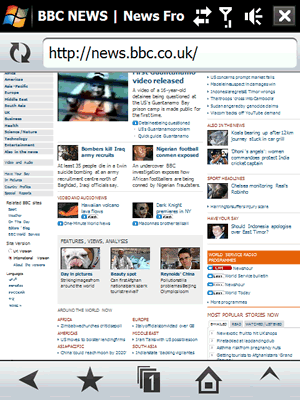
Figure 1: Opera Mobile 9.5’s new UI.
This is all well and good, but you’re probably wondering how Opera Mobile 9.5 will affect your work as a designer or developer. There are certainly some interesting new features to check out and points to be aware of to optimize sites so they display better in Opera Mobile 9.5. Below I’ll cover the Opera Mobile 9.5 user agent string, web standards support, cross device development techniques and Opera Dragonfly support (ie how to use it to debug sites directly on mobile).
Download all the code examples for this article.
Opera Mobile 9.5 user agent string
Opera Mobile 9.5 identifies using the following string:
Opera/9.51 (Microsoft Windows; PPC; Opera Mobi/buildnumber; U; en)
Where buildnumber is replaced by the actual four digit build number. Note that the PPC part of the string is read from the registry on the phone; on some phones it may be modified to something different by the handset manufacturer, e.g. HTC PPC.
Web standards support
This is the easy part—Opera Mobile 9.5 is powered by the same core rendering engine as Opera Desktop 9.5, so its web standards support is basically the same as Opera 9.5 desktop’s standards support.
Cross device development techniques
Opera Mobile 9.5’s standards support means that it can run any web site that you would expect the major desktop browsers to support—it is a fully-featured web browser running on a mobile device. There are however physical constraints to be aware of such as screen size, which can result in a different user experience when your site is viewed on mobile devices. These call for some extra thought when developing your web sites:
- Create sensible layouts: this applies for web pages as a whole—having sensible, simple layouts increases usability on desktop browsers as well as mobile browsers, but it is particularly important for page elements such as forms—you should aim to keep them small enough so that each section of the form will fit on a single screen, and allow the user to select their options from lists wherever possible, to keep inputting text down to a minimum.
- Use different controls: You can’t always guarantee that mobile users are controlling your site with a (virtual) mouse, and it is a lot more diffficult to enter large amounts of data using a mobile keypad, therefore you should plan carefully, for example by allowing the user to select options from a list whever possible, rather than having to type in all the data they are required to specify.
- Different screen sizes: Your viewport will obviously be a lot smaller on mobile devices than it is on desktop. The excellent zoom function of Opera Mobile 9.5 helps a great deal in navigation around large pages, but you can also employ techniques to make the mobile experience better, such as CSS 3 media queries, and the
viewport metatag. You’ll learn more about these below.
Sensible forms
To make forms more usable on mobile browsers in general, you should if at all possible make them small enough to fit on a single screen, and allow the user to select the most popular options from select form controls, rather than expecting them to input all the choices—text input is always going to be fiddly on a mobile phone, so the less they have to do it, the better! Let’s look at a simple form example that allows the user to enter some personal details:
<form action="forms_example1.html">
  <fieldset>
    <legend>Personal details</legend>
    <ul>
      <li><label for="name">First and last name:</label> <input type="text" name="name" id="name" value="" /><label for="age">Age:</label> <input type="text" name="age" id="age" value="" /></li>
      <li><label for="bio">Biography:</label> <textarea name="bio" id="bio" cols="25" rows="3"></textarea></li>
      <li><label for="country">Home country:</label> <input type="text" name="country" id="country" value="" /></li>
      <li><input type="submit" value="submit" /></li>
    </ul>
  </fieldset>
</form>
You can play with this form example here. This looks ok for an unstyled form, but try using this on a mobile browser, and you might find it to be a bit of a pain. (If you don't have a mobile browser to hand, use View > Small screen in the Opera desktop browser.) Firstly, it won’t fit on some screens without horizontal scrolling. Secondly, the user has to enter a lot of information, both in the Biography and and Home country fields. How can you make this work a bit better on mobile devices? Let’s have a look at a slightly updated version of the example:
<form action="forms_example2.html">
  <fieldset>
    <legend>Personal details</legend>
    <ul>
      <li><label for="name">First and last name:</label> <input type="text" name="name" id="name" value="" /></li>
      <li><label for="age">Age:</label> <input type="text" name="age" id="age" value="" /></li>
      <li>
        <p>Interests (tick all that apply):</p>
        <p><label for="music">Music:</label> <input type="checkbox" name="music" id="music" /></p>
        <p><label for="sports">Sports:</label> <input type="checkbox" name="sports" id="sports" /></p>
        <p><label for="travel">Travel:</label> <input type="checkbox" name="travel" id="travel" /></p>
        <p><label for="fooddrink">Food and drink:</label> <input type="checkbox" name="fooddrink" id="fooddrink" /></p>
        <p><label for="gaming">Computer gaming:</label> <input type="checkbox" name="gaming" id="gaming" /></p>
        <p><label for="otherinterest">Other interest:</label> <input type="text" name="otherinterest" id="otherinterest" value="" /></p>
      </li>
      <li>
        <p>
          <label for="country">Home country:</label>
          <select id="country">
            <option value="UK">United Kindom</option>
            <option value="USA">USA</option>
            <option value="Norway">Norway</option>
            <option value="Canada">Canada</option>
            <option value="Germany">Germany</option>
            <option value="Netherlands">The Netherlands</option>
            <option value="Belgium">Belgium</option>
          </select>
        </p>
        <p>
          <label for="othercountry">Other country:</label> <input type="text" name="othercountry" id="othercountry" value="" />
        </p>
      </li>
      <li><input type="submit" value="submit" /></li>
    </ul>
  </fieldset>
</form>
Play with the updated form example to see how it works. Here I have made sure that everything is in a fairly thin column, so that it should work well on most mobile screens without horizontal scrolling. In addition, I have replaced the biography section with a section allowing the user to pick their interests via checkboxes, with a text field to allow them to enter another interest they may have that isn’t on the list. Interests is basically what I wanted to find out about them, so this is an easier way to do it than expecting them to type in a large passage via a mobile keypad.
Similarly, for the Home country selection, I have allowed the user to select the most popular options from a drop-down list, rather than having to type it in. A text field is provided in case they want to specify a different option.
Of media types, media queries and viewport
There are three ways in which you can optimize style for different devices and media—media types, media queries and the viewport meta tag. In this section I will look at each one briefly and comment on how it is supported in Opera Mobile 9.5, before then looking at how the three can be used together to provide a cross-browser web page, one that should display sensibly across most devices/browsers.
Media types
Everyone who has been doing web development using CSS should know what this means by now—basically, you can specify that different stylesheets should be used when the page is being displayed via different media, such as on the screen, on the printed page, or on handheld devices. These are specified using something like the following:
<link rel="stylesheet" href="screenstyle.css" type="text/css" media="screen" />
<link rel="stylesheet" href="handheldstyle.css" type="text/css" media="handheld" />
<link rel="stylesheet" href="printstyle.css" type="text/css" media="print" />
The one most relevant to mobile devices is handheld, and sure enough many mobile browsers will use the handheld styles by default, allowing developers to automatically serve a more suitable stylesheet to mobile devices, e.g. one with a simplified layout that takes into account a smaller screen size and limited CSS capabilities.
Opera Mobile 9.5 is a bit different—we made the decision to not use the handheld stylesheet by default because it is a fully-featured web browser, capable of pretty much everything a desktop browser can do, so why dumb it down to a basic stylesheet? If “Mobile view” is switched on however, handheld stylesheets are applied.
Media queries
Media queries are a CSS 3 construct that work in a similar fashion to IE conditional comments, except they are a cross-browser standard rather than a proprietary technology. You wrap a set of CSS rules in a condition so that they are only applied to the markup if the condition is met by the browser viewing the page, for example “only apply these rules if the device viewport width is less than 480 pixels”. The following example specifies this rule:
img {
  margin: 0 0 10px 10px;
  float: right;
}

@media all and (max-device-width: 480px) {
  img {
    margin: 10px auto;
    float: none;
    display: block;
  }
}
On devices with only a small screen width available, it makes sense to just display images below text, not float them to the right. Opera Mobile 9.5 has full support for media queries.
The viewport meta tag
The viewport meta tag contains information about the preferred settings of the viewport for viewing the HTML page it is contained within. Just like any other meta tag, viewport sits inside the head element of your HTML page—browsers that support it use the information to display the web page more appropriately for that device, while browsers that don’t simply ignore it. It was originally created by Apple to improve the way web pages display on the iPhone, but we have added support for it in Opera Mobile 9.5 because it is a good way of optimizing display information for different mobile devices. The tag looks like so:
<meta name = "viewport" content = "width = device-width, height = device-height" />
All it contains is the meta attribute, which specifies that this is a viewport meta tag, and the content attribute, which contains a comma-delimited list of the different values you want to specify for this page. The different pieces of information you can specify are as follows:
widthandheight: These specify the width and height that the viewport should be set at for this web page. The values can be set in pixels, or you can use thedevice-widthanddevice-heightvalues, respectively, to specify that the width and height should be set as the full width and height of the device’s screen. The default value ofwidthis 980 pixels, and it can be set from 200 to 10,000 pixels. The default value ofheightis calculated from the width of the device and its aspect ratio, and it can be set from 223 to 10,000 pixels.initial-scale: This sets the initial scale of the web page when it is first displayed. By default it just fills up the whole screen of the device, unless you deliberately set it otherwise.minimum-scaleandmaximum-scale: These specify the minimum and maximum amounts that the user is allowed to zoom in and out, their values being multipliers.minimum-scalehas a default value of 0.25, and its value can range from just above zero to 10.0.maximum-scale’s value can also range from just above zero to 10.0.user-scalable: Specifies whether the user is allowed to zoom in and out—possible values areyesandno, withyesbeing the default.
Opera Mobile 9.5 fully supports the viewport meta tag, with a few notable specific behaviours. It ignores user-scalable, minimum-scale and maximum-scale because we believe that zooming is a browser feature that should always be available for users. Also, as the presence of the viewport meta tag in the page’s head section indicates the author has taken care of optimizing for mobile, small screen rendering is not applied. This means that viewport-enabled pages will look exactly the same whether “Mobile view” is switched on or off.
It is recommended that width and height values are not hardcoded for a single device, such as the iPhone; instead you should set their values to device-width and device-height, so that your pages also work nicely on VGA, QVGA, WVGA and WQVGA devices.
Using them in harmony
You should try to limit the use of separate, device-specific URLs as much as possible: you can optimize the same page for a variety of different devices using a smart combination of the above three features. To demonstrate using them together, let’s adapt the example shown above, adding some features to it. You can view the basic example here. The HTML for it looks like so:
<!DOCTYPE html PUBLIC "-//W3C//DTD XHTML 1.0 Strict//EN" "http://www.w3.org/TR/xhtml1/DTD/xhtml1-strict.dtd">
<html xmlns="http://www.w3.org/1999/xhtml">
  <head>
    <meta http-equiv="Content-Type" content="text/html; charset=utf-8" />
    <title>Simple form example 3</title>
    <link rel="stylesheet" href="screenstyle.css" type="text/css" media="screen" />
  </head>
  <body>
    <div id="wrapper">
      <h1>Welcome to summer camp!</h1>
      <img src="camp_mini.gif" alt="" />

      <p>Hi there, and welcome to summer camp—we are very glad to have you staying with us! To make your stay as fun as possible, we’d like to customise our offerings to your needs and and preferences. Fill in the following form to tell us a little about yourself, so we can give you the activities you’ll most enjoy, and pair you up with people you’ll have something in common with initially. After the initial settling in period, you can then go on to talk to others, and find more out about other cultures. Let a member of staff know if there is anything you need.</p>

      <form action="forms_example1.html">
        <fieldset>
          <legend>Personal details</legend>
          <ul>
            <li class="interest"><label for="name">First and last name:</label> <input type="text" name="name" id="name" value="" /></li>
            <li id="spacer" class="interest"><label for="age">Age:</label> <input type="text" name="age" id="age" value="" /></li>
            <li class="divider">
              <p>Interests (tick all that apply):</p>
              <p class="interest"><label for="music">Music:</label> <input type="checkbox" name="music" id="music" /></p>
              <p class="interest"><label for="sports">Sports:</label> <input type="checkbox" name="sports" id="sports" /></p>
              <p class="interest"><label for="travel">Travel:</label> <input type="checkbox" name="travel" id="travel" /></p>
              <p class="interest"><label for="fooddrink">Food and drink:</label> <input type="checkbox" name="fooddrink" id="fooddrink" /></p>
              <p class="interest"><label for="gaming">Computer gaming:</label> <input type="checkbox" name="gaming" id="gaming" /></p>               <p class="interest"><label for="otherinterest">Other interest:</label> <input type="text" name="otherinterest" id="otherinterest" value="" /></p>
            </li>
            <li class="divider interest">
              <p><label for="country">Home country:</label>
              <select id="country">
                <option value="UK">United Kindom</option>
                <option value="USA">USA</option>
                <option value="Norway">Norway</option>
                <option value="Canada">Canada</option>
                <option value="Germany">Germany</option>
                <option value="Netherlands">The Netherlands</option>
                <option value="Belgium">Belgium</option>
              </select>
              </p>
              <p><label for="othercountry">Other country:</label> <input type="text" name="othercountry" id="othercountry" value="" /></p>
            </li>
            <li><input type="submit" value="submit" /></li>
          </ul>
        </fieldset>
      </form>
    </div>
  </body>
</html>
And the CSS looks like so:
#wrapper {

  width: 600px;
  position: absolute;
  top: 20px;
  left: 25%;
  background-color: #FFCE7B;
  padding: 20px;
  font-family: "trebuchet MS", verdana, helvetica ;
  font-size:80%;

}

h1 {

  font-family: helvetica, arial, tahoma ;

}

img {

  float:right;

}

form {

  width: 450px;
  margin-left: 30px;
  margin-right: 50px;
  background-image: url("camp.gif");
  background-repeat: no-repeat;
  background-position: top;

}

li {

  list-style-type: none;

}

#spacer {

  padding-bottom: 10px;

}

.divider {

  border-top: black 1px solid;
  padding-top: 5px;

}

.interest {

  text-align: right;
  padding-right: 100px;

}
This example is ok as it stands, but you could do several things to optimize it for mobile devices (view the final example in all its glory).
First, I’ll add a handheld stylesheet using the following line:
<link rel="stylesheet" href="handheldstyle.css" type="text/css" media="handheld" />
In this stylesheet (see handheldstyle.css in the code download), I’ve basically removed most of the layout and styling stuff to simplify it (many mobile devices won’t support the fonts I specified in the main stylesheet, for example) and keep file size down, removed the CSS background image to further reduce download size, and decreased the width of the content. Anything else should gracefully degrade if if meets a browser that doesn’t support it (ie, just be ignored). You can quickly test how the handheld stylesheet styles the page by selecting “View > Small Screen” in the Opera Desktop menu bar, if you don’t have a suitable mobile browser available.
Next, I’ll add the following viewport meta tag into the head of the HTML:
<meta name = "viewport" content = "width = device-width, height = device-height" />
This ensures that, on browsers that understand this tag, such as Opera Mobile 9.5, the width and height are automatically set to the width and height of the device, meaning that it will fit in nicely.
Finally, I will add a media query to the bottom of the screen stylesheet, to optimize the page display for browsers that don’t select the handheld media type by default. This is as follows:
@media all and (max-device-width: 480px) {

  #wrapper {

    position: static;
    width: auto;
  }

  img {

    float:none;

  }

  form {

    width: auto;
    background-image: none;

  }

 .interest {

    text-align: left;
    padding-right: 0px;

  }

}
This basically just cancels out a lot of the positioning information (as well as the background image), to effect a much simpler layout when the maximum device viewport width is below 480 pixels.
Try the example out on any devices you have at hand. Figure 2 shows a side-by-side comparison of the same page viewed in Opera desktop 9.5, and Opera Mini 4.1.
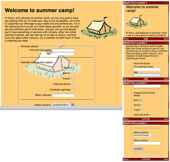
Figure 2: The example page shown in both Opera 9.5 desktop and Opera Mini 4.1.
Opera Dragonfly support
Using Opera Dragonfly’s new remote debugging feature, you can debug content running directly in an instance of Opera Mobile 9.5, from an instance of Opera Desktop 9.5 (with Opera Dragonfly running.) This is an incredibly useful feature for developers wishing to check out their sites on mobile. To find out how to set up remote debugging and debug sites running on Opera Mobile 9.5, check out David's article. There is also an article available to give you a guided tour of Opera Dragonfly, and take you through the basics.
Opera Widgets support
Opera Widgets are cross platform and cross device applications that run on top of any browser that supports them. They are made with web technologies, therefore you can develop Opera Widgets quickly and easily and deploy them to different devices with a minimum amount of adaptation.
The good news is that Opera Mobile 9.5 now has full support for these. You can download hundreds of Opera widgets for free from the Opera Widget homepage, and find a lot more out about how develop them in the Opera Widgets SDK.
Summary
I hope you have enjoyed this developer-centric tour of Opera Mobile 9.5. Let us know what you think, in the discussion forum for this article, or the Opera Forums.
Chris Mills

Chris Mills is a web technologist, open standards evangelist and education agitator, currently working at Opera Software in the developer relations team. He spends most of his time writing articles about web standards for dev.opera.com and other publications (such as .net mag and A List Apart), giving talks at universities and industry conferences, and lobbying universities to improve their web education courses. He believes that education is the answer to everything, but in particular he is passionate about using education to improve the overall content quality, accessibility, usability and future-viability of the Web.
He is the creator of the Opera Web standards curriculum, contributor to the WaSP InterACT project, and coauthor of InterACT with web standards: A Holistic Approach to Web Design. In August 2011, he also accepted the position of co-chair of the newly-formed Web Education Community Group.
Outside work he is a heavy metal drummer, proud father of three and lover of good beer.
This article is licensed under a Creative Commons Attribution, Non Commercial - Share Alike 2.5 license.
Comments
The forum archive of this article is still available on My Opera.
No new comments accepted.