Microformat Encoding and Visualization
Introduction
So you have heard about microformats, read the introductory articles and even bought the book. But now you are probably thinking "great - I have done my part to make the web a better place by adding microformats; what's next? What can people do with my data besides adding it to their address book or calendar?" The intent of this article is to get you to think about microformats in different ways, and to demonstrate some interesting visualizations and mash-ups of microformatted content.
If you are not familiar with the basics and background of microformats, then I would suggest reading these articles first, before going any further:
OK, so now you know what formats exist and what they can do, I want to help you train your eye to spot microformats.
Microformatspotting
With some practice you will start to spot microformattable data all over the place. Microformattable data isn't just text structured in page footers or as a list in the sidebar. They can easily be applied to prose text, right in the flow of the document. Each time we read something, our brains are ordering and giving structure to the content - we just don't necessarily realize it. This is because humans are smart; we are programmed to find patterns and make order out of chaos. Machines, on the other hand, aren't so good at these things, so they need some explicit help. Adding microformats to structured content is great, but adding microformats to unstructured content is even better. This adds value where the machine wasn't able to extract value in the first place. For example, take the following text snippet from the Wikipedia page about Informatics, read through it, and see how many you can spot.
In 1957 the German computer scientist Karl Steinbuch
 coined the word Informatik by publishing a paper called Informatik:
 Automatische Informationsverarbeitung (i.e. "Informatics: automatic
 information processing"). The English term Informatics is commonly
 misunderstood to be the same as computer science. But Informatics
is theoretically oriented contrary to computer science and therefore
 is more oriented towards mathematics than computer science.

The French term informatique was coined in 1962 by Philippe Dreyfus
 together with various translations-informatics (English), also proposed
 independently and simultaneously by Walter F.Bauer who co-founded
 the company named Informatics General Inc., and informatica (Italian,
 Spanish, Portuguese), referring to the application of computers to store
 and process information.
Did you see them all? Lets take a look at those paragraphs again - this time I will point out and mark-up some of the microformats.
<p class="vcard vevent">
  <span class="description">In
    <span class="dtstart">1957</span>
    the German computer scientist
    <span class="fn">Karl Steinbuch</span>
    coined the word Informatik by publishing a paper called
    <span class="summary" lang="de">Informatik: Automatische
    Informationsverarbeitung
    </span>
    (i.e. "Informatics: automatic information processing").
  </span>
The English term Informatics is commonly misunderstood to be the same
 as computer science. But Informatics is theoretically oriented contrary
 to computer science and therefore is more oriented towards mathematics
than computer science.
</p>

<p class="vevent">
  <span class="description vcard">
    The French term
    <span class="summary">informatique was coined</span> in
    <span class="dtstart">1962</span> by
    <span class="fn">Philippe Dreyfus</span>
    together with various translations—informatics (English)
  </span>
  , also proposed independently and simultaneously by
  <span class="vcard">
    <span class="fn">Walter F.Bauer</span>
    who co-founded the company named
    <span class="org">Informatics General Inc.</span>
  </span>, and informatica (Italian, Spanish, Portuguese), referring
 to the application of computers to store and process information.
</p>
In those 2 paragraphs, there are at least 2 events and 3 people. See how some of the data overlaps and is free form. Sometimes the microformat properties are not in the order you might expect or there is some distance between the values. If you look more closely at what I marked up, you will notice that we have given structure to two events in the past. The hCalendar microformat is not just for upcoming events - it can be used to mark up any event. You might say to yourself, "That's great, I just added microformats, but who cares what year these terms were coined? Its not like I am going to add 1957 and 1962 into Outlook as I would tomorrow's meeting!"
This is true - you probably aren't going to sync this data with your mobile device and check on events from 40+ years ago, so what is the point of marking this up with microformats? Is this just mark-up for mark-ups sake? Certainly not! By adding this little bit of "semantic sugar" to your HTML, we can begin to display this same data in a variety of different ways and pivot on many different axes. In aggregate, we can begin look at all recorded events that happened in those years.
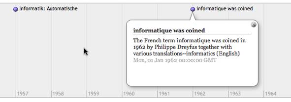
To date, the most common visualization of hCalendar data has been to convert the HTML to an .ics file and import it into your calendar app. This allows you to interact with the event alongside your daily routine, but we can do so much more with the data. Events that have timestamps can easily be plotted onto a timeline to help visualize the data. So we can take our previous example from the Wikipedia article and extract the dates and put them into a timeline without having to write a single piece of code.
Timeline Visualizations
The W3C SIMILE project has a JavaScript timeline application, which is easily embedded into HTML, much like popular JavaScript map widgets. In JavaScript you specify the data points, labels and a few other properties, then they are nicely plotted on the timeline for you. The nice thing about this JavaScript timeline application is that it also accepts a pointer to an XML file as input. This allows you to point to a page that has been microformatted with hCalendar to plot it on the timeline. Lets look at that Wikipedia snippet again, and see how we can take the microformatted page, convert it to XML and send it to the timeline application to be displayed. All these steps are done by using web services, so you don't have to code anything. The final result should look like that shown in Figure 1.

Figure 1: The Wikipedia article represented on the Timeline
Converting the data
There are a few sites that offer services to convert hCalendar to the XML needed for the JavaScript Timeline application.
These two web services allow you to take an hCalendar and transform it into different formats. Now you can begin to visualize the same event data in different ways than the original author intended. This is only possible with the help of the extra semantics that microformats provide. If the HTML had no semantic information, it would be near impossible for a machine to extract the data and associated text correctly, let alone know what type of information. By adding microformats, the original author opens the doors to lots of mashup possibilities. Taking the data and re-combining it, re-mixing it and re-displaying it in ways the author never intended or thought of! By adding a sprinkle of semantics to the HTML the data becomes orders of magnitude more valuable.
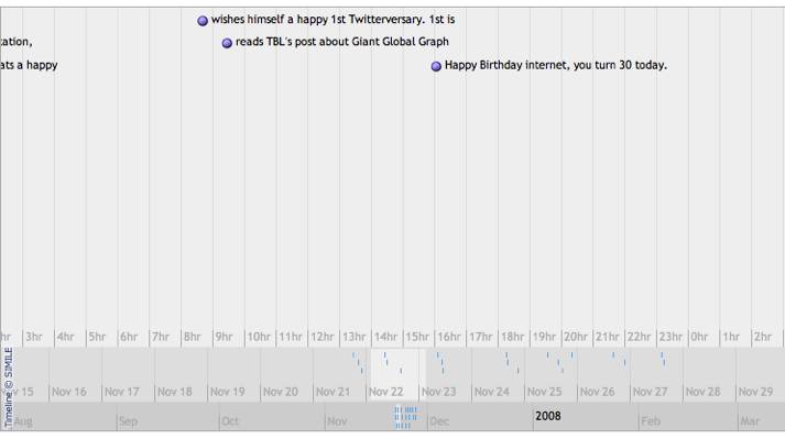
Anything that has a date can be a candidate for mapping to a timeline. The web 2.0 poster child Twitter is a tool that could benefit from being mapped onto a timeline. When you look at a friend's twitter feed, you see all the posts in reverse consecutive order. Each entry has a timestamp that can be plotted on a timeline. You can begin to see things that were not visible as a simple list. Trends emerge, such as posting more or less frequently on the weekends or evenings. These new alternative visualisations present some answers, but more often they lead to more questions. That giant gap on my friend's timeline where there were no posts at all - what was happening there? Were they busy, on vacation, or maybe something else? You can begin to do statistical analysis and get the average number of hours between posts and predict when the next one will appear. Figure 2 shows some twitter data plotted on the JavaScript timeline application.

Figure 2: Twitter data plotted on the JavaScript timeline application.
Graph Visualization
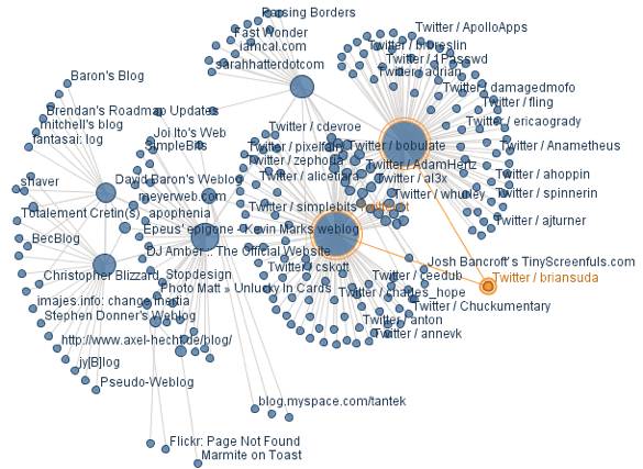
XFN is a microformat that defines relationships between you and another person. XFN defines several link types, from friend and colleague to co-worker and spouse. We can crawl all these links to a depth and graph the relationships. IBM's many eyes visualization service (see Figure 3) allows us to do just this.

Figure 3: tantek.com's XFN links represented at a crawl depth of 3, with Brian Suda highlighted
The above example takes tantek.com and spiders the site for XFN links. These are links to friends of Tantek. It finds the links marked up with XFN and follows them where it continues to look for more XFN links on each successive site. It does this to a depth of 3 and creates a graph of nodes, which are URLs, and edges, which are the XFN links between the nodes. Rather than see a list of links on an HTML page, you can now begin to visualize them on a graph. You can see how many inbound and outbound links each site has. The more connections in and out of a node, the more links that person has. By following the links, you can begin to connect yourself to anyone else on the graph through other people's URLs. It is possible to create your own Kevin Bacon Game with A-List bloggers and technologists. How many steps are there between Bill Gates and myself?
Map Visualizations
The BBC ran a short 30 day mini site about a boat trip called The Bangladesh River Journey. This website is full of Microformats, including the geo microformat, which is a way to mark-up places with a latitude and longitude, adding semantics to disambiguate them from other places with the same or similar names. You can then take that geo data and extract it using a web service, or the Operator toolbar for Firefox.
Using a service like http://suda.co.uk/projects/microformats/geo/ it is possible to convert the HTML page into a KML file or GeoRSS. This is great, but you might ask yourself "what good are those files?" One thing you can do is to import a KML file into Google maps - on the maps.google.com page, you can type the URL of a KML file and Google Maps will parse it and plot it on the map.
You can take the original BBC page (http://www.bbc.co.uk/worldservice/bangladeshboat/) and pass that into my geo web service. Doing so creates the following longer URL, which is a link to the resulting KML file - http://suda.co.uk/projects/microformats/geo/get-geo.php?type=kml&uri=http://www.bbc.co.uk/worldservice/bangladeshboat/
Now you can go to maps.google.com, paste that URL into the search box, and press enter/return. If everything goes well, you should have a new URL like this:
http://maps.google.com/maps?f=q&hl=en&geocode=&time=&date=&ttype=&q=http:%2F%2Fsuda.co.uk%2Fprojects%2Fmicroformats%2Fgeo%2Fget-geo.php%3Ftype%3Dkml%26uri%3Dhttp:%2F%2Fwww.bbc.co.uk%2Fworldservice%2Fbangladeshboat%2F&ie=UTF8&ll=22.973567,90.351563&spn=2.098716,3.735352&t=p&z=8&om=1
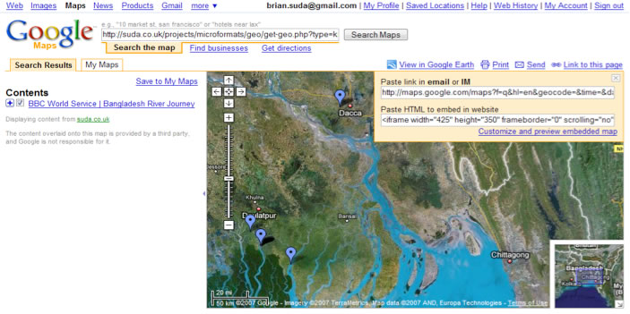
Your screen output should now look something like Figure 4.

Figure 4: The BBC page marked-up with geo microformat and displayed in Google Maps
Using techniques like this, you can begin to visualize geo content in a more spatial manner. You can see that Dacca is pretty far from Daulatpur, but when you are reading it in the text, you will have no sense of scale. The geo to map visualizations provide yet another way to view microformatted content outside the box of what was originally intended.
Summary
As you develop sites and site content, you will begin to get a trained eye for microformats and start to see them everywhere. As more and more content is microformatted, you can begin to visualize and represent the data in different ways. With all of these examples, you gain further understanding of the data from the context of the visualizations. These alternative visualizations of the data are only possible when you add more semantic meaning into the HTML. This enables other people to add more value to your products by introducing new ways to look at and perceive the information - all of which only cost you a few minutes development time to encode some microformats. There are plenty of resources out there to get you started, including a microformats cheatsheet, Dreamweaver plugins and several web-based tools to help you create microformats automatically.
The original authors of Twitter probably never though of plotting your twitter posts on a timeline, just like someone else who reads this article will probably think of another visualization that I never considered. You could be the one to get other people thinking in different ways by turning this data on its head through the use of microformats.
In future articles I will explore individual microformat Mashups more deeply.
This article is licensed under a Creative Commons Attribution, Non Commercial - Share Alike 2.5 license.
Comments
The forum archive of this article is still available on My Opera.
No new comments accepted.