Making a cross-platform AJAX-based web application
By Nicolas Mendoza
1. Introduction
I will go through how to make a full-blown widget that uses
AJAX technology. It fetches news from a newsfeed source, presents them
nicely to you, includes some eyecandy and of course lets you customize the
amount of news items, refresh time and which category of news you want to be
shown.
In addition, the widget will also be able to run as a regular client-side web application,
for instance on a cell phone or inside a desktop browser. I will use open
standards where possible, but some corner-cases might not be as cross-browser as
they might have been I had spent more resources on them. The widget is intended
to run in the Opera browser and for mobile surfing there are not any real
alternatives to Opera's browser.
Hopefully you have already worked your way through the tutorial and played with simple widgets.
If not, you should do that to get familiar with them. You should also have some familiarity with HTML, JavaScript and CSS but you will still be able to learn a thing or two if you do not.
2. Structure
When making Web applications, just like when making normal applications, you want to separate the presentation from the program logic. This is mainly so that you can easily exchange things in the presentation or logic without affecting each other. In addition, sometimes you might want to have different presentations of the same application depending on situations, such as the device it is running on.
With Web applications you get an additional layer in between for "free". The program logic, that executes actions depending on user input or other conditions, is done in the script part of the application. The layout of the application, and how it looks to the user, you do in CSS. In between you can structure the hierarchy of various elements in your application using the structural nature of HTML.
2.1. Hello Structure
An example would be having a "Hello, World!" text that is shown when clicking a button, letting it be red on screen media, and blue on handheld devices:
<!DOCTYPE html PUBLIC "-//W3C//DTD XHTML 1.0 Strict//EN" "http://www.w3.org/TR/xhtml1/xhtml1-strict.dtd">
<html><head><title>Hello, World!</title>

<!-- layout starts -->
<style type="text/css" media="handheld,screen">
#result { display: none; }
</style>
<style type="text/css" media="handheld">
#result { color: blue; }
</style>
<style type="text/css" media="screen">
#result { color: red; }
</style>
<!-- layout ends -->

<!-- logic starts  -->
<script type="text/javascript">
function hello() {
  document.getElementById("result").style.display="block";
  document.getElementById("front").style.display="none";
}
window.onload = function() { document.getElementById("front").addEventListener("click",hello,false); }
</script>
<!-- logic ends -->

</head>

<!-- structure starts -->
<body onload="init">
<div id="result">Hello, World!</div>
<div id="front">Click me!</div>
</body>
<!-- structure ends -->

</html>
Ok, so it is a lot for a simple Hello, World, but once you start putting scripts and styles in respective files you would get something like:
<!DOCTYPE html PUBLIC "-//W3C//DTD XHTML 1.0 Strict//EN" "http://www.w3.org/TR/xhtml1/xhtml1-strict.dtd">
<html><head><title>Hello, World!</title>
<!-- layout -->
<link rel="stylesheet" type="text/css" media="handheld,screen" href="common.css" />
<link rel="stylesheet" type="text/css" media="handheld" href="handheld.css" />
<link rel="stylesheet" type="text/css" media="screen" href="screen.css" />
<!-- logic -->
<script type="text/javascript" src="script.js">
</head>
<!-- structure -->
<body>
<div id="result">Hello, World!</div>
<div id="front">Click me!</div>
</body>
</html>
And it is not bad at all. The more complex a Web application is or the less time you have to do things "right", you might be tempted to mix stuff together like I have done myself. Sometimes it leaves you with less to type, or actually helps the readability, for instance by adding onclick="" handlers directly at the elements, but the most pragmatic ones prefer to separate as much as possible, and I strive to do that myself.
2.2. File structure
In addition to structuring the content itself I want to keep files apart and keep a neat structure so that it is easier to drop-in replace things, find things and even be able to share things among different projects. For instance the library script files in "lib" are symbolic links to a repository that have libraries shared among several projects, and as they evolve they are instantly updated on all projects. This is not always clever if you do massive updates and break compatibility but it is OK if you keep compatible regarding scripting libraries or share a set of images or other external sources.
This is how the particular News Reader hierarchy looks:
# project specific scripts
./scripts
./scripts/main.js
# shared scripts
./scripts/lib
./scripts/lib/florence.js
./scripts/lib/OAnimation.js
./scripts/lib/settings.js
# stylesheets
./styles
./styles/handheld.css
./styles/screen.css
# main document
./index.html
# images (yes, really)
./images
./images/logo.png
./images/webapp_settings_32.png
./images/hw_bottom.png
./images/sep_left.png
./images/sep_right.png
./images/webapp_update_32.png
./images/hw_middle.png
./images/hw_top.png
./images/sep_left_w.png
./images/sep_right_w.png
# a configuration file when packaging the file as a widget
./config.xml
2.3. The News Reader structure
As you can see it is quite a lot of markup, but not overwhelmingly much. You might also notice lack of 100% separation between logic and presentation. If you feel bold you might want to improve it yourself as an exercise to understanding the code. I will try to comment the parts inside the HTML itself, but it is mainly a division into a feed overview section, a single feed item view, and a preferences view. I have added some (probably not necessary) sugar and containers to ease the layout and animation parts.
<!DOCTYPE html PUBLIC "-//W3C//DTD HTML 1.0 Transitional//EN" "http://www.w3.org/TR/xhtml1/xhtml1-loose.dtd">
<html xmlns="http://www.w3.org/1999/xhtml" xml:lang="en" lang="en">
<head>
<title>News Reader</title>
<style type="text/css">
<!-- Some initial style to take place before the browser is able to fetch the external files.
     Remember network might be slow on handhelds -->
#messages { top: 20%; color: blue; text-align: center; width: 100%; margin: auto;}
</style>
<!-- More styles for the two main medias -->
<link rel="stylesheet" href="styles/handheld.css" media="handheld" />
<link rel="stylesheet" href="styles/screen.css" media="screen" />
<!-- Feed library -->
<script type="text/javascript" src="scripts/lib/florence.js"></script>
<!-- Settings library -->
<script type="text/javascript" src="scripts/lib/settings.js"></script>
<!-- Animation library from http://oxine.opera.com/widgets/libraries/animation.zip -->
<script type="text/javascript" src="scripts/lib/OAnimation.js"></script>
<!-- Main program -->
<script type="text/javascript" src="scripts/main.js"></script>
</head>
<!-- call the main code when the content is done loading -->
<body onload="main()">
<!-- the top container with a logo -->
  <div id="appTop">
    <div id="appTitle">
      <img id="logoImage" src="images/logo.png" border="0" />
    </div>
  </div>
  <!-- The main content -->
  <div id="appContent">
    <!-- An eyecandy separator with two spans to add a fade out effect on both sides -->
    <div class="separator" id="sep_top"><span class="sep_left"></span><span class="sep_right"></span></div>
    <!-- A container for messages to the user -->
    <div id="messages">Loading...</div>
    <!-- The view where we list all items -->
    <div id="feedItemsView" style="display: none;">
      <!-- We will add an element for each item inside this container,
           We need a container to be able to animate the items out of the view
           but not let the page itself expand -->
      <div id="feedItems"></div>
    </div>

    <!-- View for a single feed item, Should not display when we open the application
         and before external stylesheets have loaded-->
    <div id="singleFeedItemView" style="display: none;">
      <!-- A link to # so that we end up at the top of the page when going back to view all items -->
      <a href="#" id="singleFeedItemMenu">• Back to more news</a>
      <!-- a single feed item container -->
      <div id="singleFeedItem"></div>
    </div>
    <!-- The settings view which also should not be displayed when loading the application -->
    <div id="settingsView" style="display: none;">
      <!-- a sub container to add space and more in addition -->
      <div id="settings">
        <!-- a form with various settings that we should be able to submit.
             It should not really reload a new page though so we return false-->
        <form name="settingsForm" onSubmit="return false;">
          <!-- a field to add search terms -->
          <p>Shows news containing:<br /><input type="text" id="tags"></p>
          <!-- amount of news items that should be shown (and fetched) -->
          <p>News items:<br />
            <select id="noItems">
              <option value="5">5</option>
              <option value="6">6</option>
              <option value="7">7</option>
              <option value="8">8</option>
              <option value="9">9</option>
              <option value="10">10</option>
              <option value="15">15</option>
              <option value="20">20</option>
            </select>
          </p>
          <!-- how often should a feed be refreshed -->
          <p>
          <label for="refreshPeriod">Refresh:</label> <br />
          <select id="refreshPeriod">
            <option value="15">15 mins</option>
            <option value="30">30 mins</option>
            <option value="45">45 mins</option>
            <option value="60">1 hour</option>
            <option value="120">2 hours</option>
          </select>
        </p>
        <!-- Some news sources allows to sort either by normal significance (pageRank etc.) or simply by date -->
        <p>
          <label for="sort">Sort by:</label> <br />
          <select id="sort">
            <option value="relevance">relevance</option>
            <option value="date">date</option>
          </select>
        </p>
        <!-- Buttons for saving settings or leave settings view -->
        <p id="saveButton">
          <button id="save" onClick="toggleSettingsView();saveSettings();">Save</button>
          <button id="save" onClick="toggleSettingsView();">Cancel</button>
        </p>
      </form>
    </div>
  </div>
  <!-- The bottom part of the application, the same type of separator
       and two buttons for update and enter settings that are always shown -->
  <div id="bottom">
    <div class="separator" id="sep_bottom"><span class="sep_left"></span><span class="sep_right"></span></div>
      <div id="buttons">
        <b>Settings</b>
        <a href="" id="settingsLink"><img class="buttonImage" src="images/webapp_settings_32.png" /></a>
        <a href="" id="updateLink"><img class="buttonImage" src="images/webapp_update_32.png" /></a>
        <b>Update</b>
      </div>
    </div>
  </div>

  <div id="appBottom"></div>

</body>
</html>
As you can see it is not very complicated but it is the heart of the application. You should think of how you structure your interface and how the various elements depend of each other when writing the HTML. I have also added some default actions on clicking and similar just out of lazyness instead of adding them in the program logic. On the other hand it's easier to see what the various elements are supposed to do.
You might also have noticed that I have modularized the program logic a bit by putting the common parts that I might use in other projects inside a lib directory as mentioned earlier. In addition I have added ids to most of the elements so they are reachable by the program logic for animation effects and alter values inside the elements. Now let's look at how we can make all this look nice.
3. Layout
Like I mentioned earlier most of our layout is done in CSS. I have already set some default styles to some of the elements to avoid repainting. This is specially true for devices that are on slow networks like handhelds tend to be. Ideally all layout could have gone in the CSS files and I could have used classes to indicate whether they are active or not and change this with javascript, but it is slicker in my opinion to ensure that things do not change too much around on the initial loading.
I want the application to look nice in both handhelds, which tend to have small resolutions, and on a desktop, where there is more room for eyecandy. On handhelds the information itself is much more important due to the harder navigation, the lack of resources to maintain lots of extra images, and the smaller resolution.
On the desktop I want to make an application that is appealing to the user and can take advantage of the bigger size. The desktop version is designed as a widget solution, however, so there is not too much space unless you want to be rude and take large amounts of space on the user's desktop. In addition widgets are deployed with a hardcoded size so one needs to use a reasonable size that is useful on most desktop resolutions.
Both of the stylesheets share a set of common layout properties but I have still decided to use two separate stylesheets and hence many things might overlap and be identical. This is not the end of the world however and led me to experiment with the layout while developing till the end. I could have taken out what ended up as identical and put in a shared stylesheet, but I chose not to. You may want to take the alternative approach.
3.1. Handheld layout
What you run into the most often when making applications for handheld are two things, the first is the lack of space to play with, and the second is the neccessity of making your application be easily to navigate in. You do not have the luxury of pointing devices and you need to take into consideration that navigation happens by moving through the order of elements layed out, and simple scrolling.
If you are aware of that the more choices a user is given the harder its to navigate, think of how it much worse it becomes when you might need to navigate through all options to go from one item to another one. You might add shortcuts and other nice things, but it is safest to assume that a simple arrowkey and a selection button is all you have. If you want a user to use your application, make it easy to use.
The lack of space forces you to cram things together or think ahead on how to divide information. But if you make things too small or have too much information at one place the user might not be able to read or navigate or just be blinded by too much information at once. You should test your application a lot in regards of usability also on the slowest and smallest devices and ensure it is still usable.
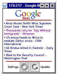
Here are two video captures of the application running on a mobile device:
body {
  background-color: #ffffff;
  font-family: sansserif, arial, helvetica;
  margin: 0;
  padding:0;
  overflow: auto; /* we want the handheld to allow us to scroll down if we overflow */
  font-size: 0.7em; /* we make the default text a tad smaller, using em of course */
  }

.feedItem {
  position: relative;
  margin: 0;
  padding: 0;
  }

.itemTitle, #singleFeedItemMenu, .itemTitleViewed {
  /* some common styles for entries in the full view and the title in a single item view */
  margin: 2px 2px;
  padding: 0;
  display: block;
  color: darkblue;;
  text-decoration: none;
  font-weight: bold;
}

#singleFeedItemMenu { display: block; }

.itemTitleViewed { color: #990099; /* when a feed is viewed we mark it differently */ }

#singleFeedItemView { padding: 2px; position: relative; display: none; }

#singleFeedItem { margin: 2px; }

#feedItems { position: relative; padding: 2px; }
#feedItemsView { display: none; overflow: hidden;  padding: 0; margin: 0; }

/* the feeds items we get actually contain html, so we resize images
   and do some massaging to fit the handheld medium */
#singleFeedItem img { max-width: 100%; display: block; margin: auto; float: none;}
#singleFeedItem > a { font-size: 1em; font-weight: bold;}
#singleFeedItem font { font-size: 1em;}
#singleFeedItem > a > br { display: none;}
#singleFeedItem > a > font { display: block; margin: auto;}
#singleFeedItem > br:first-child { display: none;}


/* This is a hack to avoid bein part of the navigation on Opera for Symbian.
   Normally a context menu for all images pop up.
   With this we ensure that the ensure that the outer element gets the
   image's original size while we actually set the image as a background on the outer element */
#appTitle {
  background-image: url('../images/logo.png');
  background-repeat: no-repeat;
  background-position: top center;
}
#logoImage { visibility: hidden;}


/* Make separators fade in and out on the sides.
   The color can be changed as the images fade outwards to an opaque white,
   making an fade effect. Makes it smoother to the eye yet separating content slightly.
.separator {
  margin: 0px auto;
  padding: 0;
  width: 95%;
  height: 2px;
  background-color: darkred;
  position: relative;
}

.sep_left {
  background-image: url(../images/sep_left.png);
  background-repeat: repeat-y;
  background-position: left;
  width: 10px;
  height: 2px;
  left: 0;
  display: inline-block;
  float: left;
}

.sep_right {
  background-image: url(../images/sep_right.png);
  background-repeat: repeat-y;
  background-position: right;
  display: inline-block;
  width: 10px;
  height: 2px;
  right: 0;
  display: inline-block;
  float: right;
}

/* how should we present the messages */
#messages { color: darkgreen; text-align: center; width: 100%; margin: auto;}

/* the combination of these make the settings view stand apart "floating" on top,
   at least originally, but then I needed more space. */
#settingsView { width: 100%; margin: auto; padding-top: 2px; position: absolute;
  text-align: center; visibility: hidden; overflow: auto; }
#settings { margin: 1px; padding: 0; background-color: #ffffff; border: 1px solid #999999; }

/* Make stuff smaller than default */
h1 { font-size: 0.7em; display: inline; margin: 2px; padding: 0; }
form { font-size: 0.5em; margin: 2px;}
form > * { margin: 2px;}
button, input, select { font-size: 0.5em;}

/* we do not want that much air in the settings */
p br { display: none; }

/* buttons go in the center on handheld */
#bottom {
  text-align: center;
}

#buttons {
  margin: 0;
  padding: 2px;
}

.button {
  display: inline-block;
  background-repeat: no-repeat;
  background-position: center center;
  border: 1px solid white;
}

#buttons * {
  vertical-align: middle;
}
You might dislike the usage of hardcoded pixel values like I have done, and I do normally that too. In this case I have mainly focused to have a good presentation on a 176x208 resolution, but it is still usable on slightly larger resolutions. However, for margins, borders and padding the use of non-relative sizes are acceptable. Open your application in Opera, press Shift+F11 to go to handheld mode, and resize window to ensure it still works OK on different resolutions.
3.2. Desktop layout
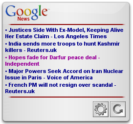
The desktop resolution and pointing devices gives you more freedom in how to place the various elements around, however for this example I have restricted myself to a hardcoded size set in the widget configuration. This makes it slightly easier to add eyecandy like picture without needing to add too much resizability, but still since the size is relatively small, one needs to still be generous regarding the usage of space.
There are some hidden tricks in both of the stylesheets in regards of positioning of feed items and overviews of feed items. This is to be able to do the animations in a smooth way. Also like mentioned, the styles have some common parts and could have probably share even more attributes if tailored better.
body {
  font-family: sansserif, arial, helvetica;
  margin: 0;
  padding:0;
  overflow: hidden;
  font-size: 0.7em;
  width: 300px; /* hard coded size */
  height: 600px;
}

/* Various background images to get the special look also more space between elements */
#appTop {
  margin: 0;
  padding: 10px 0 5px 0;
  background: transparent url(../images/hw_top.png) scroll no-repeat top left;
  }

#appContent {
  margin: 0;
  padding: 0 20px;
  overflow: hidden;
  background-image: url(../images/hw_middle.png);
  }

#bottom { margin: 0; padding: 0; }

#appBottom {
  margin: 0;
  padding: 0;
  background: transparent url(../images/hw_bottom.png) scroll no-repeat top left;
  height: 23px;
  width: 300px;
  }

.feedItem { position: relative; margin: 0; padding: 0; }

.itemTitle, #singleFeedItemMenu, .itemTitleViewed {
  margin: 2px 2px;
  padding: 0;
  display: block;
  color: darkblue;
  text-decoration: none;
  font-weight: bold;
}

#singleFeedItemMenu { display: block; }

.itemTitleViewed { color: #990099; }

#singleFeedItemView { padding: 2px; position: relative; display: none; }

#singleFeedItem { margin: 2px; }

#feedItems { position: relative; padding: 2px; }
#feedItemsView { display: none; overflow: hidden;  padding: 0; margin: 0;}

/* Still need to reformat some of the HTML in the feed items */
#singleFeedItem img { min-width: 100px; display: block; margin: auto; padding-right: 5px; max-width: 80%}
#singleFeedItem > a { font-size: 1em; font-weight: bold;}
#singleFeedItem font { font-size: 1em;}
#singleFeedItem > a > br { display: none;}
#singleFeedItem > a > font { display: block; margin: auto;}
#singleFeedItem > br:first-child { display: none;}

#appTitle {
background-image: url('../images/logo.png');
background-repeat: no-repeat;
background-position: top left;
padding: 0;
margin: 0 20px 0 20px;
}

#logoImage { visibility: hidden;}

/* we use a slightly different picture for the fading since the background is not white in the widget */
.separator {
margin: 0px auto;
padding: 0;
width: 95%;
height: 2px;
background-color: darkred;
position: relative;
}

.sep_left {
background-image: url(../images/sep_left_w.png);
background-repeat: repeat-y;
background-position: left;
width: 10px;
height: 2px;
left: 0;
display: inline-block;
float: left;
}
.sep_right {
background-image: url(../images/sep_right_w.png);
background-repeat: repeat-y;
background-position: right;
display: inline-block;
width: 10px;
height: 2px;
right: 0;
display: inline-block;
float: right;
}

#messages { color: darkgreen; text-align: center; width: 100%; margin: auto;}

#settingsView {
  width: auto;
  margin: auto;
  padding-top: 2px;
  text-align: center;
  visibility: hidden;
  overflow: auto;
  }

#settings { margin: 2px; }

/* we can have a bigger settings and buttons */
h1 { font-size: 1em;}
form { font-size: 1em;}
input, select { font-size: 1em;}

#buttons { margin: 0; padding: 8px 10px 0 10px; text-align: right; }

#buttons * { vertical-align: middle; }

/* Do not bother showing text on bottom buttons as the images are easy to identify */
#buttons b { display: none; }
4. Interface
There are a lot of good rules for making interfaces, people study these for years and making a perfect interface is not easy. I will however try to point out a few things I had in mind when designing the way the application should work.
4.1. Do not surprise the user
When designing a Web application the user interface is crucial. It's important that buttons and other interactive elements are clear on what they are supposed to do. Try to use terms that are exact and describe the action that will follow. Use common analogies that do what are expected. Blue underlined text is expected to be a clickable link. An icon with a disk, printer, circular arrow or gear are known to signify the action save, print out, reload/refresh or settings respectively.
Normally you want the interface to be rather atomic, that is, do not try to be too clever and do a lof of unexpected actions when a user expects a single action. Note that sometimes you might need to check certain preconditions after the user has clicked on something. However you might want to deactivate the button instead using techniques like removing the colors or lowering the opaqueness level. Keeping it simple is always a good rule.
When making Web applications that provide new features, there may be no common convention for how those features should be presented to the user, or interact with them. It might be tempting to experiment with alternative ways of doing things. Sometimes that might even succeed, but most of the time you will either scare away users or spend a lot of time teaching the users the new ways of interacting.
4.2. Do not be rude
Especially when you are making widgets that behave like normal desktop applications, you want to take as little screen estate as possible from the user. Screen estate is expensive, so do not be too greedy with how much you use. If you really need large amounts of screen estate consider making various display modes that let the user minimize shrink or hide your application.
Also, be careful when popping up requesters, asking questions or notifying the users about things. For instance a user might not want to know every ten seconds that no new news items have arrived. They might be interested to know every now and then that some news items have arrived. If some backend server is down when fetching news items, how about trying a couple of times while just showing already downloaded data meanwhile. Networks are flaky, and the user might not care that some news items were not available when he just removed the network connection to do some offline work at the café.
4.3. Keep related tasks close
Try to place elements that belong together nearby. Reaching out with a mouse or tabbing through a lot of elements to do a common action is tiresome. When designing for small devices which normally have awkward input methods, keeping the amount of actions needed to get from one element to another is crucial.
When designing the News reader application I chose to put the settings and refresh buttons at the bottom. This requires a user to go through all the news items before he can reach those buttons, which might seem like a bad choice. However I'm convinced that these buttons will not be used as often as entering the news items themselves. In addition having to skip past two additional elements every time you want to go to a news item requires more work. When moving back and forward between a news item and the overview I keep the focus on the last chosen news item so that it is easy to get to the next one. However when going back and forth between overview and settings I have chosen to focus on the top again if some of the settings have changed and there is a change new items have arrived.
4.4. Go with the flow
When laying out your various elements and states, use containers and group together things that belong together. This eases the overview for you or a fellow developer, improves the possibilities of styling and lets you position elements relative to each other avoiding hardcoding. In addition you might want to order elements in a logical way, keeping in mind user agents that do not support CSS, screen readers that might read text and content sequentially, and optimized browsers like Opera mini that benefits from a proper order.
4.5. Eye candy
A good application is of course pleasing to the eye and looks inviting. The first impression is crucial like with all new encounters. However, your users will quickly see past the outer beauty and want to know if there is anything worthwhile inside the application too. If your fancy graphics makes a slower download of the application, more sluggish navigation, or get in the way of the user, then all the time spent on making it look good turns out to be useless since the user will move on to other applications that are easier to use.
When making decoration and styling your application, keep in mind good habits like using high contrasts and few colors, preferably various shades of the same color. Make important things stand out, but be clear in the priorities as trying to make everything stand out, naturally leads to everything drowning each other and you end up with a cacophony of colors and effects.
Keep separate graphics for different devices, using stylesheets depending on media is a good technique, then only the graphics needed are loaded by your application. A compromise is to make a picture an average size and scale up or down as necessary. If size is not a problem, scaling down will always look better than scaling up so using a large version looks the best.
Splash screens might seem like a good idea. But only the first 10 or so times. You should avoid a splash screen unless it shows a progress indication while loading. If you want to provide information about yourself or your application, put it in an about page or similar.
4.6. Animation
Many times animation increases usability. Making an effect when hovering or activating an element gives the users feedback that they actually did activate the element. With awkward input devices this hugely increases usability. Progress bars that move helps the users understand that something is going on, and if possible how long time the process will take. However rotating icons in 3D when focusing it, is not necessary.
Keep in mind that animations require altering the screen image and possibly running scripts to exchange frames. This consumes power and on battery-dependent devices you might consider this. You do not want your users to run out of power minutes after starting your application, unless you are in the battery or power plant business that is.
In this Web application I have utilized the Animation library provided by Opera Software. It is a very handy library that lets you animate any element by adding an animation element to it. By using custom profiles it can animate virtually anything. In the News Reader Web application I have used the onfinish callbacks to make sure animations are finished before starting a new one, or entering a different state in the code. I also keep an array of ongoing animations to keep track of them. As you can see the "stairway animation" of the various news items are using it.
5. Settings
Like normal applications you want to be able to save user settings, states, configuration and other things so that they survive till next time you use the Web application. Unless you save data to a remote server using XMLHttpRequest or GET requests through images, iframes or actual requests requiring reloading of page, you are stuck with cookies.
Cookies are unfortunately not to be trusted, too much at least. But most of the time that is the only thing you've got. So when saving data to cookies, be aware that the amount of cookies per host or the size of data allowed per cookie varies. You might want to add some checking that data that was saved actually ended up correctly by reading it again. In addition you might want to have an own cokoie as an index to other cookies, and keep track of which cookies still exist.
If you happen to lose data saved in cookies, make sure your application can handle that gracefully and make the user understand why his settings are lost.
When making widgets another way of saving data is provided, namely the setPreferenceForKey(value,key) and preferenceForKey(key) functions. This allows you to store larger amount of data and are supposed to be non-volatile, that is, they are supposed to stick around.
Naturally when making Web applications that are meant for various devices and modes, whichever method is available varies. This is why I resolved to making a settings library that uses the method that is available. See the file in scripts/lib/settings.js
6. Retrieval of data
There are several ways of getting dynamic data. Including DOM LS, XMLHttpRequest, injecting javascript and probably more. XMLHttpRequest put the X in AJAX and is the de facto standard of fetching dynamic data from the Web for most Web applications. However it is not always fool-proof. Sometimes you have restrictions on which domains you are allowed to fetch data from, and sometimes the data you want to fetch is not proper XML, and you need to fall back to manual parsing of contents.
For this news reader and other Web applications I've been using the Florence library, which is basically a feed fetching library, but it also lets you iterate through content received yourself if you are not using RSS or ATOM as a news source.
The library uses XHR. If it is not allowed to contact a host due to security restrictions, it can fall back to use XHR to a designated proxy running on the same site as the web application, If neither of those methods work, it tries to use JavaScript injection. This also requires a proxy, which basically embeds content from a given URL into JavasSript code which is then included as a script.
These methods work transparently in the background and you only need to refer to a Feed object or a FeedStore object if having multiple feed sources.
I would encourage you to use an XML based format; preferably a standard one like ATOM, or a well-known but unfortunately poorly defined format like the ones in the RSS family.
Keep in mind when fetching data from external sources, that bandwidth usage might be of importance, try to reuse data if possible, use diffs or timestamps to receive only data that hasn't been received before. Be careful about recurring fetching of data. Consider changing the frequency of data-fetching based on the activity of the users. If they have not touched the application for a while, chances are they are not using the application and might not be that eager to have the application retrieve newer data.
7. Conclusion
Making sure you make reusable code, device-independent layout and interfaces that adapt to the device are not trivial tasks. However, by following this set of guidelines, being modular, avoid hardcoding, make graceful fallbacks, and acceptable degraded versions you will already be on your way in making a robust application.
My advices for making great web applications can be summarized like this:
- Do not be afraid to reuse code, and avoid re-inventing wheels and spend the energy on making it extensible and useful.
- Concentrate on letting your application do one thing and do that well
- Do not be rude to the users, let them have their ways
- Keep things simple

Nicolas Mendoza has been working with dynamic Web applications since before the term AJAX was invented. He has been working with mobile web applications, SVG, HTML, CSS, ECMAScript and other web related technologies. In addition he has a firm background in conventional programming (C, C++, Java, Perl, TCL and more.) and is a fan of Amiga, Linux, (F)OSS and Open standards.
This article is licensed under a Creative Commons Attribution, Non Commercial - No Derivs 2.5 license.
Comments
The forum archive of this article is still available on My Opera.
No new comments accepted.