Introducing Opera Fingertouch
As of today millions of people are browsing the full web on their mobile phones and devices. These devices bring new challenges to browser vendors and handset manufacturers trying to deliver a pleasurable user experience to their users because of small screen size, limited controls, and other factors. As a result, the phones and devices are evolving to suit, with touchscreens and other advances becoming more popular. In addition, people are increasingly touching screens with their fingers rather than a stylus, which is not as precise, and brings its own set of problems to the table.
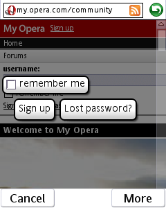
Today we introduce Fingertouch , a technology designed to make interacting with the Web easier and simpler on these touch-based devices. Fingertouch provides visual feedback when you hit a Web link, and assists you when you come across multiple links or other selectable elements in close proximity to one another.
To see Fingertouch in action today, download the new beta version of Opera Mobile for Symbian UiQ.
We'd love to hear what you think about Fingertouch - we want to make it as useful as possible, so tell us what you think and ask questions on our Mobile forums.
The challenge
When loading a Web page made for a PC screen with Opera Mobile you will see a zoomed-out overview of the Web page; with a simple tap on the screen you can zoom into the part that interests you. You can then pan around on the page by simply swiping your fingers in any direction. This is all well and good, but there are issues, especially when using a finger to control the action:
- A lack of visual feedback when you hit links and other elements on the page - you might hit a link (or form field) by mistake, or not hit anything at all.
- If you come across a page with many links and other elements close together, it is easy to hit the wrong one.
Fingertouch to the rescue!
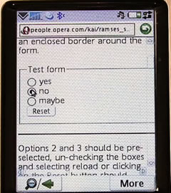
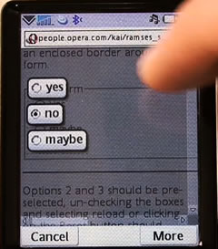
This challenge led to us creating Fingertouch. The first realization we had was that we needed to give users a lot more feedback when they hit something on a Web page. We chose to zoom in on the elements in question so it is clear that they are being focused on. The user then needs to click the element they want to select again to complete the selection process, which results in a nice smooth "fly out" animation to indicate success. You'll get more of a feel for this by watching the video or trying the build out, but the screenshots below give you an idea.
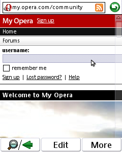
The other aspect of Fingertouch is helping users select what they want when they come across lots of links or other selectable elements close together. The images below further illustrate how Fingertouch helps in such a situation:
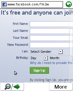
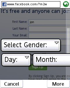
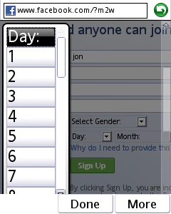
The solution also works nicely with forms.

Comments
No new comments accepted.