Improving the usability of within-page links
Introduction
A year and a half ago usability consultant Jakob Nielsen published an article called Avoid Within-Page Links, advising that web developers avoid within-page links (ie any link that takes the user to a "named anchor" within the same page.)
I disagree (respectfully and deferentially, naturally) that they should be avoided, but similarly feel a little disquiet about a couple of problems you can encounter when using within-page links:
- There's the disorientation that you feel when the screen changes but you don't really know what you're meant to be looking at, especially when there are multiple headings and paragraphs on the page - which section have you jumped to?
- You think you've gone to another page, when in actual fact you're on the same page, but you don't realise it because the display has "jumped". Likewise, as Nielsen says, "Clicking Back doesn't take you to the previous page; it takes you to the previous scroll state of the same page." To me, the problem here is that you don't see the page scrolling - if the fact that you're moving within the same page were visually reinforced, then the default behaviour of the back button becomes expected rather than confusing.
The first problem is identifying what you're supposed to be looking at - the target of the link. Fortunately, with CSS3, we can change that using the :target pseudoclass, which is a class that the browser applies to any element that is the destination of a link that contains the fragment identifier.
The second problem is the default "jumping" of the browser. With some JavaScript we can change that. Visitors with a browser that can't deal with CSS3 and who don't have JavaScript enabled will not see any of the usability enhancements, but their experience will not be degraded in any way.
A word about coding within-page links
In Ye Olde Days, within-page links were coded as anchors with no destination, either sitting by themselves or wrapped with a semantic element:
<a name="about" id="about"></a><h2><a name="start" id="start">Cheesecakes through the ages </a></h2>There are problems with this, however, in our semantics-aware world. Firstly, anchors with no destination heading will still pick up all the styles that you've set for links (hover effects and the like), which you probably don't want because these anchors are unclickable. Also, if you're using XHTML, the name attribute is deprecated for the a element (see http://www.w3.org/TR/xhtml1/#C_8)
More philosophically, destinationless anchors like this are semantically redundant. If you want to identify a heading, or a div (or a list, list item, paragraph - anything really) then it's better to use the id attribute on that element:
<h2 id="start">Cheesecakes through the ages</h2>Indentifying the target of within-page links
Thanks to the magic of CSS, it's easy to target the destination of links. The CSS3 draft contains many selectors and pseudo-classes that have been implemented in newer browsers - one of which is the :target pseudo-class. The Kestrel version of Opera (the alpha of version 9.5) implements :target, although this is currently slightly buggy (it should be fixed by the final version.) Firefox and Safari already implement :target..
The browser applies the pseudoclass to any element linked to via a fragment identifier, as all within-page links are. (It also works if another page or even an external website links to you!). In any :target aware browser check out my first code example - a :target demo that colors the background of a targeted paragraph (note that in all my examples, I've deliberately put any CSS and JavaScript in the head of the document, so you can easily check out all the code by viewing source.)
Notice, too, that the :target can be on any HTML element, including lists, list items, headings and spans - this is demonstrated in my second example.
Once we can target the destination for a link, we're not limited to setting background colours. To immediately make your site achingly oh-so-web-2.0, why not add a one pixel background image of a pastel colour fading to transparent over two seconds?
This technique is simple to implement, but does require some thought. Do you have other background images used within body text - for example, background-images set by CSS on certain links to downloadable documents or external links? If so, you'll need to ensure that they are gif or png with transparent backgrounds, otherwise they'll end up as white squares when the :target background is applied to their container, as demonstrated in Figure 1.
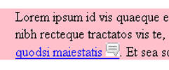
Figure 1: Make sure your images have transparent backgrounds, otherwise they'll look a mess when you are using a background colour.
It's wise to give some thought to the aesthetics of the page once the target style is applied. Try to apply the styling to the smallest area needed to draw the eye. If, for example, you have a page with multiple news items, each consisting of a div containing a heading and multiple paragraphs, consider highlighting just the heading rather than the whole div with a rule like
div.article:target  h2 {
  background-color: pink;
}
Smooth scrolling
The second problem we identified was that of disorienting the reader by "jumping" around the page. Stuart Langridge identified this problem in 2003 - three years before Nielsen - and wrote a script called Smoothscroll, which he released under the MIT license - see http://www.kryogenix.org/code/browser/licence.html.) The script calculates the distance between the link and its destination and scrolls between them, as fast or as slow as is necessary to make the "distance".
I'm no JavaScripter, so I've simply hacked this script so that it can jump to any element with an id, rather than named anchors as the original script was coded for. It works in Opera, Firefox and IE, and you can see it's already much less disorientating and combines well with the :target CSS.
Other scripts attempt smooth scrolling as well, indicating that it's a recognised problem; the mootools library has a "smoothscroll" module, but both mootools and Stuart's versions have a usability darkside: they break the back button and browser history: if you hit a link to smoothscroll to it, then hit the back button, the browser's address bar correctly updates to the previous location, but the screen doesn't scroll back to where it was, which may cause the user more annoyance than the problem it was meant to solve. (Great minds are working on this very problem, and will hopefully report back in a future dev.opera article).
For Internet Explorer users
IE users don't benefit from highlighting the :target pseudoclass, because that browser doesn't support it. If you're using Stuart's Smoothscroll script, you could fix IE by adding a class to the destination of the link, and double up all :target CSS rules:
*:target,, .IE-target {
  background-color: pink;
}
This way, IE users who have JavaScript will get the same effect, and IE users who have JavaScript turned off still receive the browser's default behaviour.
This works best with the fading highlight, otherwise you have to add JavaScript to remove an IE-target class from the "old" target the next time you highlight another within-page link, which adds to the complexity and execution time of the script. Browsers that natively support :target automatically withdraw the pseudoclass from one element when another element is targeted.
One last thing for IE users: IE has a big ugly bug that can mean that in certain circumstances, within-page links that are activated using the keyboard fail to go to their destination, but instead disappear into limbo. This particularly affects users with disabilities who don't use conventional mice. Gez Lemon of the Web Standards Project's Accessibility Task Force describes the problem and its various solutions in detail in his article Keyboard Navigation and Internet Explorer, but the basic choice is:
- Code the destination elements to have
tabindex="-1", which makes the markup invalid - Set the destination link to have
tabindex="-1"in the Smoothscroll JavaScript - so sneaking an invalidity into your markup through the scripting back door, but this won't work for that 3 to 10% of your audience who don't have JavaScript - Make sure the IE-only
hasLayoutproperty istruefor all destinations using CSS. This won't invalidate your markup but fails for users not using CSS, and can lead to madness as you need to understand howhasLayoutworks - Persuade all your IE users to switch to a proper browser like Opera instead!
Summary
None of the techniques above can be classed as advanced, but in combination they show that good document structure combined with CSS and JavaScript can enhance the user experience with some visual reinforcement. Users with screenreaders get no visual reinforcement, of course, but the most poplar screenreaders already prefix within-page link with an announcement of "this page link" so the user understands the context. And, of course, those people using older, less advanced browsers are not disadvantaged in any way.Thanks
Stuart Langridge for "Smoothscroll" and Nedjma Mestari for showing me how to make animated gifs.
This article is licensed under a Creative Commons Attribution, Non Commercial - Share Alike 2.5 license.
Comments
The forum archive of this article is still available on My Opera.
No new comments accepted.