CSS and opacity: methods for creating translucent elements
Introduction
There are two general methods for creating partially transparent elements on a Web page. The first method uses transparent PNGs with the opacity pre-set through a digital imaging application. While this technique works, making it cross-browser compatible is a bit complicated. Internet Explorer 6 and below don’t support PNG alpha-transparency natively, so you need to incorporate Microsoft’s AlphaImageLoader filter and some scripting to correct for this deficiency.
The second method for creating translucent elements—the technique we’ll explore in this article—is to use CSS properties to directly control the transparency of an element.
While this method has drawbacks of its own, it does enjoy advantages over the PNG technique: It is much simpler—not only are you directly manipulating the transparency of an element and you need not load external images, but also you don’t need to mess with Microsoft’s complicated AlphaImageLoader filter. Although use of another, less convoluted filter is necessary.
Throughout the course of this article, I’ll be taking you through some examples to demonstrate how to use opacity techniques on Web pages—to help follow along with these examples, you can download all the example files.
The CSS opacity property
CSS3 has a specific property that controls the transparency of an element, aptly named "opacity". It takes as its value a number from zero to one, representing the degree to which the element is opaque. A value of zero means completely transparent and one means completely solid.
To demonstrate this property using a simple example, let’s create a couple of boxes using CSS. After creating two divs, and setting their dimensions, color, and position in the browser window using CSS, we end up with the example shown in Figure 1:
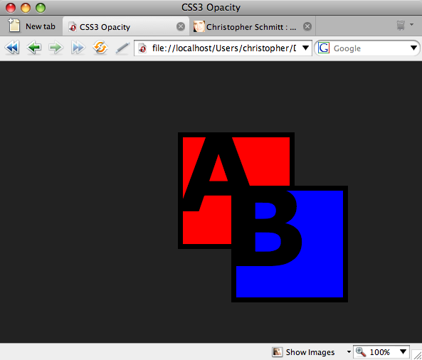
Figure 1. Stacked elements
Now, let’s make box "B" partially transparent by setting the opacity property:
#boxB {
  opacity: .3;
}
Here, we’ve made it 30% opaque, and end up with a translucent box example as shown in Figure 2:

Figure 2. See through element when its opacity setting is lowered
Suppose we’ve decided the box is a little more transparent than we’d like. Then, we can just adjust the level of opacity:
#boxB {
  opacity: .7;
}
Now, the box in the example is a bit more opaque (at 70%), as shown in Figure 3:

Figure 3. Increasing the value of the opacity
Why do we use decimal numbers and not percentages which are used in other properties? As mentioned in a correspondance with Tantek Çelik, who was Microsoft’s primary representative to the HTML and CSS working groups at the W3C at the time, the thought was that percentages might be too confusing especially with regard to parent elements and inheritance. So, using a new unit value was put in place to help alleviate those concerns and retain some clarity.
While this property has great potential, it is still an experimental property that is not officially recommended by the W3C. However, most modern browsers support the opacity property, including Firefox 1.5+, Safari 1.2+, and Opera 9+. Internet Explorer 7 doesn’t support the property and it does not look like the upcoming IE8 will support it either—although that’s based on testing the first beta, which is the latest version available as of this writing.
So, how do we ensure cross-browser compatibility for partially transparent elements? Fortunately, Internet Explorer and Mozilla-based browsers such as Firefox and Netscape Navigator came with their own browser-specific, proprietary properties that allow us to replicate the opacity property just illustrated. the Mozilla one no longer needs to be used, as it now has full support for the proper opacity property; for Internet Explorer 5.5 and up we need to use its filter property, which is capable of creating various effects such as shadows and gradients in IE browsers. To manipulate and element’s transparency, use the alpha filter, and pass through it an opacity value between 0 and 100:
#boxB {
  filter: alpha(opacity=30);
}
A cross-browser solution
Now, let’s work through an example that functions in most modern browsers.
First, we’ll create a simple Web page, as shown in Figure 4, that includes two main divs: a “content” div that displays a boat image in the background, and a white overlay that includes a serene quote from The Tao Te Ching:
<div id="content">
<div id="quotebox">
<div id="quote">
<p>Be content with what you have; rejoice in the way things are.</p>
<p>When you realize there is nothing lacking, the whole world belongs to you.</p>
<p><em>— Lao Tzu</em></p>
</div><!-- end #quote -->
</div><!-- end #quotebox -->
</div><!-- end #content -->

Figure 4. The default rendering
Suppose we want to make the white overlay partially transparent, so that the boat image is visible behind it. To do this, add all three of our opacity properties to the relevant CSS selector. In this example, the “quotebox” div encloses the overlay:
#quotebox {
  opacity: .4;
  filter: alpha(opacity=40);
}
We use all three properties here to ensure that the transparency effect works in as many browsers as possible. We end up with a barely-opaque overlay in our Web page, as shown in Figure 5:
Figure 5. The transparent quote
While the overlay itself looks good, notice that the quotation text is transparent as well. This is because the opacity properties are inherited by all child elements. In this example, the "quote" div encloses the quotation. We can try to override this inherited transparency by resetting the opacity in the quote div:
#quote {
font-size: 32px;
color: #000;
opacity: 1;
filter: alpha(opacity=100);
}
Unfortunately, this technique doesn’t work in many browsers, and you’ll still end up with unreadable text!
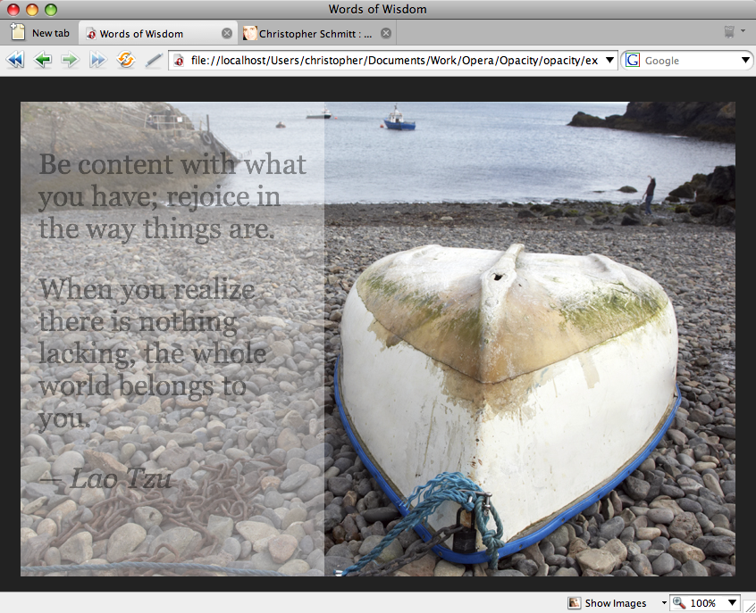
So, the rather imperfect solution to this problem is to make the overlay opaque enough that the enclosed text is still readable, as shown in Figure 6:
#quotebox {
  opacity: .65;
  filter: alpha(opacity=65);
}

Figure 6. The quote with improved contrast for better legibility
Now, the overlay is still nicely translucent, and we can comfortably read the text. While this doesn’t provide the versatility we might want in our design, it is a manageable solution until browser support catches up with this fairly new CSS property.
Drawbacks
While we have a fairly elegant way to ensure cross-compatibility of element transparency, there are a couple of drawbacks to this technique.
Besides the inheritability problem mentioned above, the CSS we’ve created is not standards-compliant. CSS3 properties are not recommended yet, although the CSS validator can optionally validate CSS3, and the other two are proprietary properties not recognized by the W3C.
So, if it is important for your code to be valid—and there are many considerations to recommend it—then this method is not for you. However, if you are looking for a simple solution that works on most browsers until W3C recommendations and modern browsers catch up to CSS3, then this technique for creating partially-transparent elements may be the one you’re looking for.
transparent future
Whileopacity is a widely implemented part of the CSS 3 Color Module, that specification also includes additional ways to control transparency through CSS. It is now possible to specify an alpha channel to the familiar RGB color model and the new HSL color model. These color models with alpha channels added are called RGBA and HSLA respectively.
The alpha channel is specified as the last value of the RGBA or HSLA value, and works much the same way as opacity, with a value between 0 (fully transparent) and 1 (fully opaque). For example, the RGBA value rgba(255, 0, 0, 0.5) is red that is half transparent, half opaque. The difference between opacity and these two new color models is that opacity is applied to the whole element, so the text, background and border will all take the specified opacity. In RGBA and HSLA, it only applies to the property it is specified on, so you can make the background have transparency while keeping the text fully opaque for example.
Both HSLA and RGBA are implemented in the next version of Opera’s rendering engine, Core-2.2, and can be previewed in the Opera ACID3 build on Opera Labs. Support is also included in Safari 3+ and Firefox 3+.
This article is licensed under a Creative Commons Attribution, Non Commercial - Share Alike 2.5 license.
Comments
The forum archive of this article is still available on My Opera.
No new comments accepted.